
Your landing page’s weakest score is Information hierarchy.
How Rippling ranks
- 1.
Remote78
- 2.
Deel77
- 3.
Rippling76
- 4.
Shor74
- 5.
Oyster72
76Growth scoreupdated
category scores
category scoresShowHide
Information hierarchy
62FairDoes the design help or inhibit what the page is trying to say?
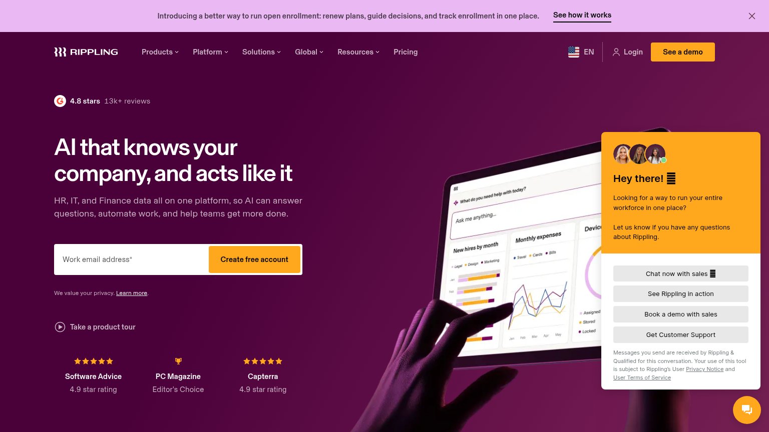 1234
- Proactive chat widget — Large orange chat panel with four equal-weight buttons outshines the hero CTA and covers the product visual.
- Promo announcement banner — Bright pink banner with 'See how it works' link is the first thing scanned and pulls attention away from the fold's conversion.
- See a demo button — Styled in the same orange weight as 'Create free account', creating two competing primary actions in the fold.
- Six-item dropdown nav — Products, Platform, Solutions, Global, Resources, Pricing plus Login offer seven exits before the email field.
Mobile web
72FairThe phone experience as a first-class citizen.
 12
- Open enrollment banner — Wraps to three lines plus a link, eating the top ~15% of the viewport before the logo.
- Award badges row — Third trust element in the fold after G2 stars and privacy line; clips mid-text and adds clutter.
Value props
78FairTitle, subtitle, hero — do they sell the product's true value?
Rippling’s headline
AI that knows your company, and acts like it
HR, IT, and Finance data all on one platform, so AI can answer questions, automate work, and help teams get more done.
Working
Could improve
Trust
82StrongProof that the product is real, competent, and safe to try.
How Rippling compares
Trust read
CTA
86StrongCopy, size, verb, cost-feel — does the primary CTA earn the click?
How Rippling compares
Recommended rewrites