
Your landing page’s weakest score is CTA.
How Oyster ranks
- 1.
Remote78
- 2.
Deel77
- 3.
Rippling76
- 4.
Shor74
- 5.
Oyster72
CTA
68FairCopy, size, verb, cost-feel — does the primary CTA earn the click?

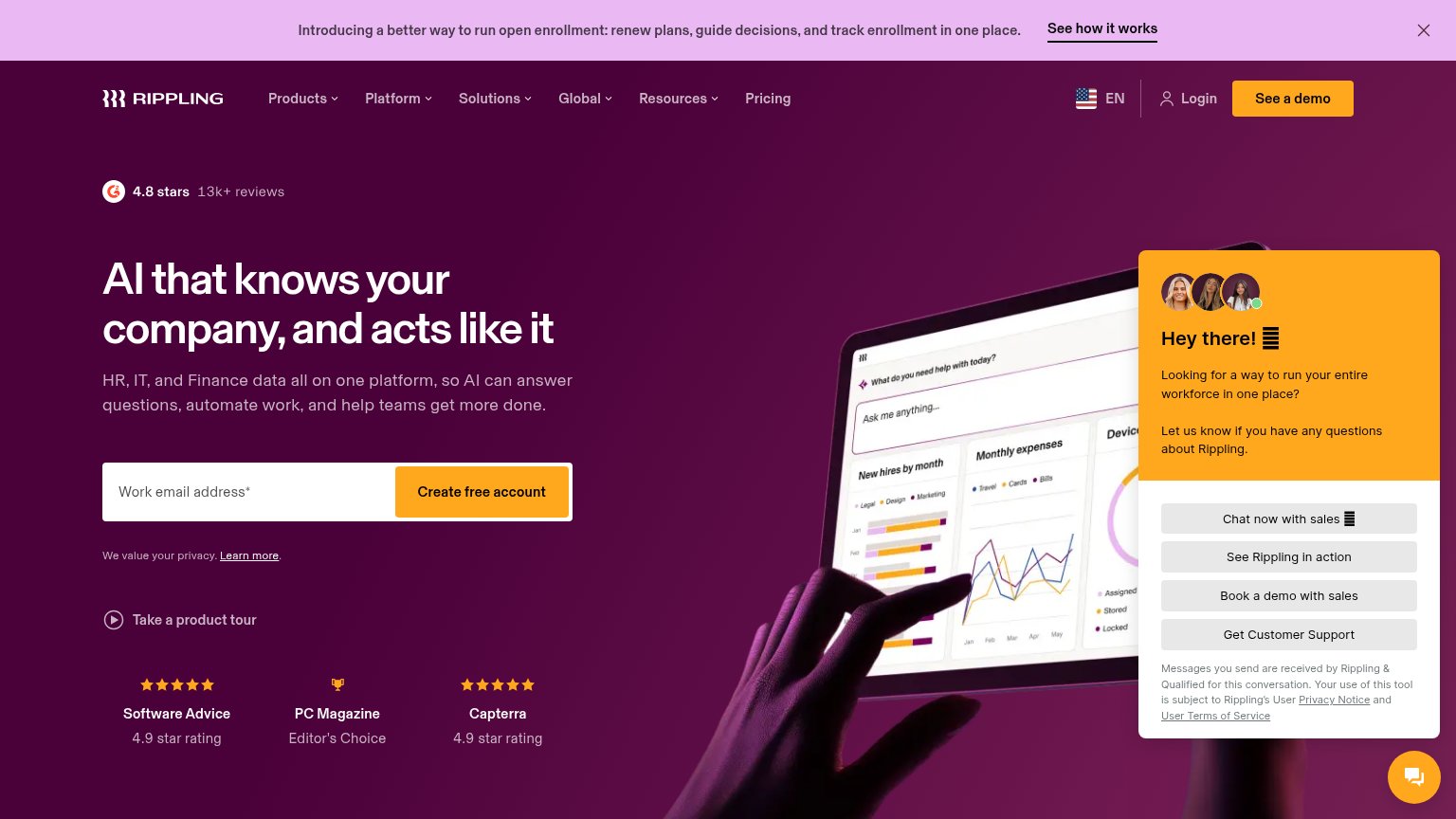
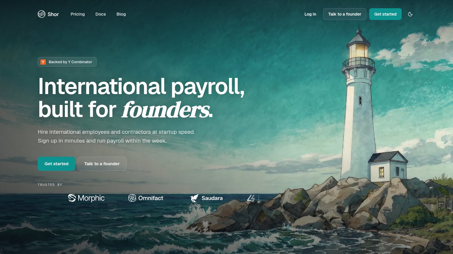
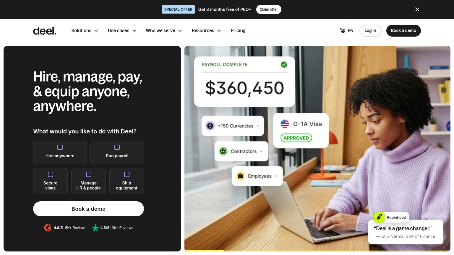

Problems
- demo click feels costly, sales-gated
- low-friction path demoted to ghost
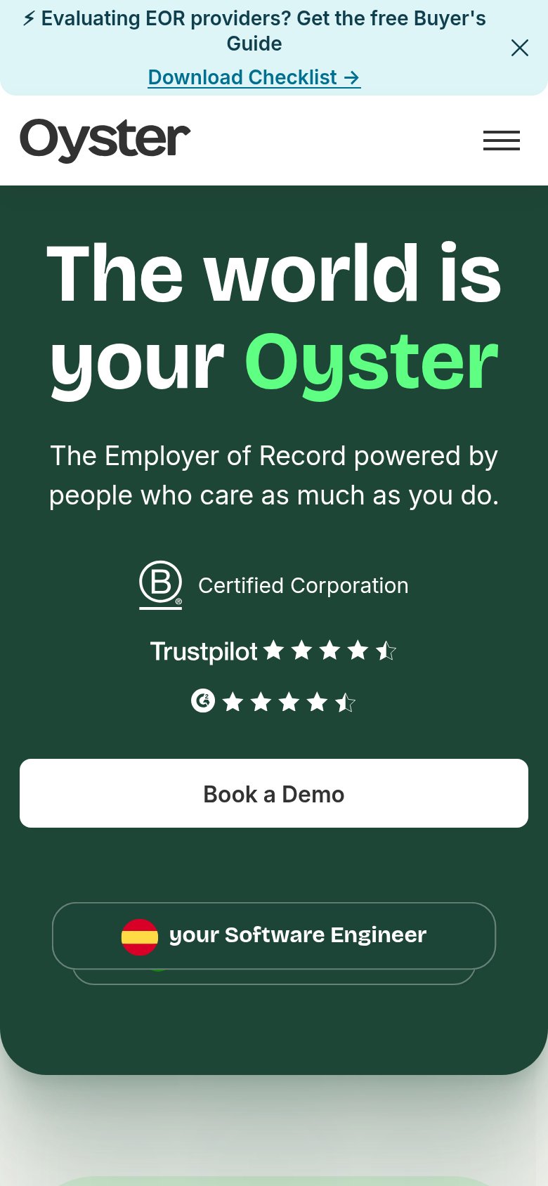
- secondary CTA dropped on mobile fold
Value props
68FairTitle, subtitle, hero — do they sell the product's true value?
Oyster’s headline undersells
The world is your Oyster
The Employer of Record powered by people who care as much as you do.
Working
- Map pins show global hires in action
- Subhead names the EOR category
- Trustpilot, G2, B Corp proof stack
Could improve
- Headline is a pun, not a value claim
- No numbers: countries, speed, cost
- "People who care" is a soft differentiator
Trust
72FairProof that the product is real, competent, and safe to try.
How Oyster compares
Trust read
Information hierarchy
74FairDoes the design help or inhibit what the page is trying to say?
What works
What to improve
Mobile web
76FairThe phone experience as a first-class citizen.
What works
What to improve