
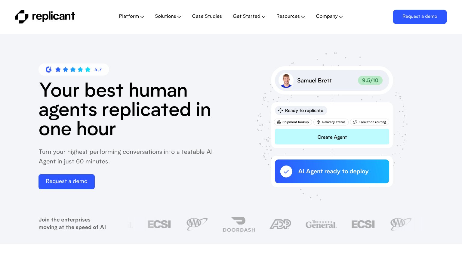
Your landing page’s weakest score is CTA.
How Replicant ranks
- 1.
Replicant75
- 2.
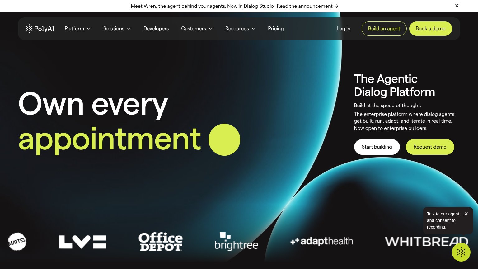
PolyAI70
- 3.
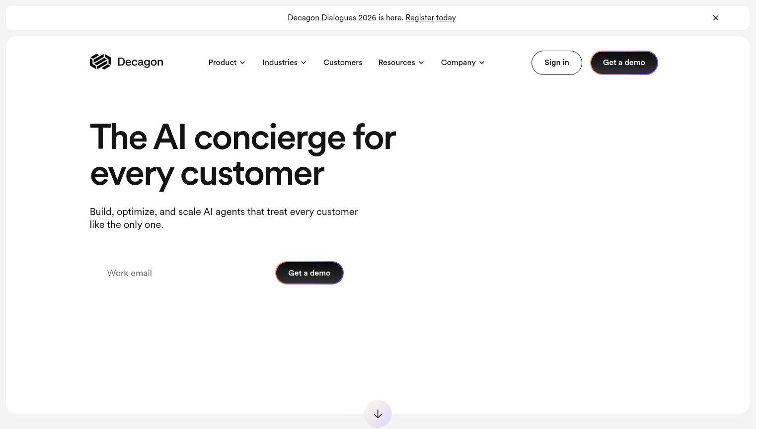
Decagon67
- 4.
Sierra62
- 5.
Parloa46
- 6.
Acrely42
75Growth scoreupdated
category scores
category scoresShowHide
CTA
64FairCopy, size, verb, cost-feel — does the primary CTA earn the click?
Problems
- 'Request' feels costly/sales-gated
- ignores headline's 1-hour promise
- no low-friction alternative CTA
Information hierarchy
76FairDoes the design help or inhibit what the page is trying to say?
123- Six dropdown nav items — Six same-weight nav menus (Platform, Solutions, Case Studies, Get Started, Resources, Company) open a dozen exit paths before the hero CTA.
- Duplicate demo CTAs — Header 'Request a demo' matches the hero CTA in color and weight, splitting the eye between two identical actions.
- Faded logo carousel — Low-contrast, cropped logos with duplicated ECSI/AAA marks read as a scrolling strip mid-motion, weakening the social-proof beat.
Trust
76FairProof that the product is real, competent, and safe to try.
How Replicant compares
Trust read
Mobile web
78FairThe phone experience as a first-class citizen.
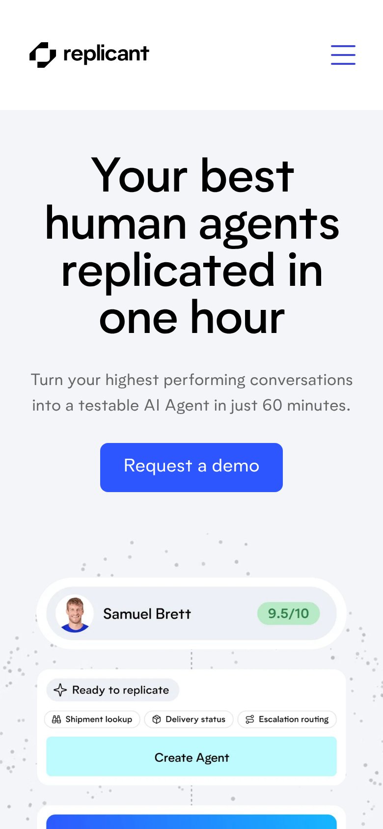
What works
What to improve
Value props
82StrongTitle, subtitle, hero — do they sell the product's true value?
Replicant’s headline
Your best human agents replicated in one hour
Turn your highest performing conversations into a testable AI Agent in just 60 minutes.
Working
Could improve