
Your landing page’s weakest score is Value props.
How Reflect ranks
76Growth scoreupdated
category scores
category scoresShowHide
Value props
68FairTitle, subtitle, hero — do they sell the product's true value?
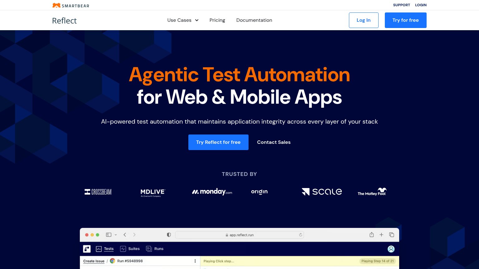
Reflect’s headline undersells
Agentic Test Automation for Web & Mobile Apps
AI-powered test automation that maintains application integrity across every layer of your stack
Working
- Hero screenshot shows a real test run
- Strong logo bar: monday.com, Scale, MDLIVE
- Category is instantly clear
Could improve
- Zero numbers or concrete outcomes
- 'Maintains application integrity' is abstract
- No emotional hook for QA pain
Mobile web
72FairThe phone experience as a first-class citizen.
 123
- Six-line hero headline — Desktop-scale type wraps into six cramped lines, shoving the CTA deep into the fold.
- Double-decker header stack — SmartBear bar plus tall Reflect hamburger row burns two header decks before the hero begins.
- Try Reflect button — Desktop-proportioned button floats narrow in the column instead of a full-bleed thumb target.
Information hierarchy
78FairDoes the design help or inhibit what the page is trying to say?
What works
What to improve
Trust
78FairProof that the product is real, competent, and safe to try.
How Reflect compares
Trust read
CTA
82StrongCopy, size, verb, cost-feel — does the primary CTA earn the click?
How Reflect compares
Recommended rewrites