
Your landing page’s weakest score is Trust.
How Recraft ranks
67Growth scoreupdated
category scores
category scoresShowHide
Trust
45PoorProof that the product is real, competent, and safe to try.
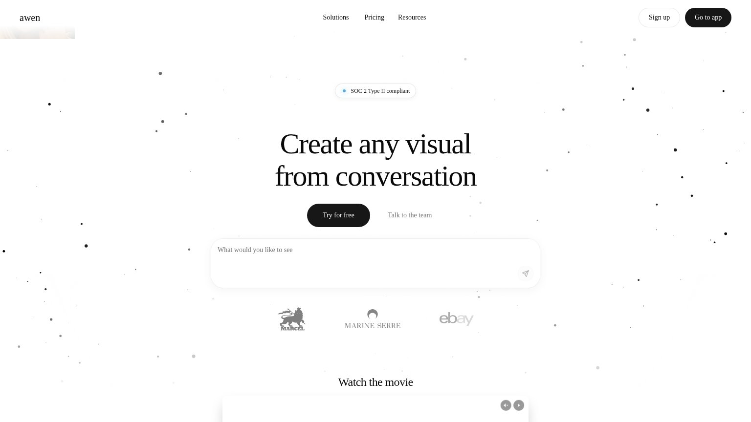
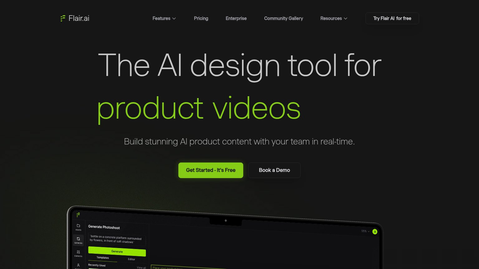
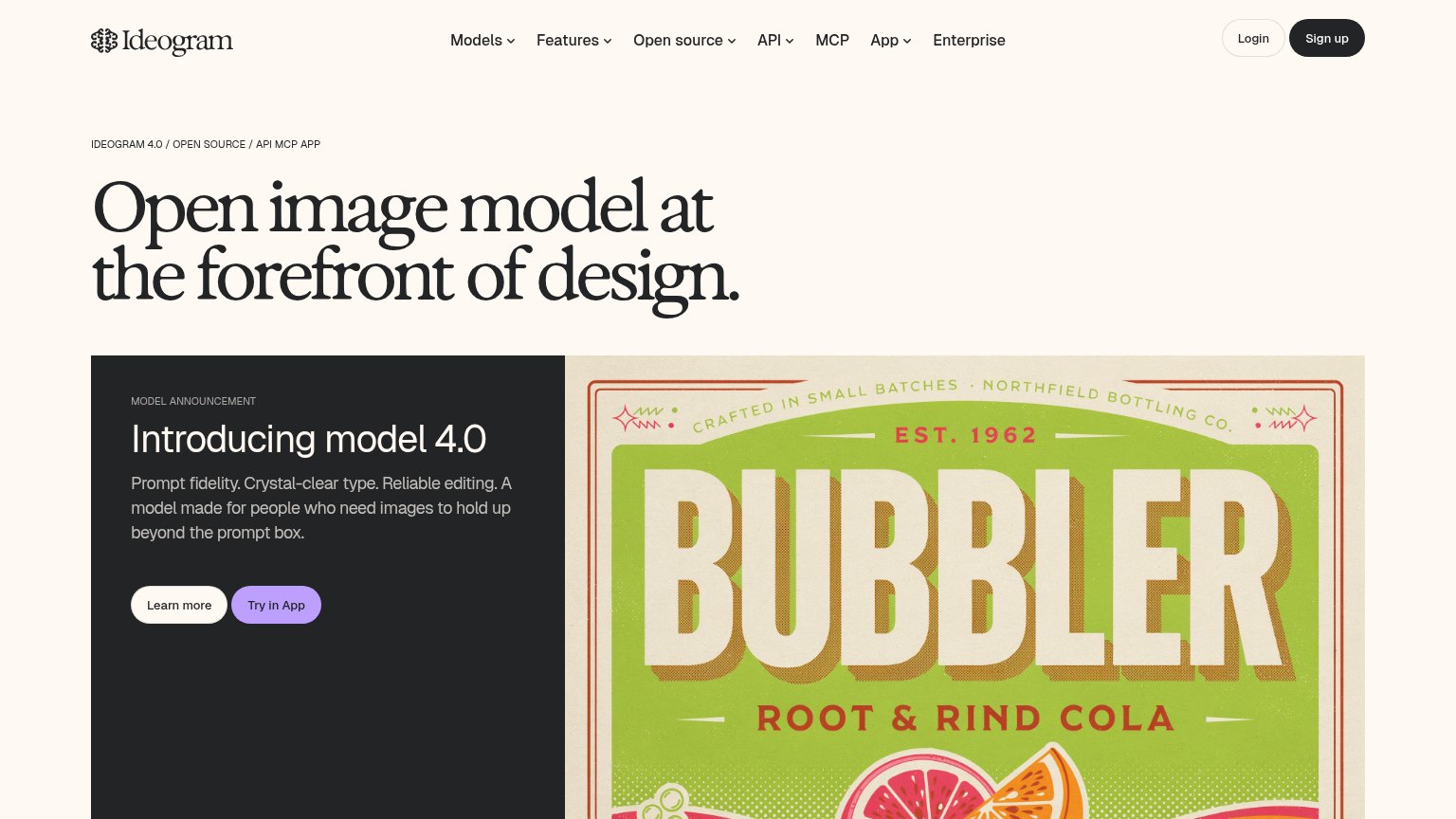
| Trust read | |
|---|---|
| Recraft | implicit context Recraft may benefit from pre-existing familiarity among its target audience. |
| Customer logo row (eBay, Marine Serre, Marcel) below the hero CTA | |
| No visible trust signal identified. | |
| Laptop mockup showing the real Flair AI editor UI with a "Generate Photoshoot" panel, prompt, templates, and generated p | |
| Generated "BUBBLER Root & Rind Cola" poster with crisp rendered type | |
| Product screenshot of the Krea app interface ("Let's create something") on the monitor |
Information hierarchy
66FairDoes the design help or inhibit what the page is trying to say?
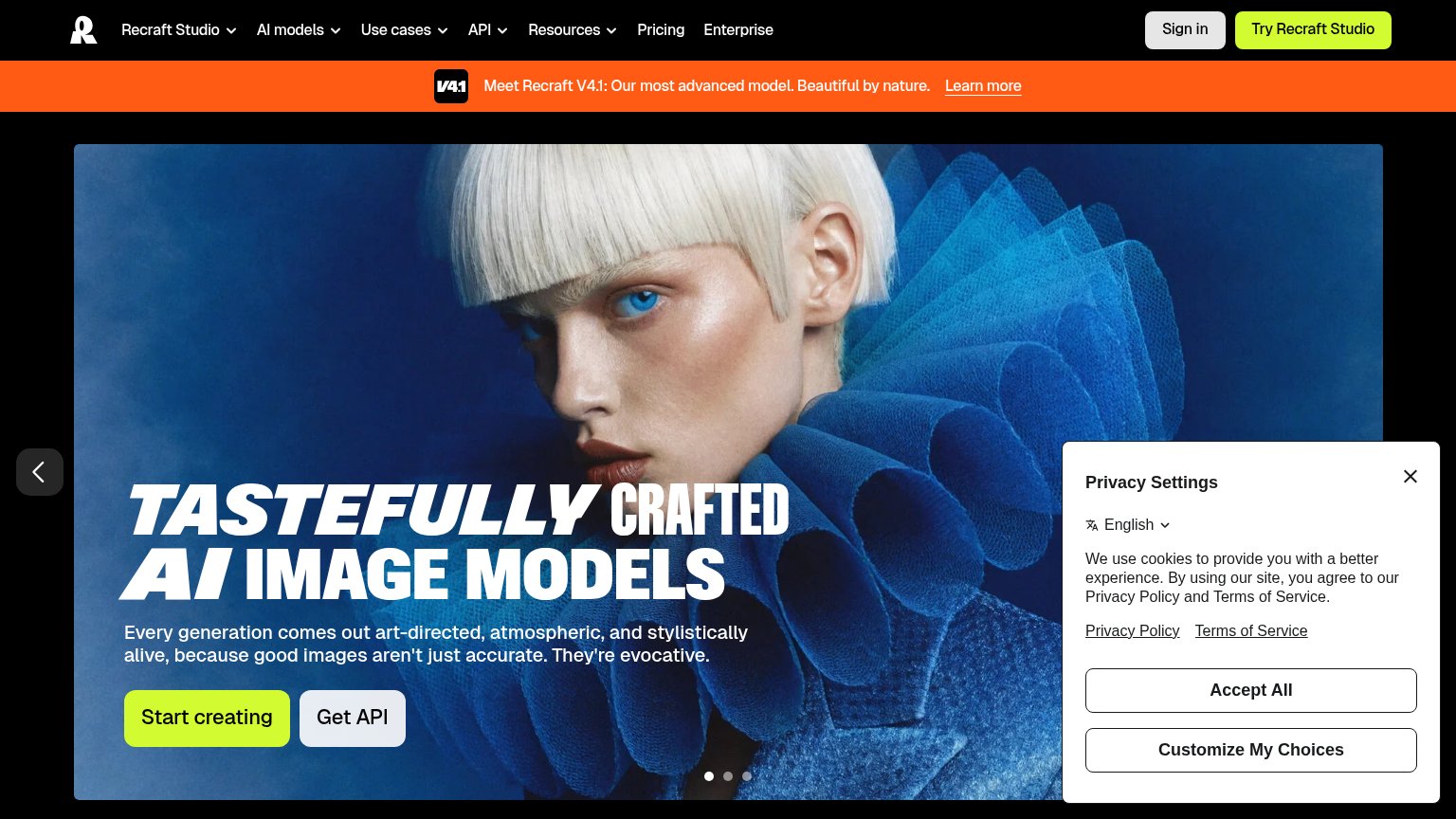 1234
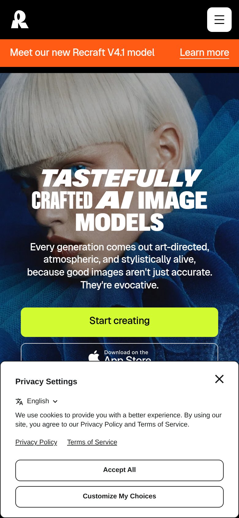
- Privacy Settings modal — Covers the right third of the hero and buries the fold's emotional anchor behind cookie chrome.
- Try Recraft Studio button — Same lime weight as "Start creating" — two identical primary CTAs split the scan path.
- Carousel dots arrow — Hero is a rotating carousel, so the value proposition swaps out from under the visitor.
- Orange V4.1 banner — Highest-contrast band on the page pulls the first glance to "Learn more" instead of the headline.
Mobile web
70FairThe phone experience as a first-class citizen.
What works
What to improve
Value props
74FairTitle, subtitle, hero — do they sell the product's true value?
Recraft’s headline
TASTEFULLY CRAFTED AI IMAGE MODELS
Every generation comes out art-directed, atmospheric, and stylistically alive, because good images aren't just accurate. They're evocative.
Working
Could improve
CTA
80StrongCopy, size, verb, cost-feel — does the primary CTA earn the click?
How Recraft compares
Recommended rewrites