
Your landing page’s weakest score is Value props.
How awen ranks
75Growth scoreupdated
category scores
category scoresShowHide
Value props
68FairTitle, subtitle, hero — do they sell the product's true value?
awen’s headline undersells
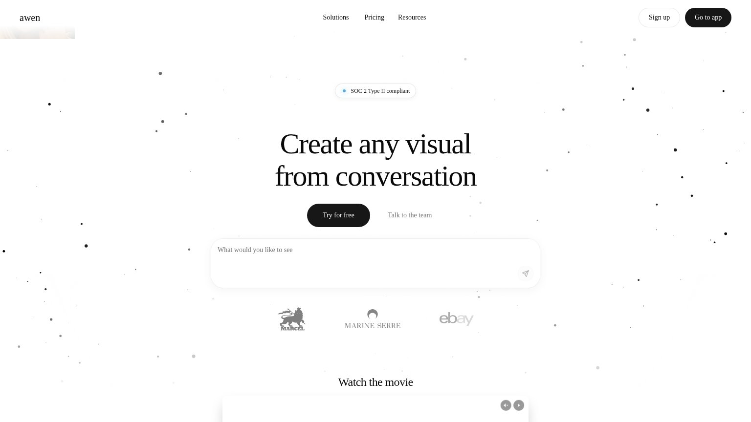
Create any visual from conversation
Working
- Names the mechanism plainly
- Prompt box demonstrates product
- Strong logo proof: eBay, Puig, Acne
Could improve
- No subhead adds specifics
- No numbers or outcomes
- 'Any visual' too broad for ICP
Information hierarchy
72FairDoes the design help or inhibit what the page is trying to say?
 1234
- Try for free vs prompt box — Two same-priority actions — the black CTA and the prompt input both invite the first click, splitting the visitor's next step.
- Go to app button — Styled identically to the hero CTA (black pill), so the strongest-weight element in the fold points away from signup.
- Talk to the team link — Low-contrast gray text sits beside the primary CTA with no button affordance, reading as disabled rather than clickable.
- Faded client logos — Marcel, Marine Serre, and eBay marks are washed out to near-invisibility, wasting the fold's only social proof.
Trust
72FairProof that the product is real, competent, and safe to try.
How awen compares
Trust read
Mobile web
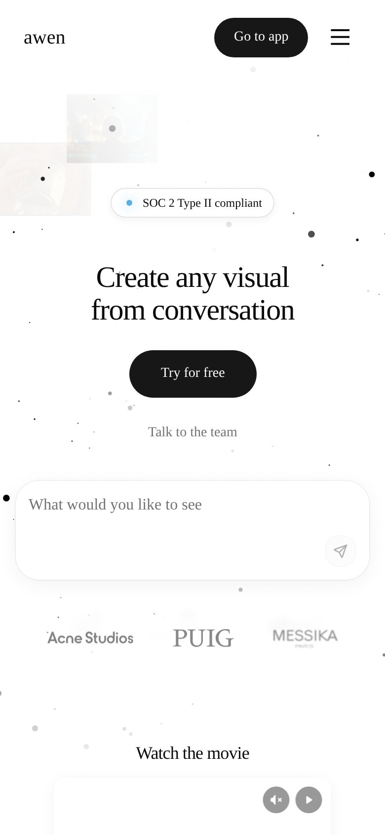
78FairThe phone experience as a first-class citizen.
What works
What to improve
CTA
86StrongCopy, size, verb, cost-feel — does the primary CTA earn the click?
How awen compares
Recommended rewrites