
Your landing page’s weakest score is Trust.
How Ideogram ranks
Trust
52FairProof that the product is real, competent, and safe to try.
| Trust read | |
|---|---|
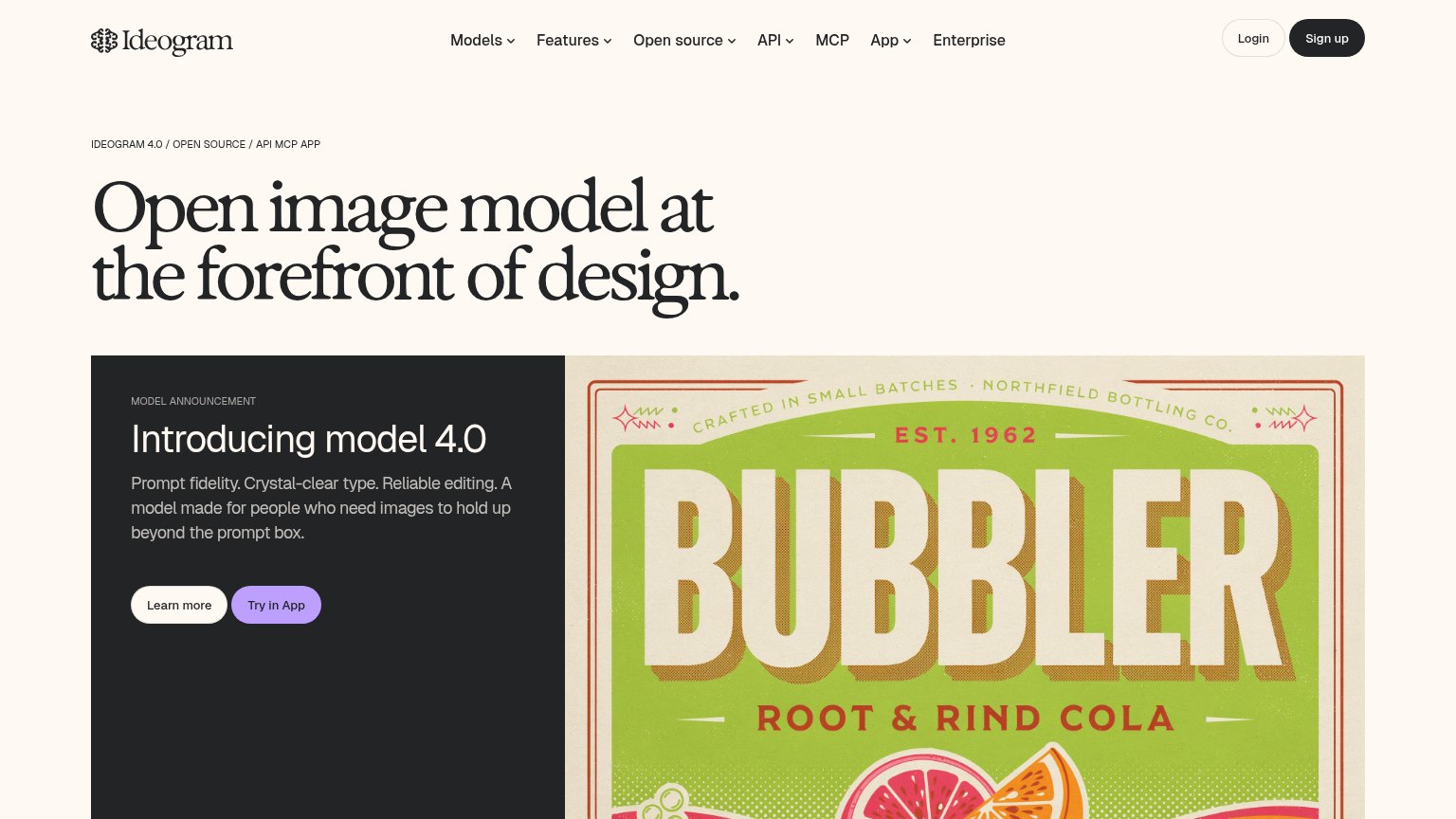
| Ideogram | Generated "BUBBLER Root & Rind Cola" poster with crisp rendered type |
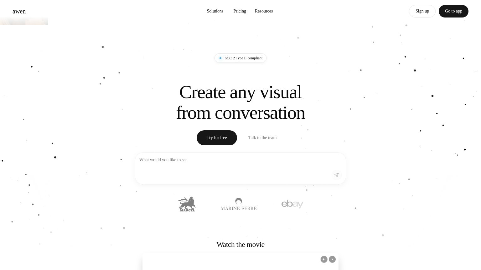
| Customer logo row (eBay, Marine Serre, Marcel) below the hero CTA | |
| No visible trust signal identified. | |
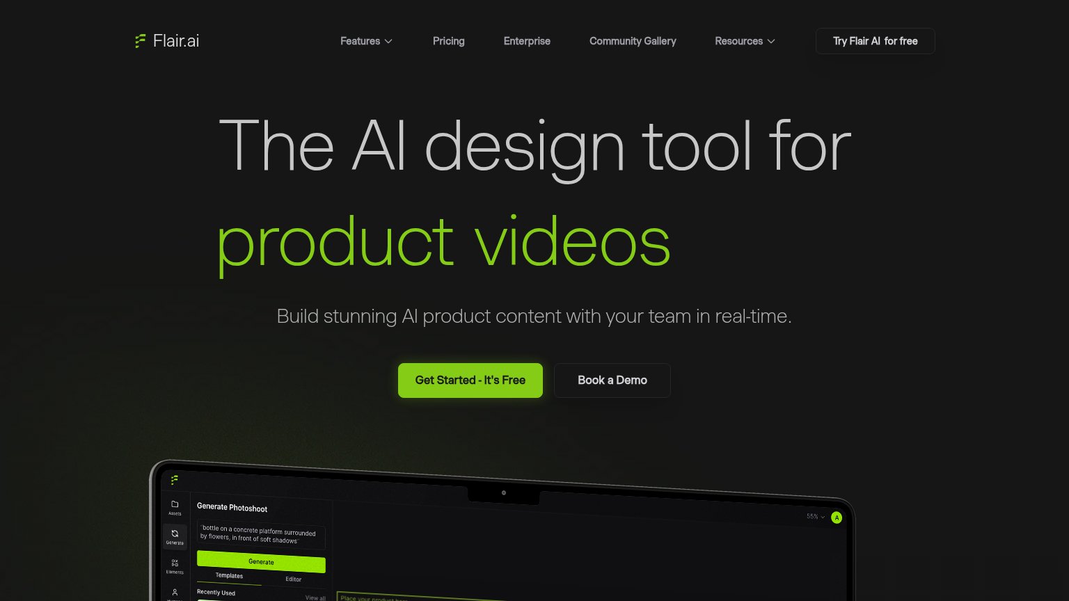
| Laptop mockup showing the real Flair AI editor UI with a "Generate Photoshoot" panel, prompt, templates, and generated p | |
| implicit context Recraft may benefit from pre-existing familiarity among its target audience. | |
| Product screenshot of the Krea app interface ("Let's create something") on the monitor |
Mobile web
60FairThe phone experience as a first-class citizen.
 123
- Hamburger-only header — The desktop Sign up button disappears on mobile, leaving zero visible CTAs in the entire first viewport.
- Four-line hero headline — The oversized serif headline eats nearly half the viewport, pushing every action below the fold.
- Model announcement card — Cut off mid-sentence with its Learn more / Try in App buttons stranded below the fold.
CTA
62FairCopy, size, verb, cost-feel — does the primary CTA earn the click?
How Ideogram compares
Recommended rewrites
Information hierarchy
73FairDoes the design help or inhibit what the page is trying to say?
What works
What to improve
Value props
74FairTitle, subtitle, hero — do they sell the product's true value?
Ideogram’s headline
Open image model at the forefront of design.
Prompt fidelity. Crystal-clear type. Reliable editing. A model made for people who need images to hold up beyond the prompt box.
Working
Could improve