
Your landing page’s weakest score is Trust.
How ReadMe ranks
73Growth scoreupdated
category scores
category scoresShowHide
Trust
58FairProof that the product is real, competent, and safe to try.
| Trust read | |
|---|---|
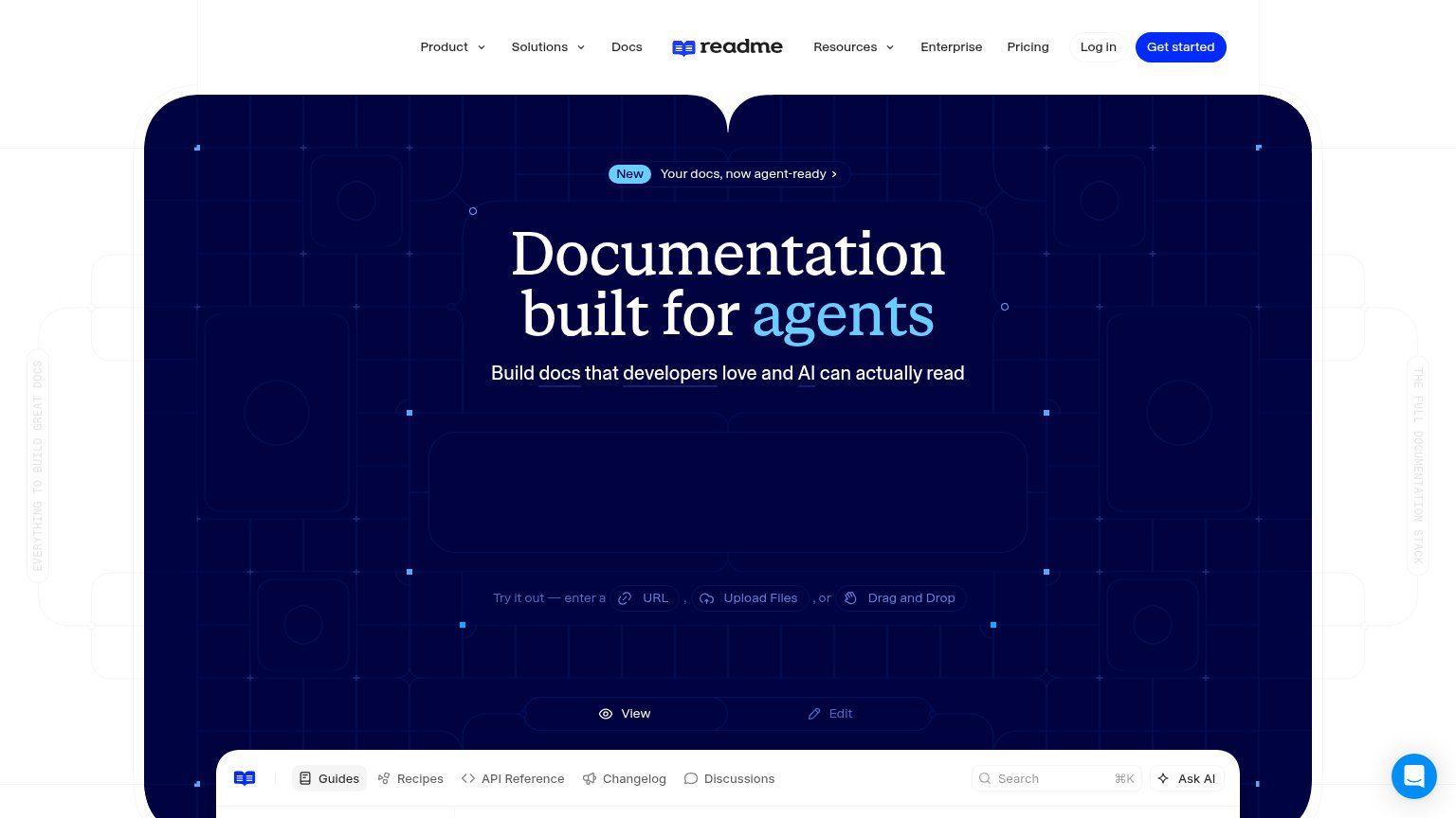
| ReadMe | Embedded live docs UI with Guides, Recipes, API Reference, Changelog, Discussions tabs |
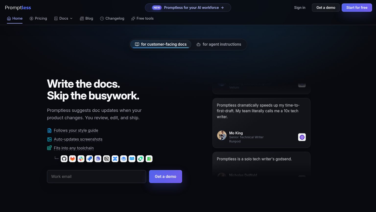
| Testimonial: "Promptless dramatically speeds up my time-to-first-draft… my team literally calls me a 10x tech writer." — | |
| Detailed real product screenshot of the Mintlify docs UI showing the "Quickstart Guide" ('Start building intelligent doc | |
| Embedded product demo of a live GitBook docs site ("Welcome to Acme" with sidebar nav, search, and Ask AI) | |
| Realistic docs product demo with "Create Agent" API reference and TypeScript code sample |
Information hierarchy
64FairDoes the design help or inhibit what the page is trying to say?
1234- Empty URL input panel — The central try-it widget renders as a blank dark rectangle on desktop, hiding the interactive conversion surface the mobile fold shows clearly.
- Nav link row — Seven equal-weight nav items plus Log in sit above the headline, giving attention eight exits before the primary action.
- View/Edit toggle — Low-contrast ghost buttons float mid-fold with no visible context, adding a competing control cluster near the conversion widget.
- Embedded docs toolbar — The docs-preview tab bar (Guides, Recipes, API Reference...) creeps into the fold as a second nav-like strip of clickable items.
Value props
78FairTitle, subtitle, hero — do they sell the product's true value?
ReadMe’s headline
Documentation built for agents
Build docs that developers love and AI can actually read
Working
Could improve
CTA
82StrongCopy, size, verb, cost-feel — does the primary CTA earn the click?
How ReadMe compares
Recommended rewrites
Mobile web
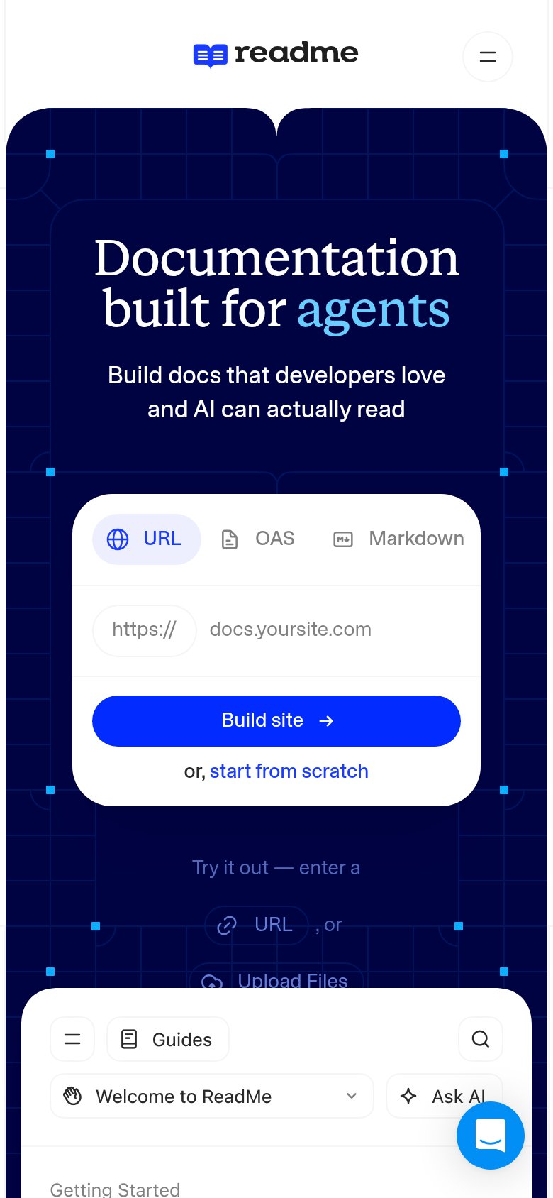
82StrongThe phone experience as a first-class citizen.
What works
What to improve