
Your landing page’s weakest score is Mobile web.
How Promptless ranks
- 1.
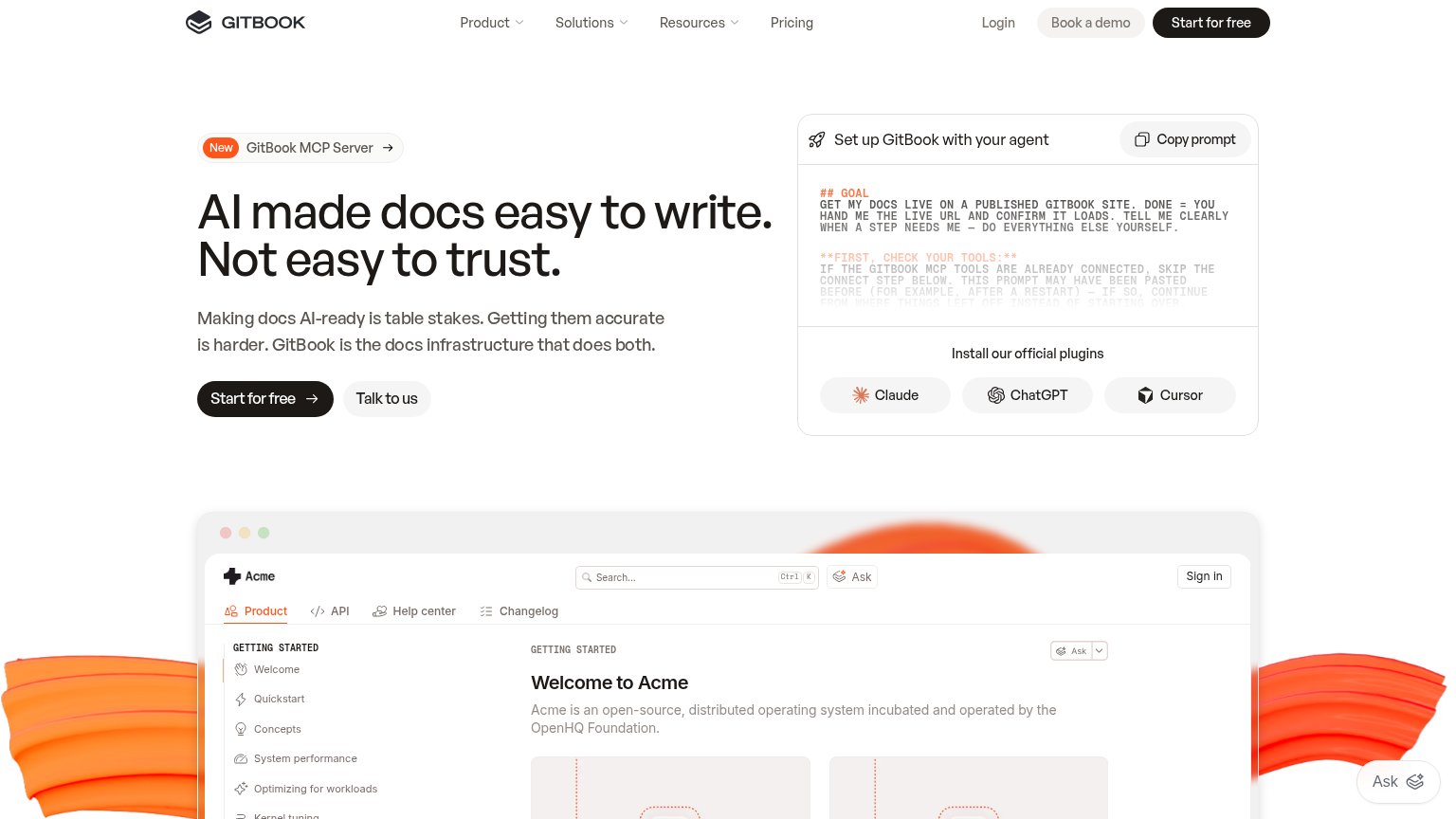
GitBook76
- 2.
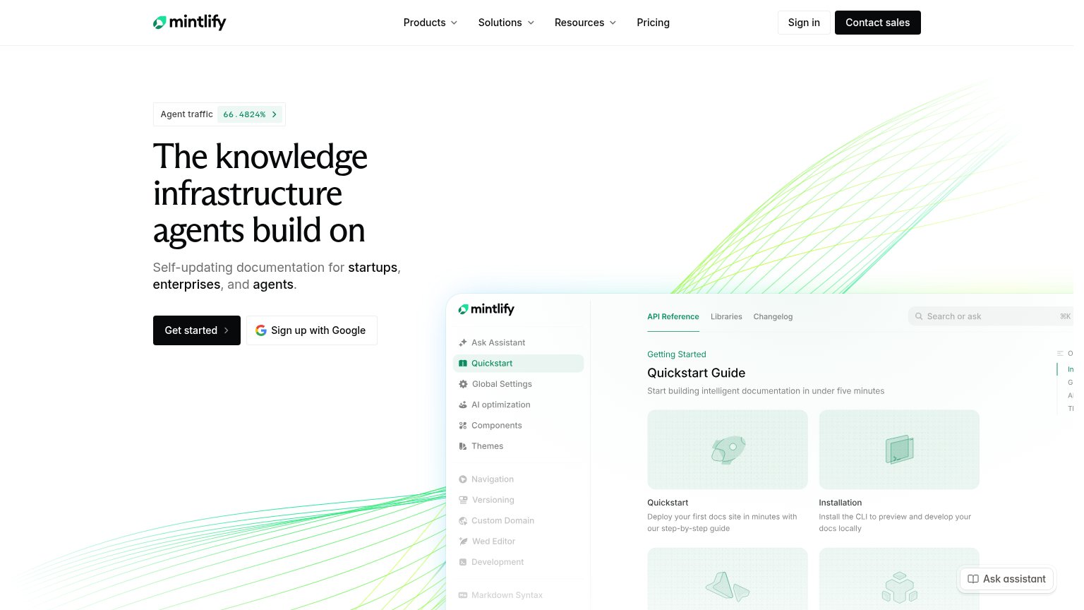
Mintlify73
- 3.
ReadMe73
- 4.
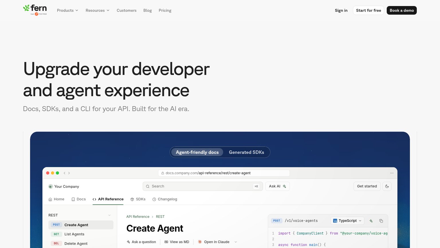
Fern67
- 5.
Promptless63
Mobile web
44PoorThe phone experience as a first-class citizen.
 1234
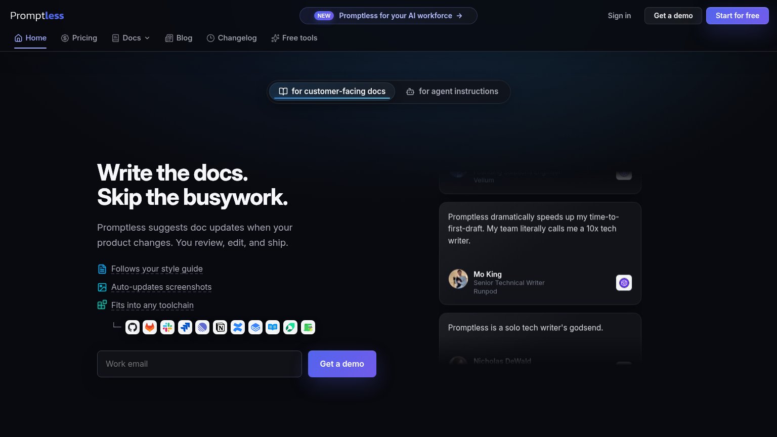
- Body copy overflows viewport — The subhead "Promptless suggests doc updates when Promptless…" is clipped at the right edge — text is not wrapping to the phone column.
- Get a demo button clipped — The primary CTA runs off the right edge, showing only "Get a d…" — the form row did not stack for mobile.
- Integration icon row clipped — The toolchain logo strip overflows the viewport with an icon cut in half at the right edge and an orphan icon wrapping below.
- Two-row toggle eats fold — The "for customer-facing docs / for agent instructions" segmented control stacks into a tall block that pushes the headline down.
CTA
62FairCopy, size, verb, cost-feel — does the primary CTA earn the click?
Problems
- demo ask feels costly
- conflicts with 'Start for free' nav
- email field gates the click
- no payoff copy on email input
Trust
62FairProof that the product is real, competent, and safe to try.
How Promptless compares
Trust read
Information hierarchy
68FairDoes the design help or inhibit what the page is trying to say?
What works
What to improve
Value props
78FairTitle, subtitle, hero — do they sell the product's true value?
Promptless’s headline
Write the docs. Skip the busywork.
Promptless suggests doc updates when your product changes. You review, edit, and ship.
Working
Could improve