
Your landing page’s weakest score is Information hierarchy.
How Rask AI ranks
80Growth scoreupdated
category scores
category scoresShowHide
Information hierarchy
76FairDoes the design help or inhibit what the page is trying to say?
 1234
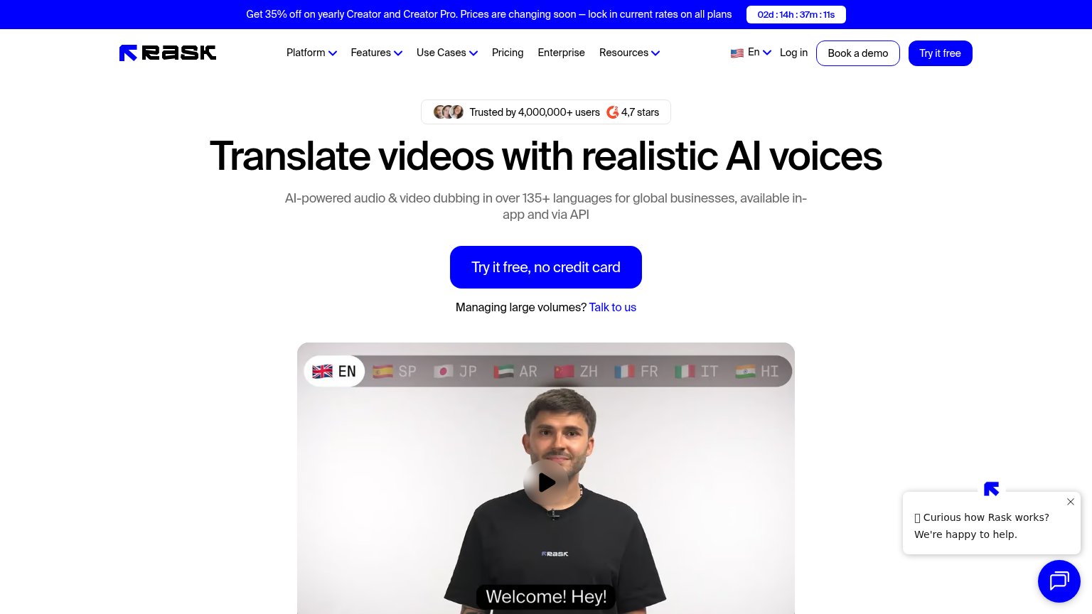
- Chat popup bubble — Auto-opened widget plus close button injects a competing message into the fold's corner and pulls eyes off the CTA.
- Header nav cluster — Six dropdown/link groups plus Log in create most of the fold's ten exit paths before the hero CTA is read.
- Book a demo button — Outlined button sits beside 'Try it free' at near-equal weight, splitting the header's conversion focus.
- Countdown promo banner — Urgency banner with pricing copy competes with the headline as the first message visitors process.
Trust
78FairProof that the product is real, competent, and safe to try.
| Trust read | |
|---|---|
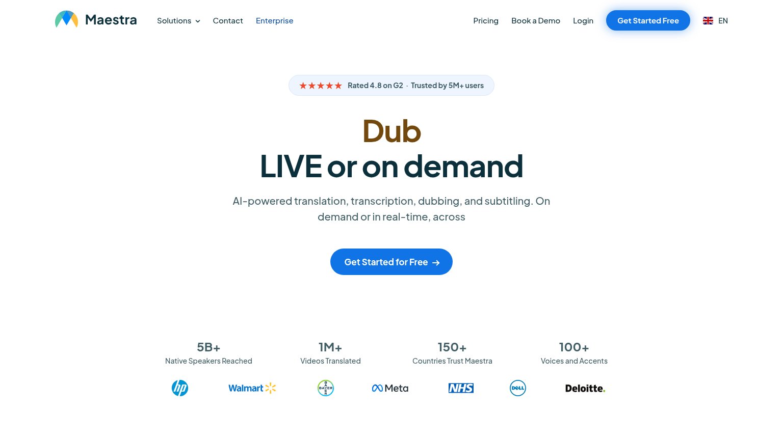
| Rask AI | "Trusted by 4,000,000+ users" badge with 4,7-star G2 rating above the headline |
| "Backed by Y Combinator" badge beneath the hero CTA | |
| Interactive voice demo widget with playable "Narration" sample and ElevenCreative/ElevenAgents/ElevenAPI tabs | |
| No visible trust signal identified. | |
| Row of realistic AI avatar video examples beneath the hero showing generated talking-head clips | |
| "Rated 4.8 on G2 · Trusted by 5M+ users" badge above the headline |
Value props
82StrongTitle, subtitle, hero — do they sell the product's true value?
Rask AI’s headline
Translate videos with realistic AI voices
AI-powered audio & video dubbing in over 135+ languages for global businesses, available in-app and via API
Working
Could improve
Mobile web
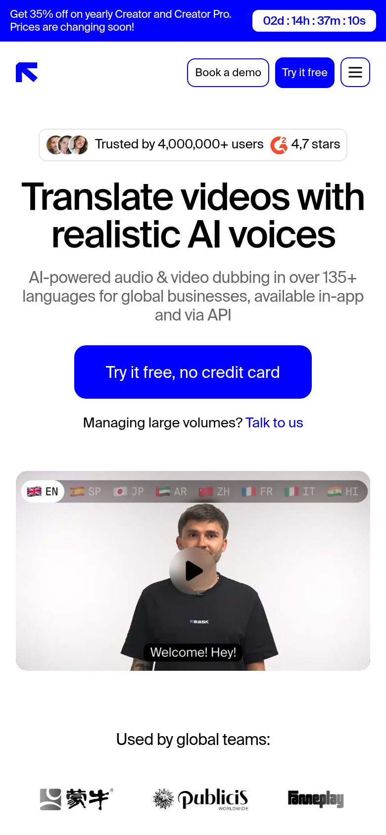
82StrongThe phone experience as a first-class citizen.
What works
What to improve
CTA
84StrongCopy, size, verb, cost-feel — does the primary CTA earn the click?
How Rask AI compares
Recommended rewrites