
Your landing page’s weakest score is Mobile web.
How Radiusbob ranks
Mobile web
38PoorThe phone experience as a first-class citizen.
 123
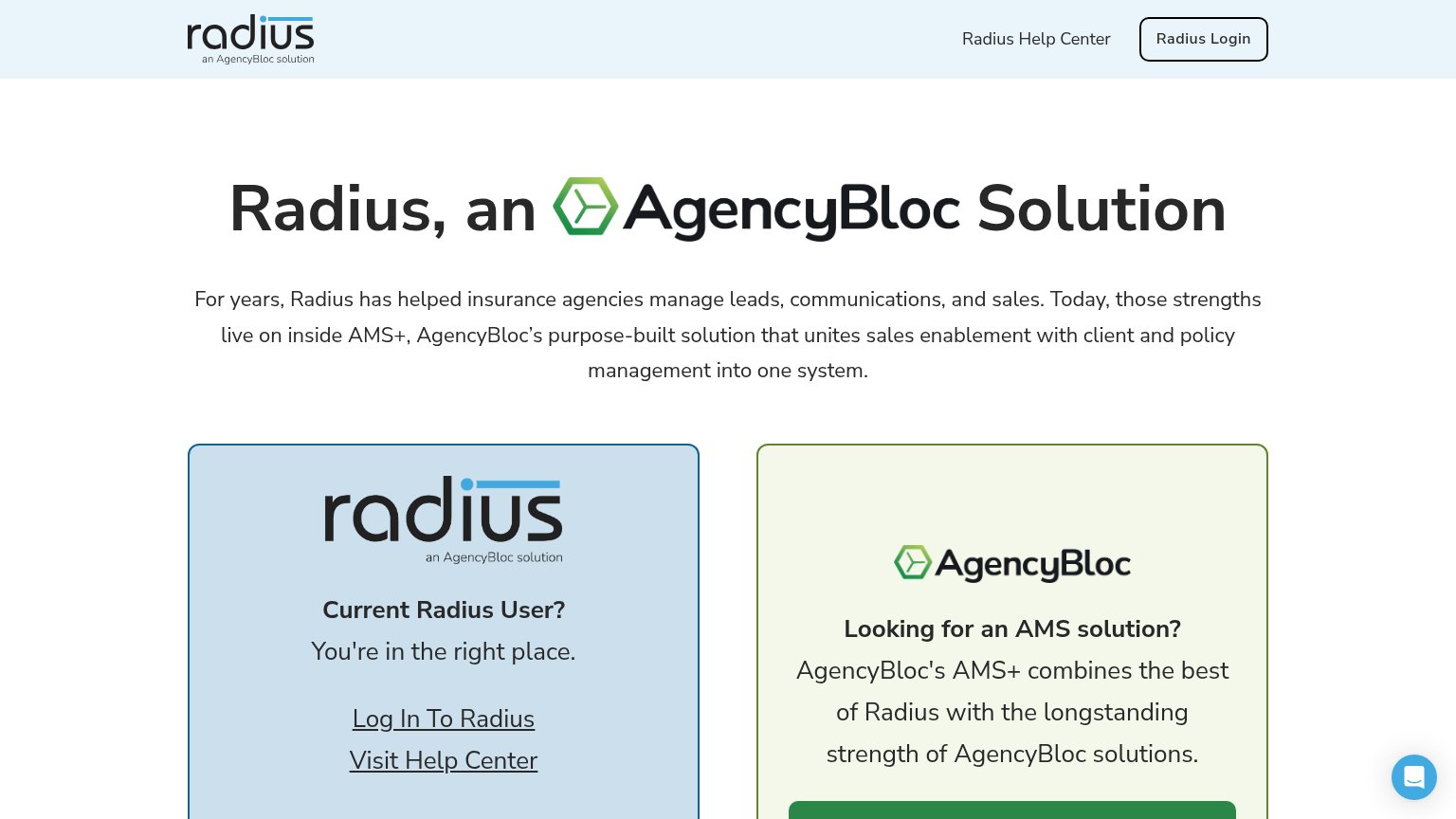
- Uncollapsed header stack — Nav never collapses to a hamburger — logo, help link, and login button stack vertically and eat ~25% of the first viewport.
- Oversized wrapping headline — "Radius, an AgencyBloc Solution" barely scales down, wrapping into three huge lines with an inline logo image that breaks the text flow.
- Chat bubble overlap — The Intercom-style chat bubble sits on top of the paragraph text at the fold edge, adding a dead blocker with no conversion value.
Trust
42PoorProof that the product is real, competent, and safe to try.

| Trust read | |
|---|---|
| Radiusbob | "For years, Radius has helped insurance agencies manage leads, communications, and sales" paired with AgencyBloc co-bran |
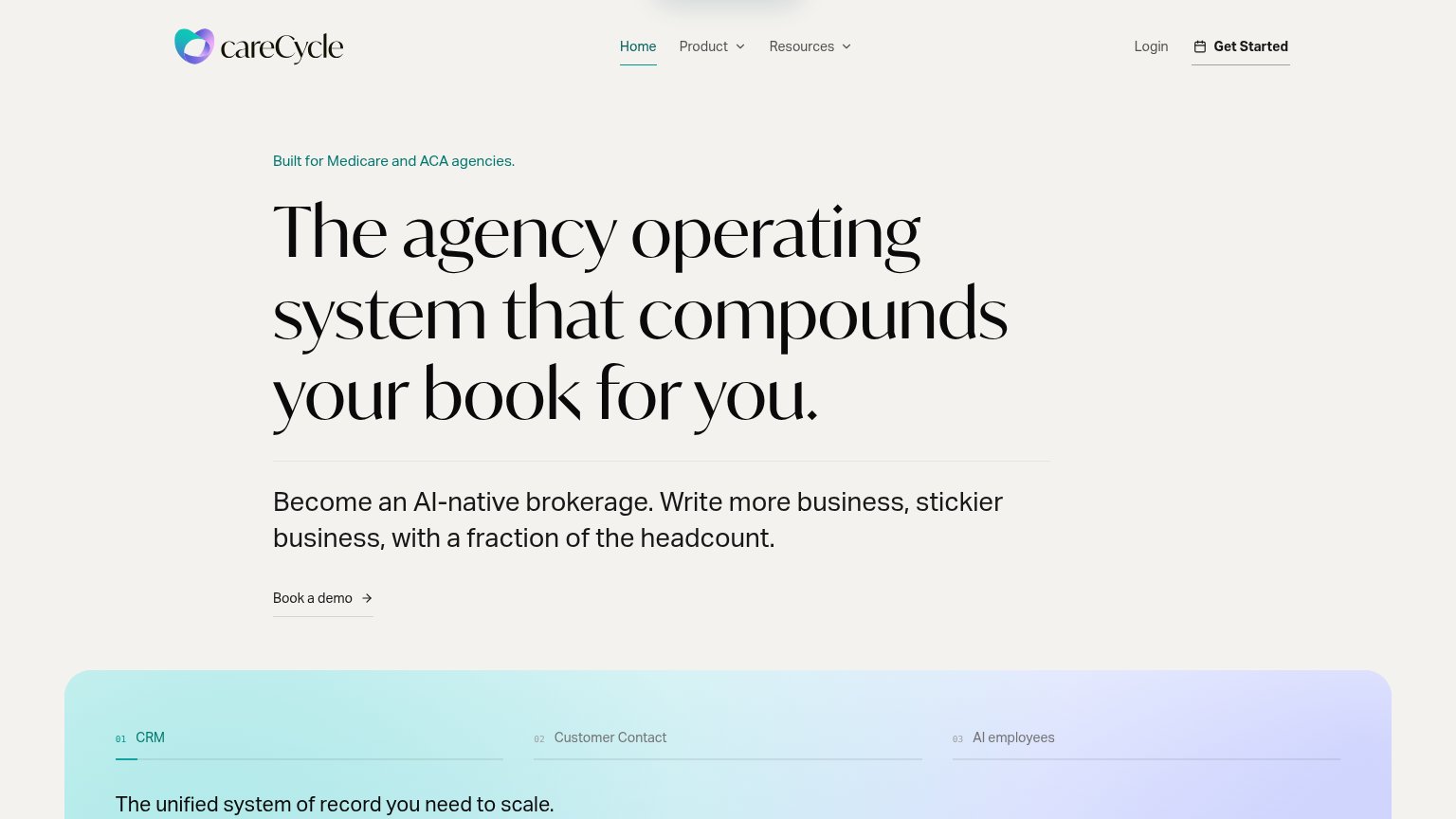
| Tabbed feature module labeled "CRM / Customer Contact / AI employees" with "The unified system of record you need to sca | |
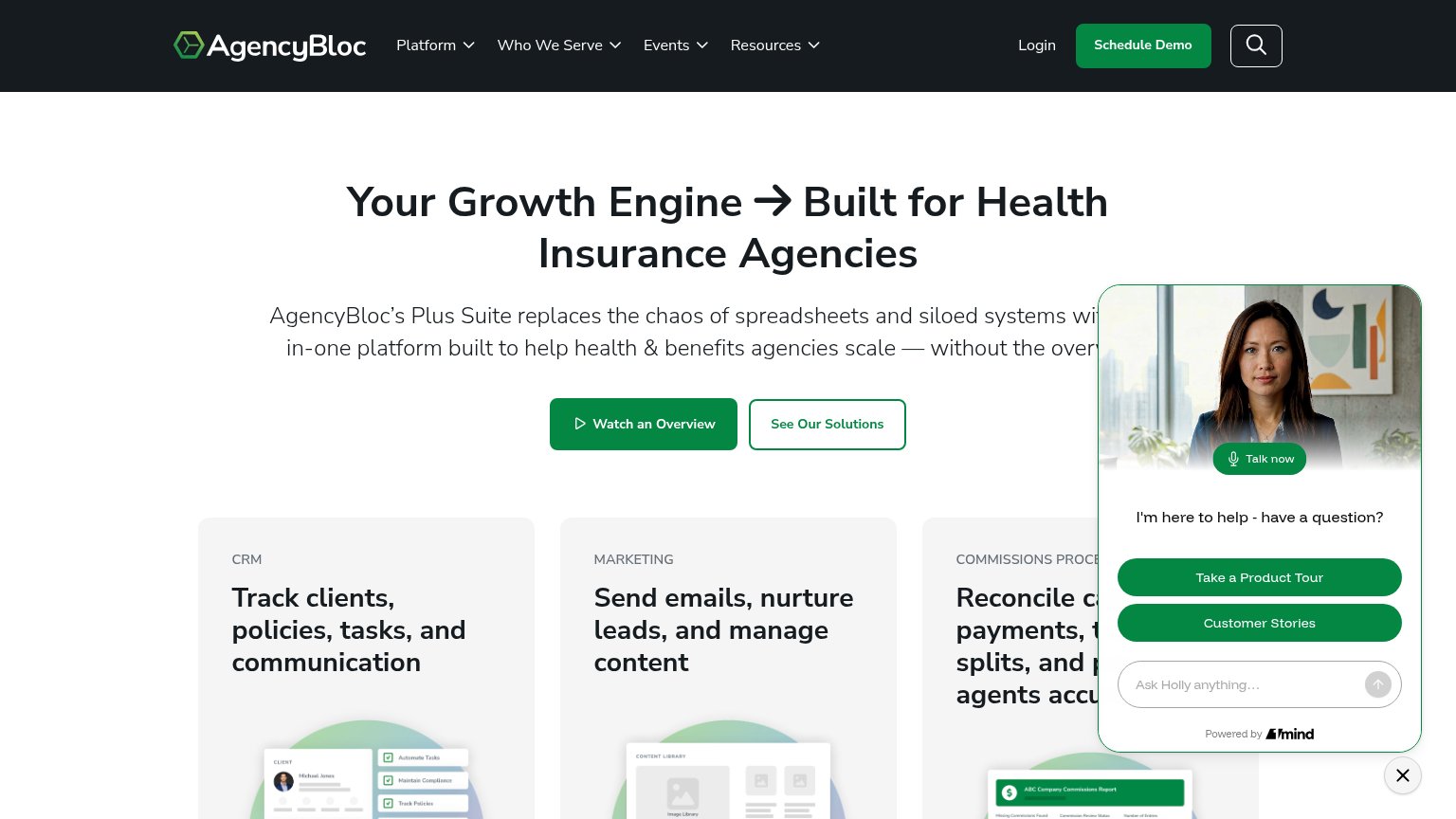
| Product UI mockups in the capability cards (CRM client record, content library, "ABC Company Commissions Report") | |
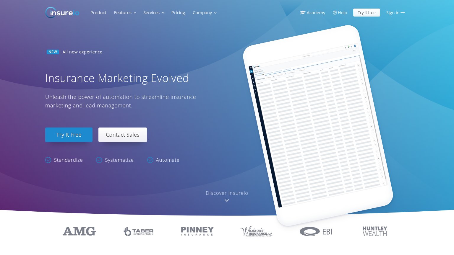
| No visible trust signal identified. | |
| Laptop mockup showing the analytics dashboard UI ("YTD Revenue $25,000", "AEP Production", "Closing Rate") | |
| Customer logo strip: AMG, Taber Brokerage, Pinney Insurance, Wholesale Insurance, EBI, Huntley Wealth |
Value props
48PoorTitle, subtitle, hero — do they sell the product's true value?
Radiusbob’s headline
Radius, an AgencyBloc Solution
For years, Radius has helped insurance agencies manage leads, communications, and sales. Today, those strengths live on inside AMS+, AgencyBloc’s purpose-built solution that unites sales enablement with client and policy management into one
Working
Could improve
CTA
52FairCopy, size, verb, cost-feel — does the primary CTA earn the click?
How Radiusbob compares
Recommended rewrites
Information hierarchy
68FairDoes the design help or inhibit what the page is trying to say?
What works
What to improve