
Your landing page’s weakest score is Trust.
How careCycle ranks
Trust
44PoorProof that the product is real, competent, and safe to try.
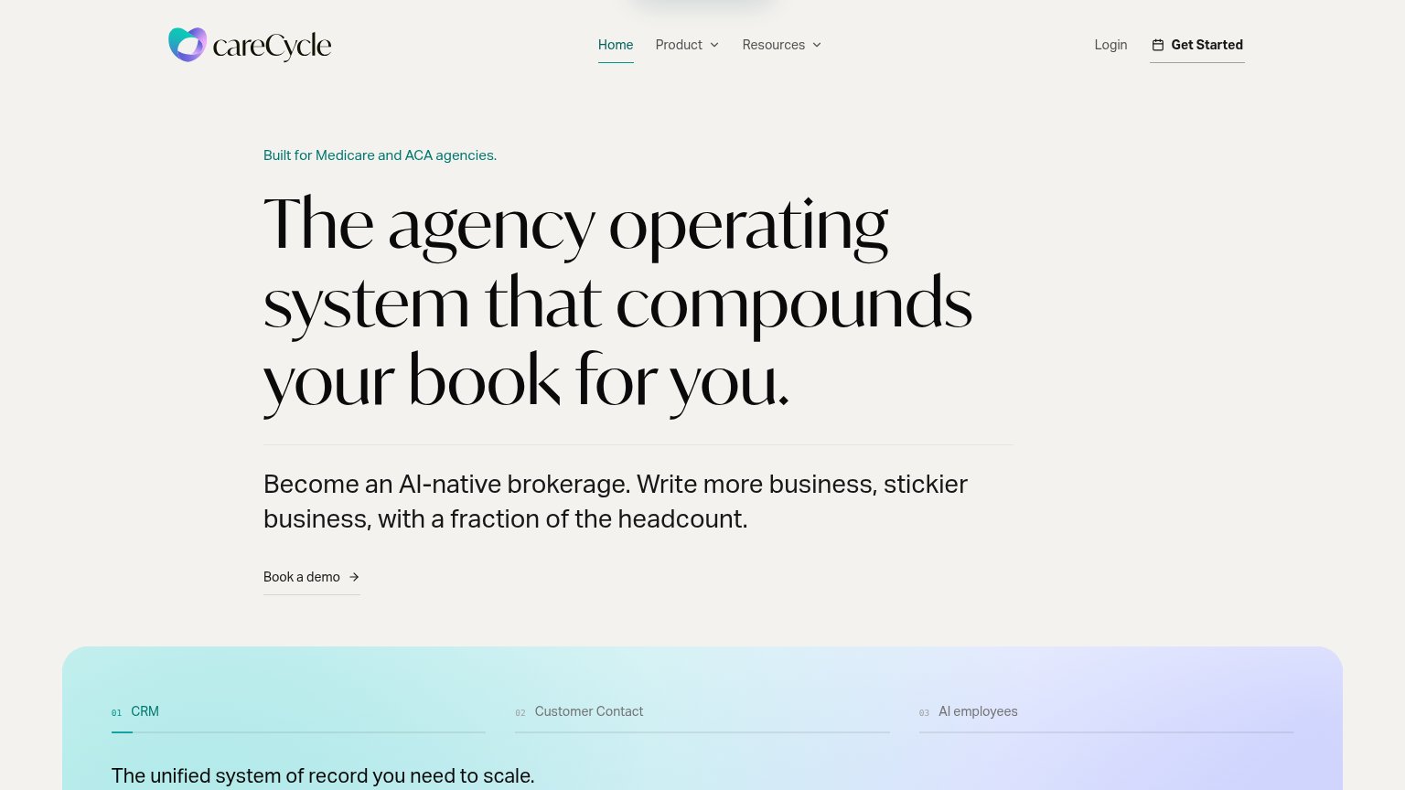
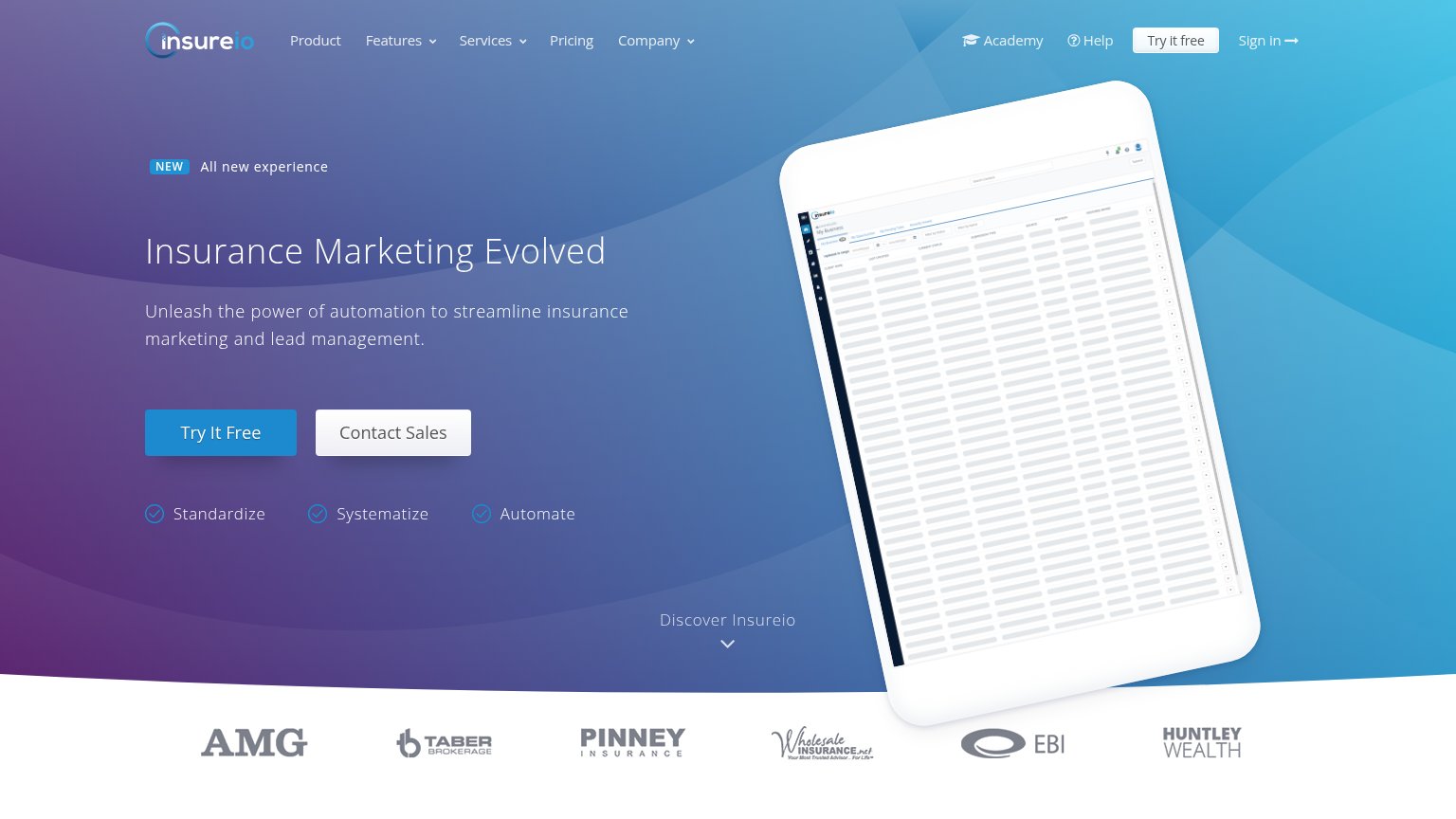
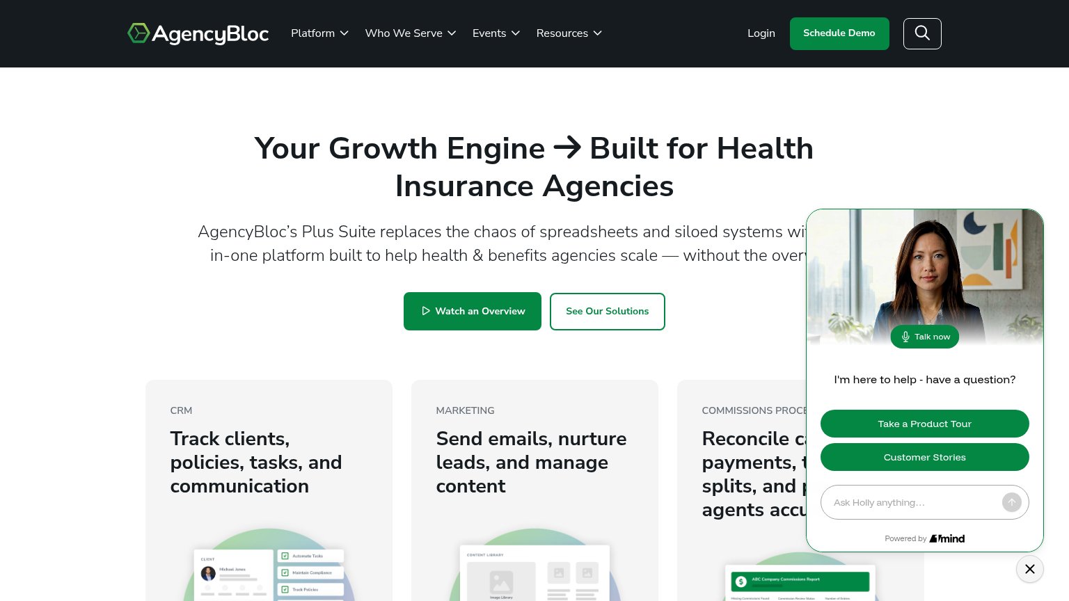
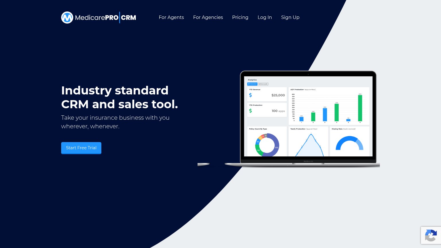
| Trust read | |
|---|---|
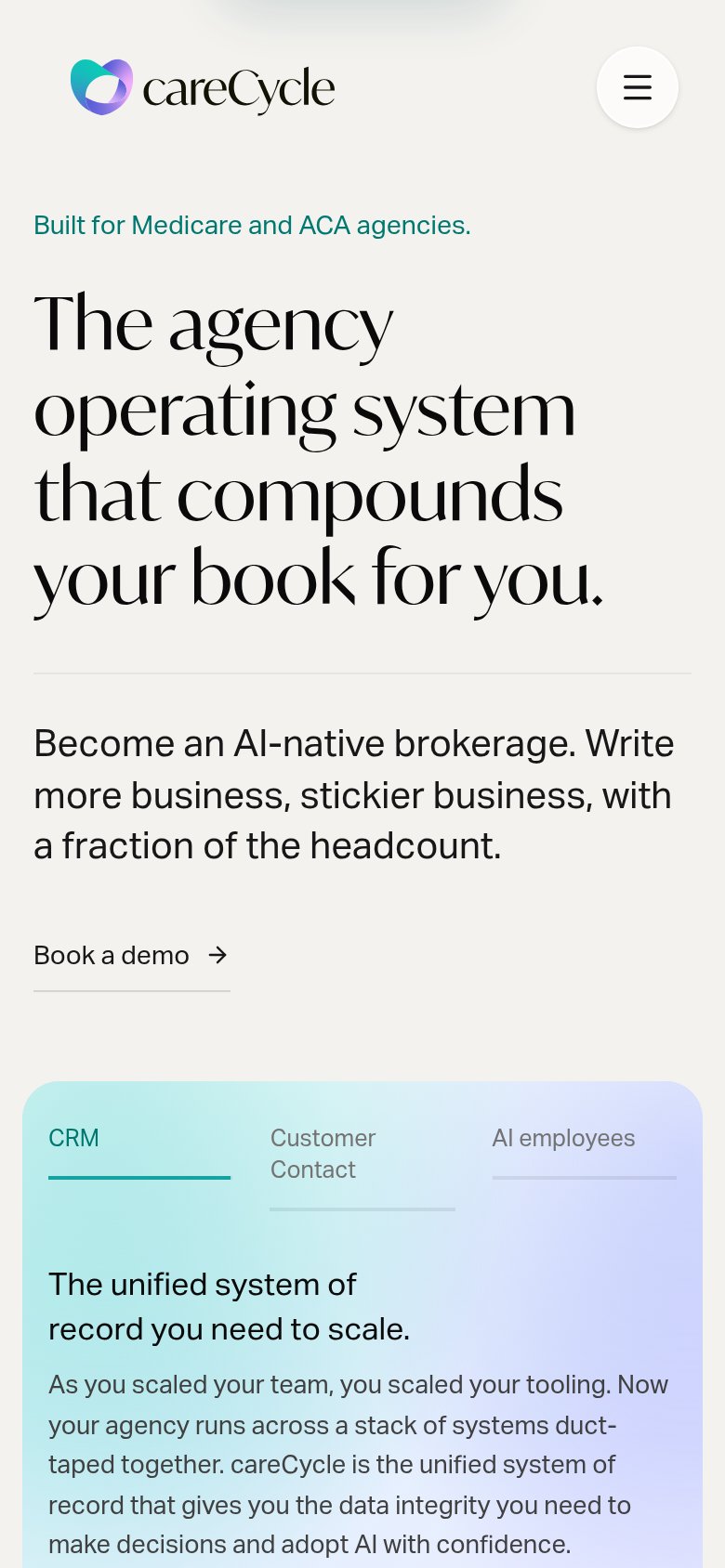
| careCycle | Tabbed feature module labeled "CRM / Customer Contact / AI employees" with "The unified system of record you need to sca |
| Product UI mockups in the capability cards (CRM client record, content library, "ABC Company Commissions Report") | |
| "For years, Radius has helped insurance agencies manage leads, communications, and sales" paired with AgencyBloc co-bran | |
| No visible trust signal identified. | |
| Laptop mockup showing the analytics dashboard UI ("YTD Revenue $25,000", "AEP Production", "Closing Rate") | |
| Customer logo strip: AMG, Taber Brokerage, Pinney Insurance, Wholesale Insurance, EBI, Huntley Wealth |
CTA
58FairCopy, size, verb, cost-feel — does the primary CTA earn the click?
Problems
- styled as text link, not button
- demo click feels costly/committal
- competes with nav 'Get Started'
- less visual weight than nav CTA
Mobile web
66FairThe phone experience as a first-class citizen.
What works
What to improve
Information hierarchy
72FairDoes the design help or inhibit what the page is trying to say?
What works
What to improve
Value props
72FairTitle, subtitle, hero — do they sell the product's true value?
careCycle’s headline
The agency operating system that compounds your book for you.
Become an AI-native brokerage. Write more business, stickier business, with a fraction of the headcount.
Working
Could improve