
Your landing page’s weakest score is CTA.
How Radiant ranks
CTA
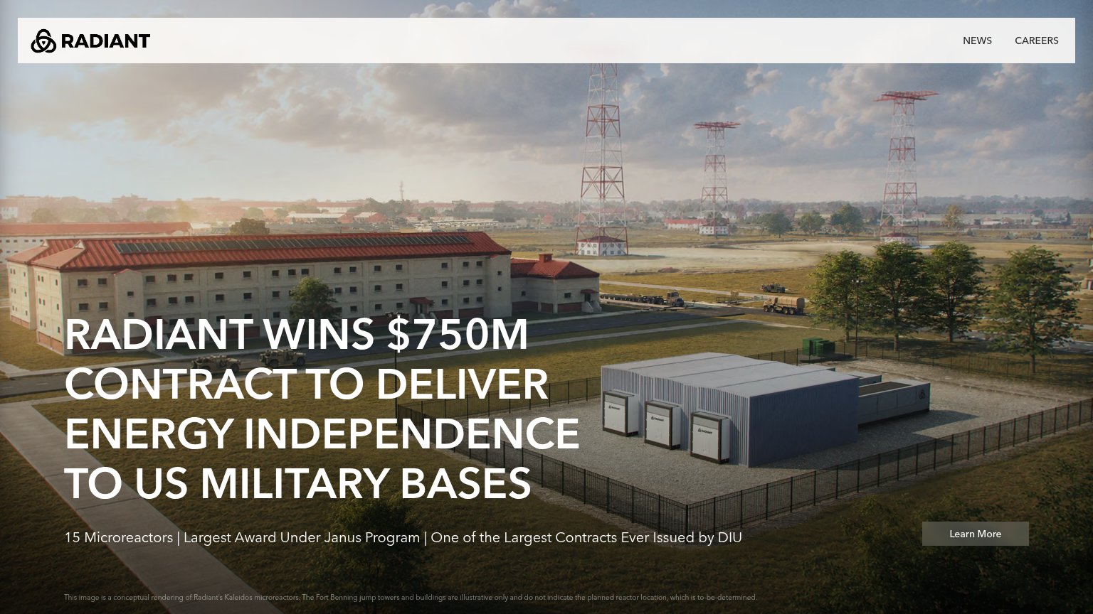
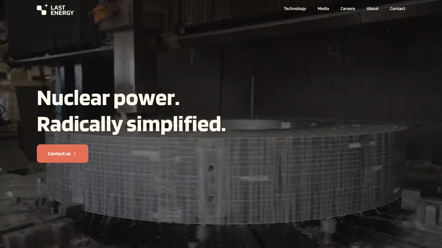
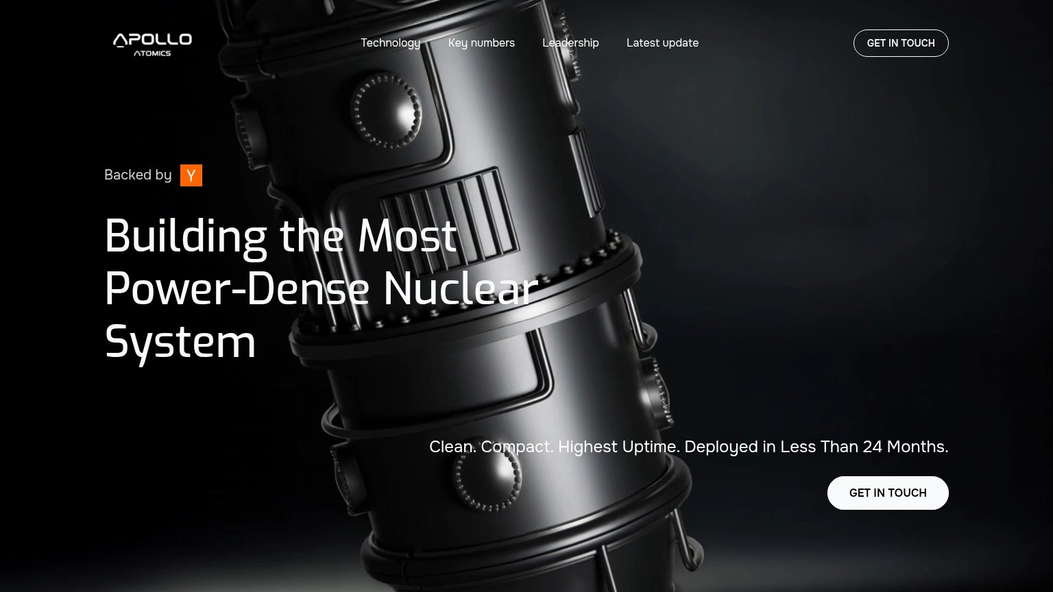
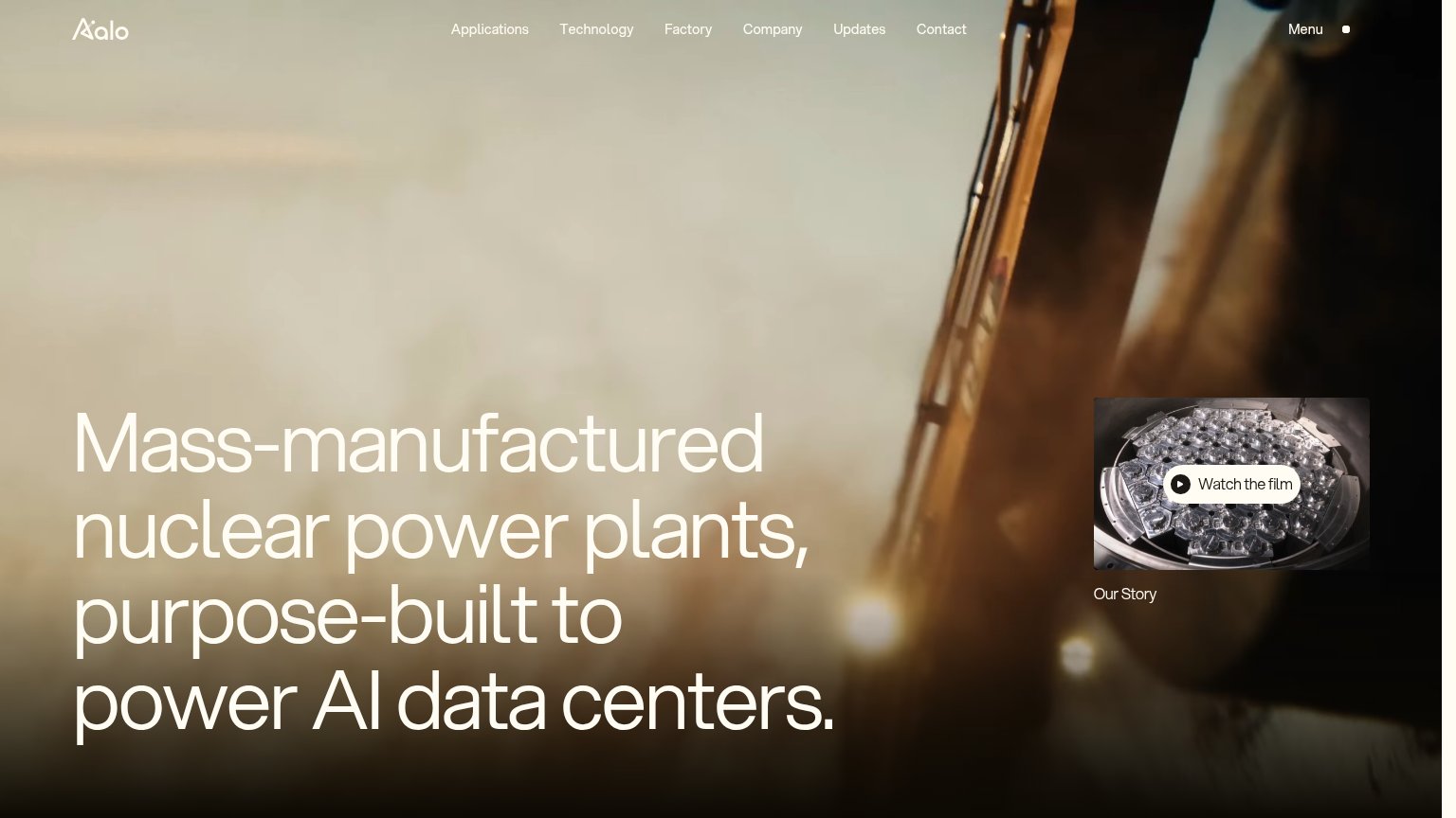
55FairCopy, size, verb, cost-feel — does the primary CTA earn the click?
Problems
- generic 'Learn More' label
- low-contrast, recessive styling
- small footprint vs headline
- no payoff or headline echo
Mobile web
64FairThe phone experience as a first-class citizen.
 1234
- Learn More button — Sits in the bottom quarter of the fold with desktop proportions and low contrast against the dark photo instead of a full-width, high-contrast tap target.
- Six-line hero headline — The desktop headline barely scales down, wrapping into six all-caps lines that push the CTA to the fold's edge.
- News/Careers link row — Desktop text links are kept inline instead of collapsing to a hamburger, crowding the header on a phone width.
- Disclaimer fine print — Three lines of low-contrast legal copy crowd the bottom of the fold right under the CTA.
Trust
72FairProof that the product is real, competent, and safe to try.
How Radiant compares
Trust read
Information hierarchy
78FairDoes the design help or inhibit what the page is trying to say?
What works
What to improve
Value props
86StrongTitle, subtitle, hero — do they sell the product's true value?
Radiant’s headline
RADIANT WINS $750M CONTRACT TO DELIVER ENERGY INDEPENDENCE TO US MILITARY BASES
15 Microreactors | Largest Award Under Janus Program | One of the Largest Contracts Ever Issued by DIU
Working
Could improve