
Your landing page’s weakest score is Mobile web.
How PocketGuard ranks
Mobile web
68FairThe phone experience as a first-class citizen.
 1234
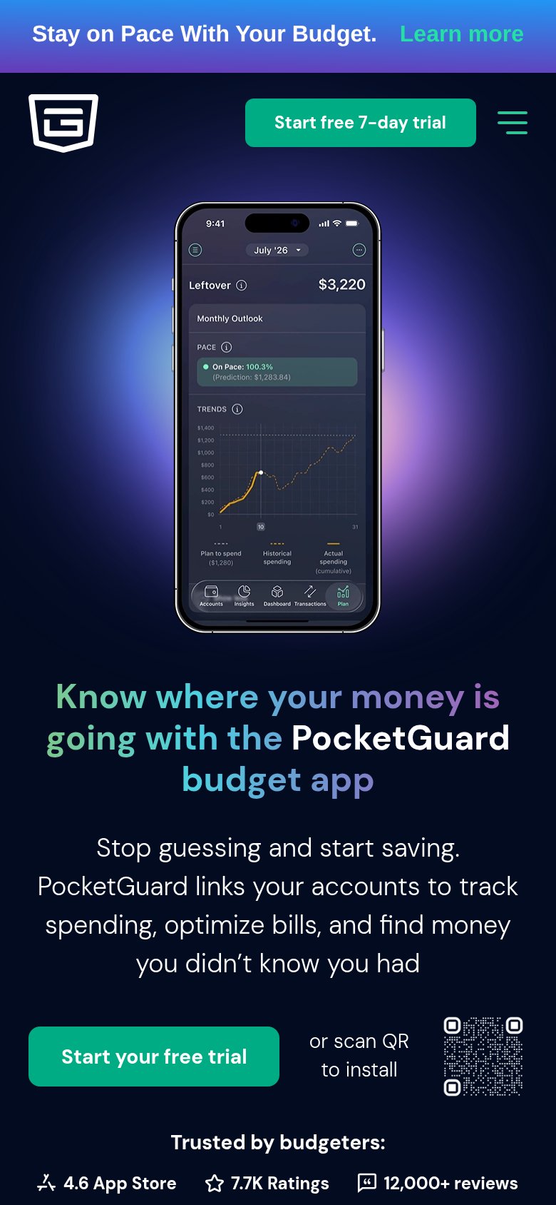
- Oversized phone mockup — Eats the top of the fold and pushes the headline and primary CTA below the first viewport.
- QR code beside CTA — Useless on a phone the visitor is already holding and shrinks the trial button to half-width.
- Promo banner strip — "Stay on Pace With PocketGuard's Budget" adds a competing message and Learn more link above the header.
- Half-width trial button — "Start PocketGuard's free trial" sits at partial width instead of a full-bleed thumb-friendly bar.
Trust
70FairProof that the product is real, competent, and safe to try.
| Trust read | |
|---|---|
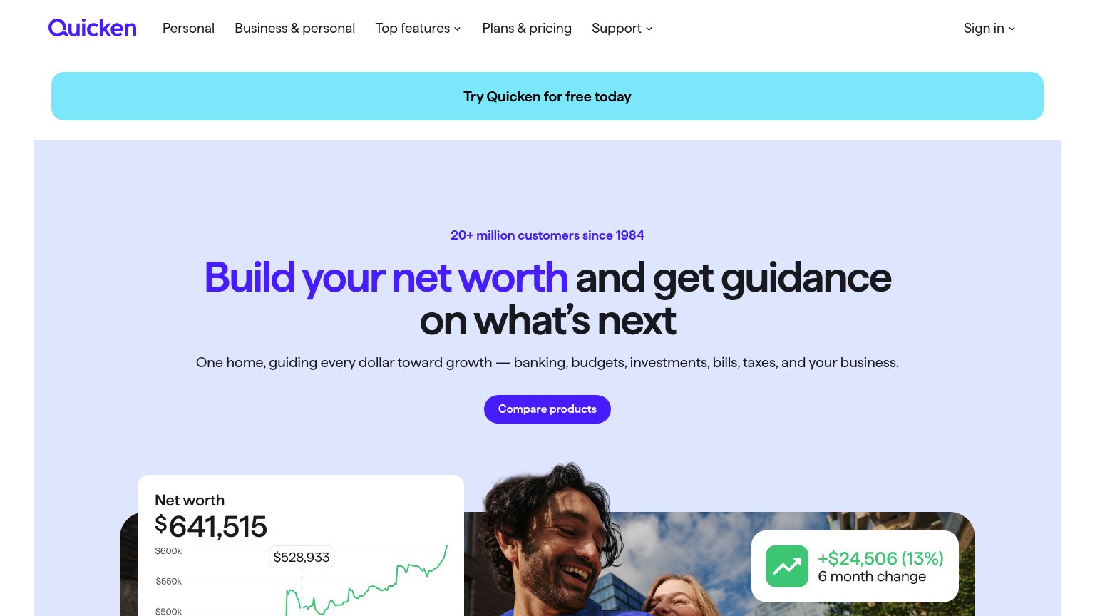
| PocketGuard | "Trusted by budgeters: 4.6 App Store · 7.7K Ratings · 12,000+ reviews" strip on the mobile fold |
| implicit context monarch.com may benefit from pre-existing familiarity among its target audience. | |
| YNAB has a New York Times Bestselling book! Order it today. | |
| "Apple Design Awards Finalist" laurel badge (mobile fold) | |
| 20+ million customers since 1984 | |
| IRA rollover graphic showing 401(k), 403(b), 457(b) chips with the "Let's get all your savings in one view" callout |
Information hierarchy
74FairDoes the design help or inhibit what the page is trying to say?
What works
What to improve
CTA
76FairCopy, size, verb, cost-feel — does the primary CTA earn the click?
How PocketGuard compares
Recommended rewrites
Value props
76FairTitle, subtitle, hero — do they sell the product's true value?
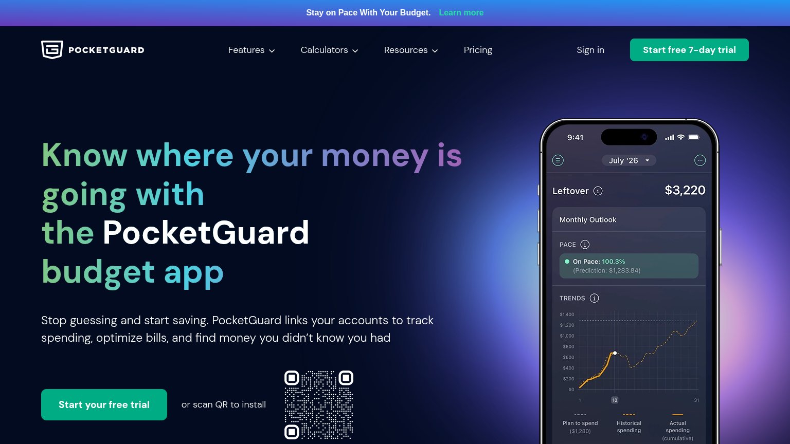
PocketGuard’s headline
Know where your money is going with the PocketGuard budget app
Stop guessing and start saving. PocketGuard links your accounts to track spending, optimize bills, and find money you didn't know you had
Working
Could improve