
Your landing page’s weakest score is Trust.
How pVerify ranks
Trust
38PoorProof that the product is real, competent, and safe to try.
| Trust read | |
|---|---|
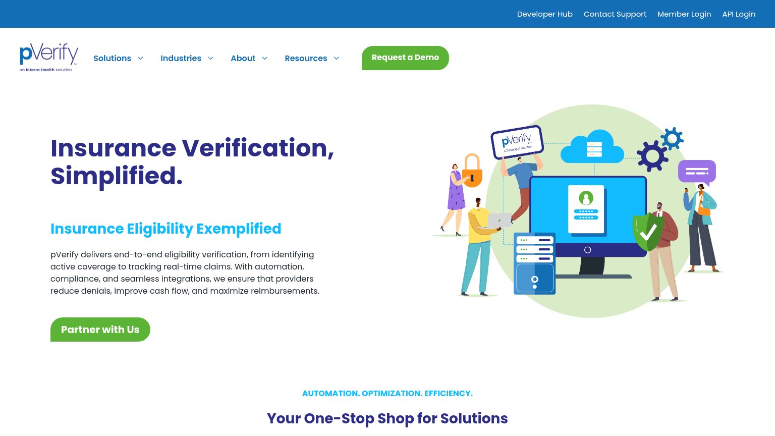
| pVerify | "an Interra Health solution" parent-brand tagline under the pVerify logo |
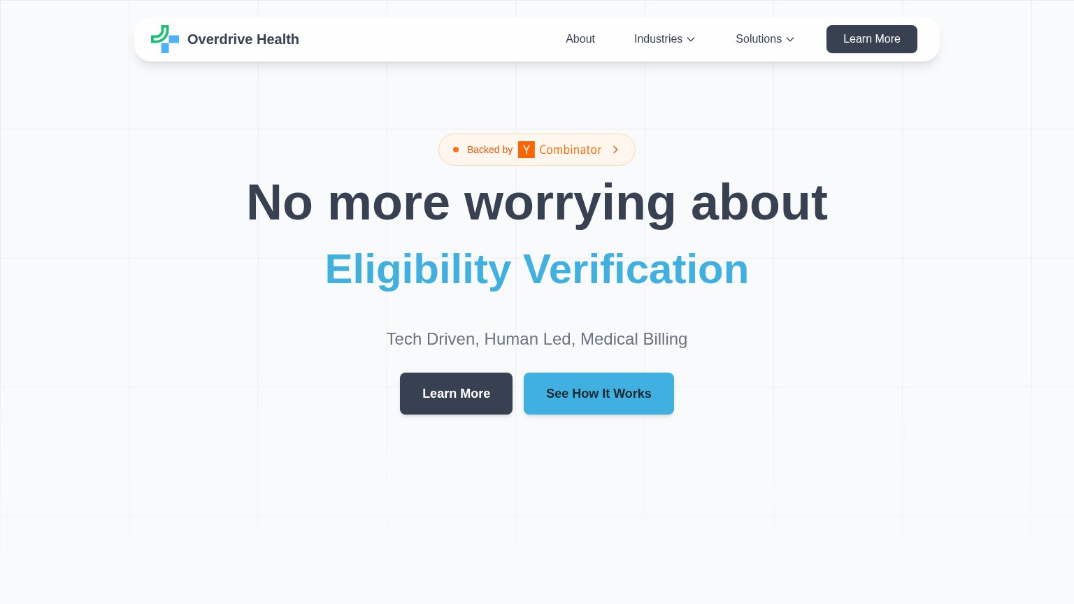
| "Backed by Y Combinator" badge above the headline | |
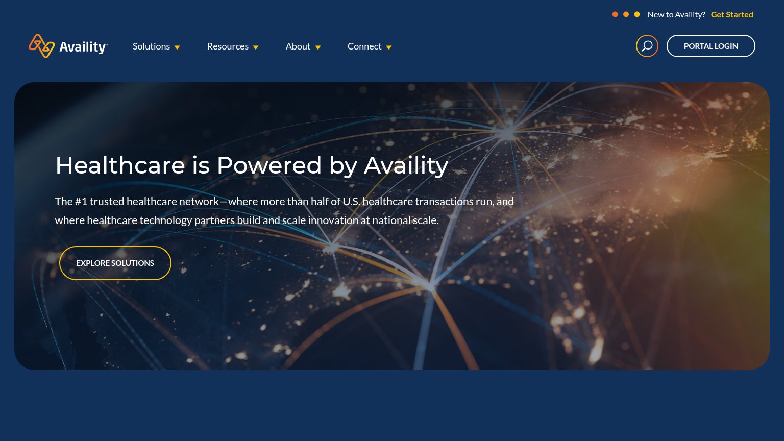
| "The #1 trusted healthcare network—where more than half of U.S. healthcare transactions run" | |
| implicit context Waystar may benefit from pre-existing familiarity among its target audience. | |
| No visible trust signal identified. | |
| No visible trust signal identified. |
Mobile web
58FairThe phone experience as a first-class citizen.
 1234
- Duplicate hamburger menu — A second hamburger appears below the logo, duplicating the header's menu and wasting fold space.
- Oversized logo block — The centered logo eats a large slice of the first viewport, pushing the headline and CTA down.
- Nine-line body paragraph — Desktop-length prose buries the 'Partner with Us' button well below the fold.
- Three-line wrapping headline — The headline scales down too little and stacks into tall wrapped lines that dominate the screen.
CTA
62FairCopy, size, verb, cost-feel — does the primary CTA earn the click?
How pVerify compares
Recommended rewrites
Value props
66FairTitle, subtitle, hero — do they sell the product's true value?
pVerify’s headline
Insurance Verification, Simplified.
Insurance Eligibility Exemplified
Working
Could improve
Information hierarchy
68FairDoes the design help or inhibit what the page is trying to say?
What works
What to improve