
Your landing page’s weakest score is Mobile web.
How pulso.health ranks
- 1.
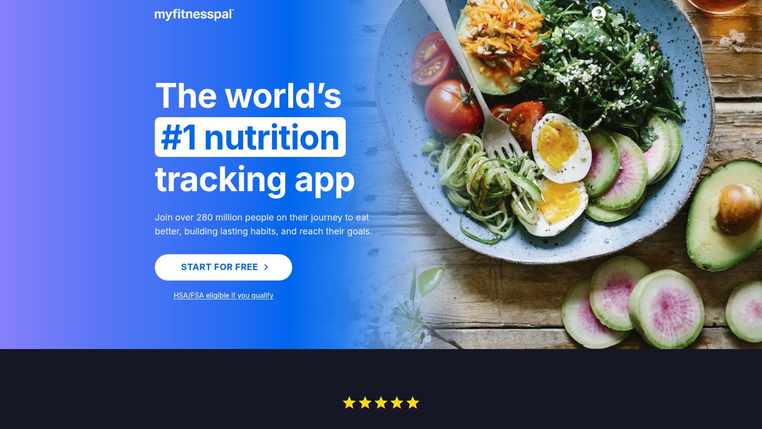
MyFitnessPal82
- 2.
pulso.health78
- 3.
Yazio73
- 4.
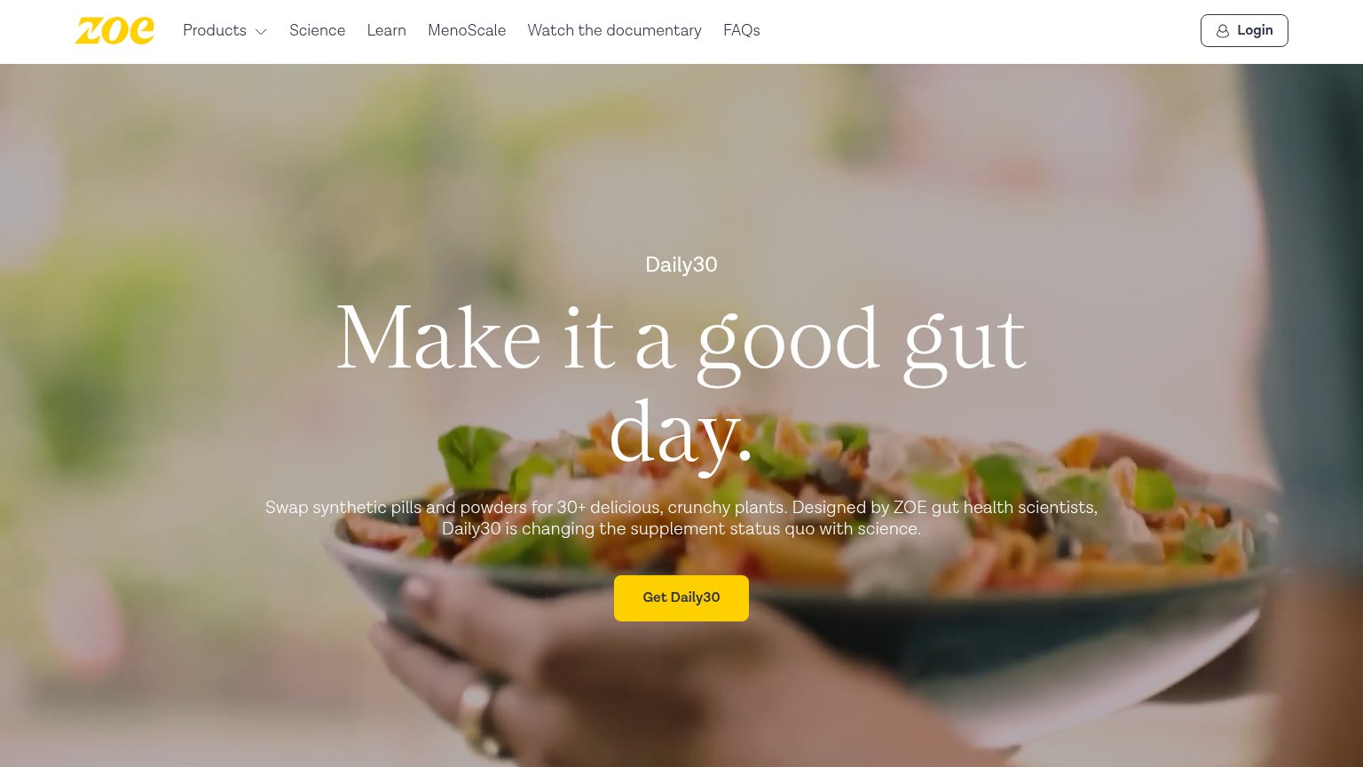
ZOE72
- 5.
Lifesum70
- 6.
MyRealFood60
Mobile web
68FairThe phone experience as a first-class citizen.
 123
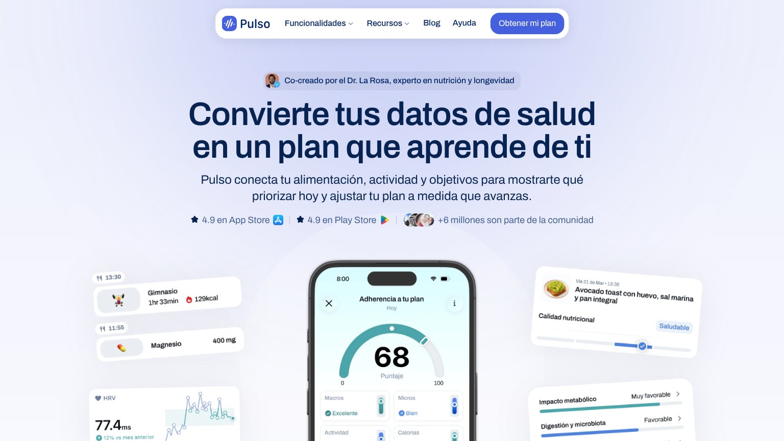
- Oversized hero headline — Desktop-scale type wraps into five lines, consuming a third of the fold before the subhead.
- Compact header CTA — "Obtener mi plan" is a small pill in the header, not a thumb-friendly full-width button, and never repeats in the hero.
- Stacked proof badges — App Store, Play Store, and community avatars pile into three rows, crowding the space between subhead and demo.
CTA
76FairCopy, size, verb, cost-feel — does the primary CTA earn the click?
Problems
- no hero-level CTA, nav-only
- no zero-commitment signal
- 'obtener' feels like a process
Information hierarchy
82StrongDoes the design help or inhibit what the page is trying to say?
What works
What to improve
Value props
82StrongTitle, subtitle, hero — do they sell the product's true value?
pulso.health’s headline
Convierte tus datos de salud en un plan que aprende de ti
Pulso conecta tu alimentación, actividad y objetivos para mostrarte qué priorizar hoy y ajustar tu plan a medida que avanzas.
Working
Could improve
Trust
82StrongProof that the product is real, competent, and safe to try.
How pulso.health compares
Trust read