
Your landing page’s weakest score is Information hierarchy.
How Prolific ranks
72Growth scoreupdated
category scores
category scoresShowHide
Information hierarchy
64FairDoes the design help or inhibit what the page is trying to say?
 12
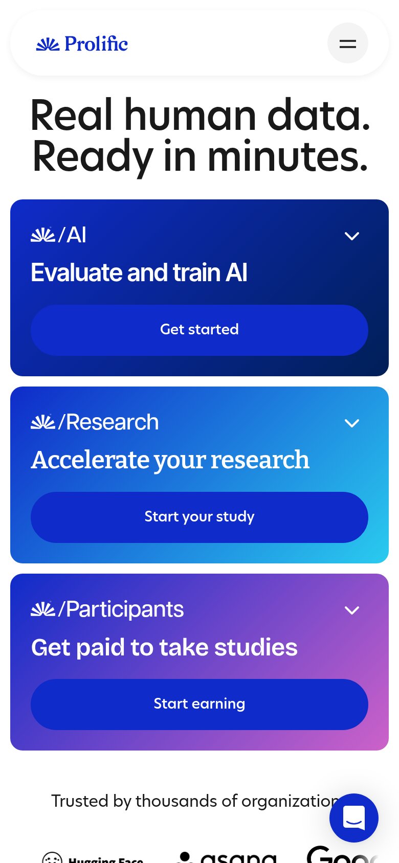
- Three equal-weight CTAs — "Get started", "Start Prolific's study", and "Start earning" share identical styling, so no single primary action wins the one-second scan.
- Header button cluster — Three same-size header buttons ("Get paid to participate", "Get started for free", "Sign in") duplicate the panel CTAs and add exits before the fold's argument lands.
Trust
68FairProof that the product is real, competent, and safe to try.
| Trust read | |
|---|---|
| Prolific | implicit context Prolific may benefit from pre-existing familiarity among its target audience. |
| "Backed By Y Combinator" badge in the mobile capture | |
| "New Frontier data and RL environments, off the shelf" announcement banner | |
| implicit context Scale AI may benefit from pre-existing familiarity among its target audience. | |
| implicit context Mercor may benefit from pre-existing familiarity among its target audience. | |
| "Continue with Google" OAuth button with Google logo |
CTA
72FairCopy, size, verb, cost-feel — does the primary CTA earn the click?
How Prolific compares
Recommended rewrites
Value props
76FairTitle, subtitle, hero — do they sell the product's true value?
Prolific’s headline
Real human data. Ready in minutes.
Working
Could improve
Mobile web
78FairThe phone experience as a first-class citizen.
What works
What to improve