
Your landing page’s weakest score is Trust.
How Prized ranks
Trust
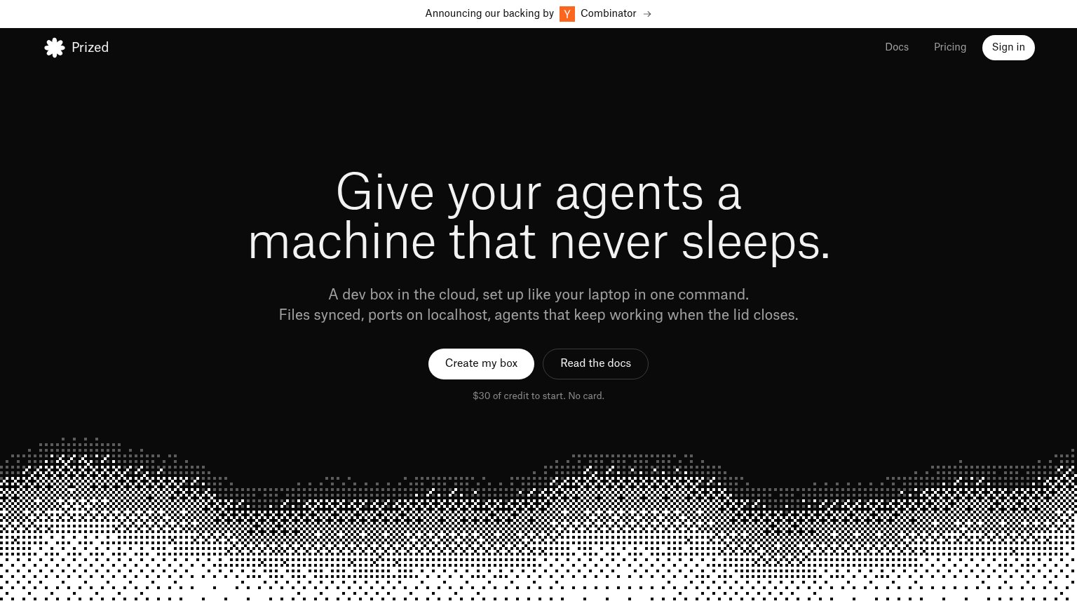
54FairProof that the product is real, competent, and safe to try.
| Trust read | |
|---|---|
| Prized | "Announcing our backing by Y Combinator" banner |
| implicit context Gitpod (Ona) may benefit from pre-existing familiarity among its target audience. | |
| Code editor screenshot with tabs "game.ts", "characters.module.css", "bonus-level.ts" | |
| GitHub star count "127.5K" in the header | |
| No visible trust signal identified. | |
| implicit context E2B may benefit from pre-existing familiarity among its target audience. |
Mobile web
78FairThe phone experience as a first-class citizen.
 12
- Split CTA pair — "Create my box" and "Read the docs" share the row, leaving the primary CTA half-width instead of a full-bleed thumb target.
- Three-line headline — The hero headline wraps into three tall lines at near-desktop size, pushing the CTA pair toward the bottom of the first viewport.
CTA
82StrongCopy, size, verb, cost-feel — does the primary CTA earn the click?
How Prized compares
Recommended rewrites
Information hierarchy
84StrongDoes the design help or inhibit what the page is trying to say?
What works
What to improve
Value props
84StrongTitle, subtitle, hero — do they sell the product's true value?
Prized’s headline
Give your agents a machine that never sleeps.
A dev box in the cloud, set up like your laptop in one command. Files synced, ports on localhost, agents that keep working when the lid closes.
Working
Could improve