
Your landing page’s weakest score is Trust.
How Coder ranks
Trust
48PoorProof that the product is real, competent, and safe to try.
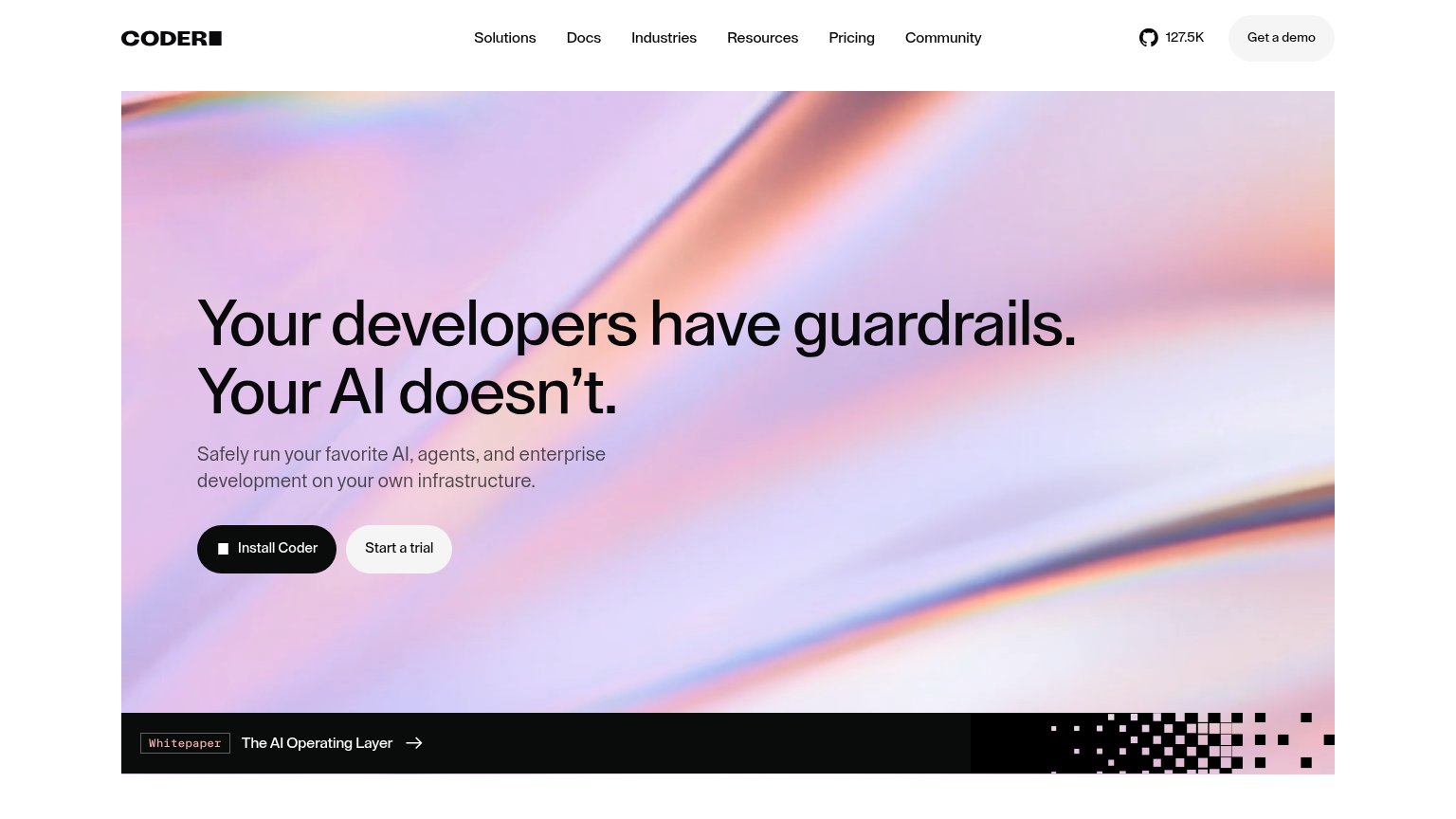
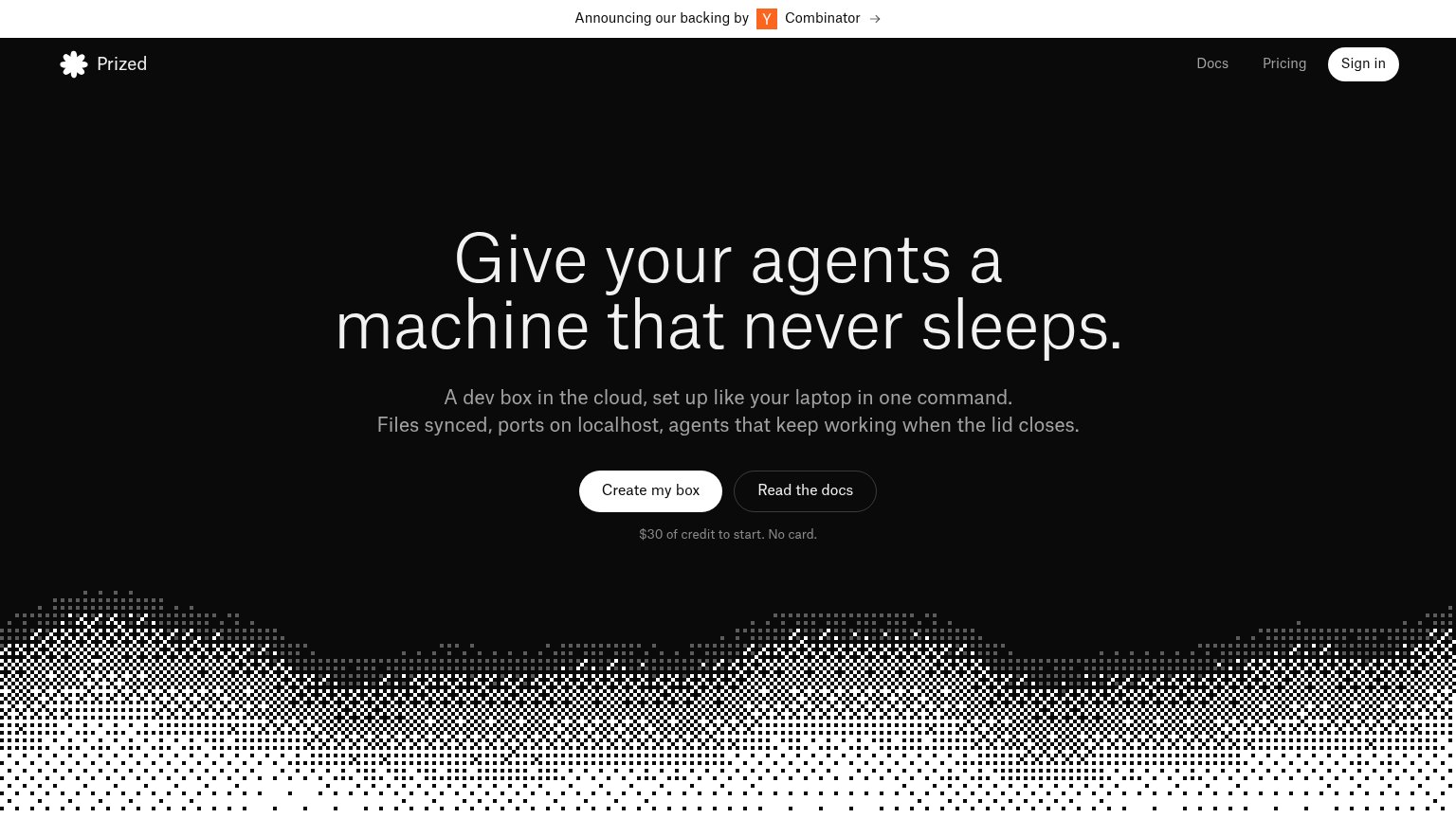
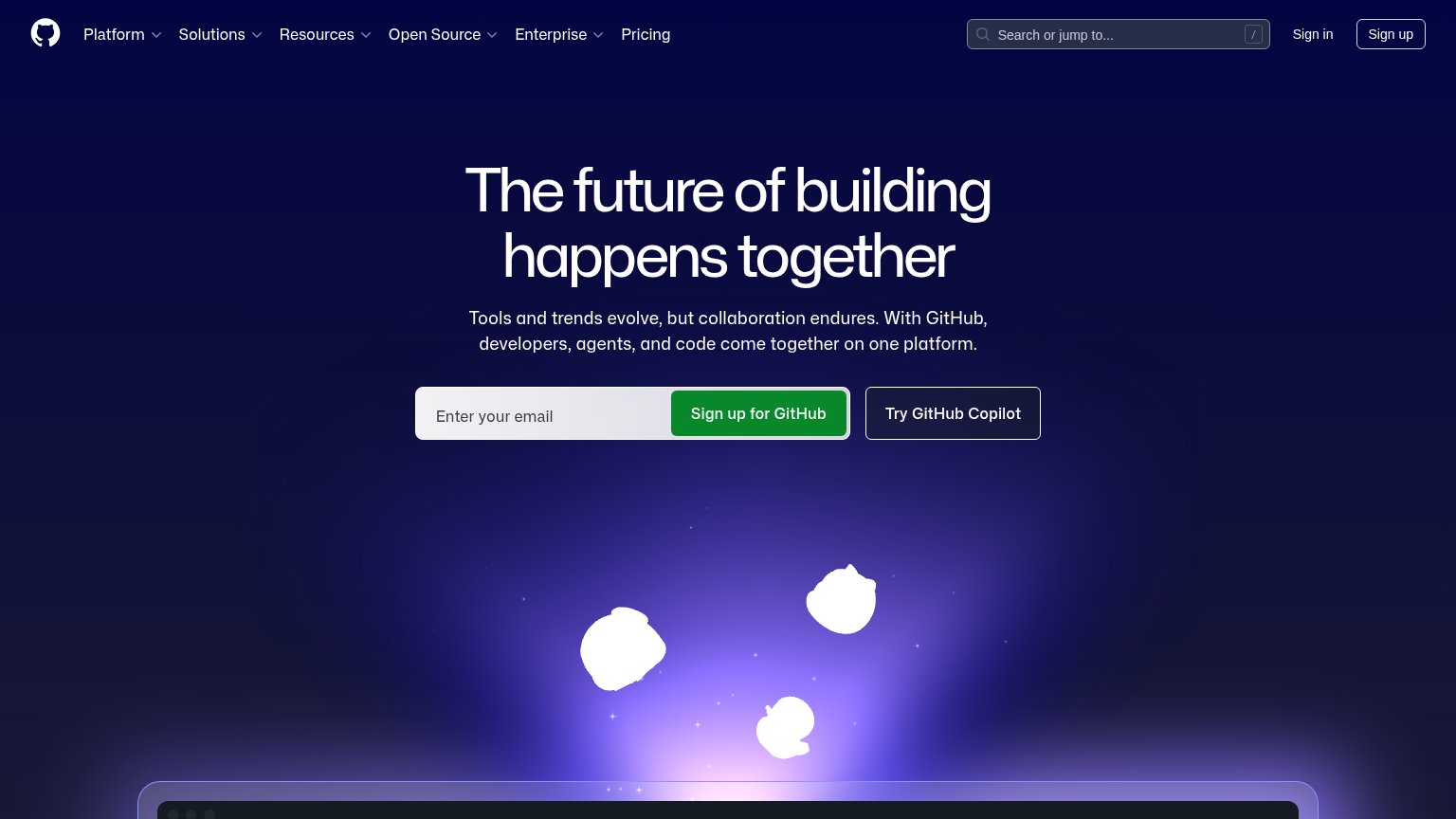
| Trust read | |
|---|---|
| Coder | GitHub star count "127.5K" in the header |
| "Announcing our backing by Y Combinator" banner | |
| implicit context Gitpod (Ona) may benefit from pre-existing familiarity among its target audience. | |
| Code editor screenshot with tabs "game.ts", "characters.module.css", "bonus-level.ts" | |
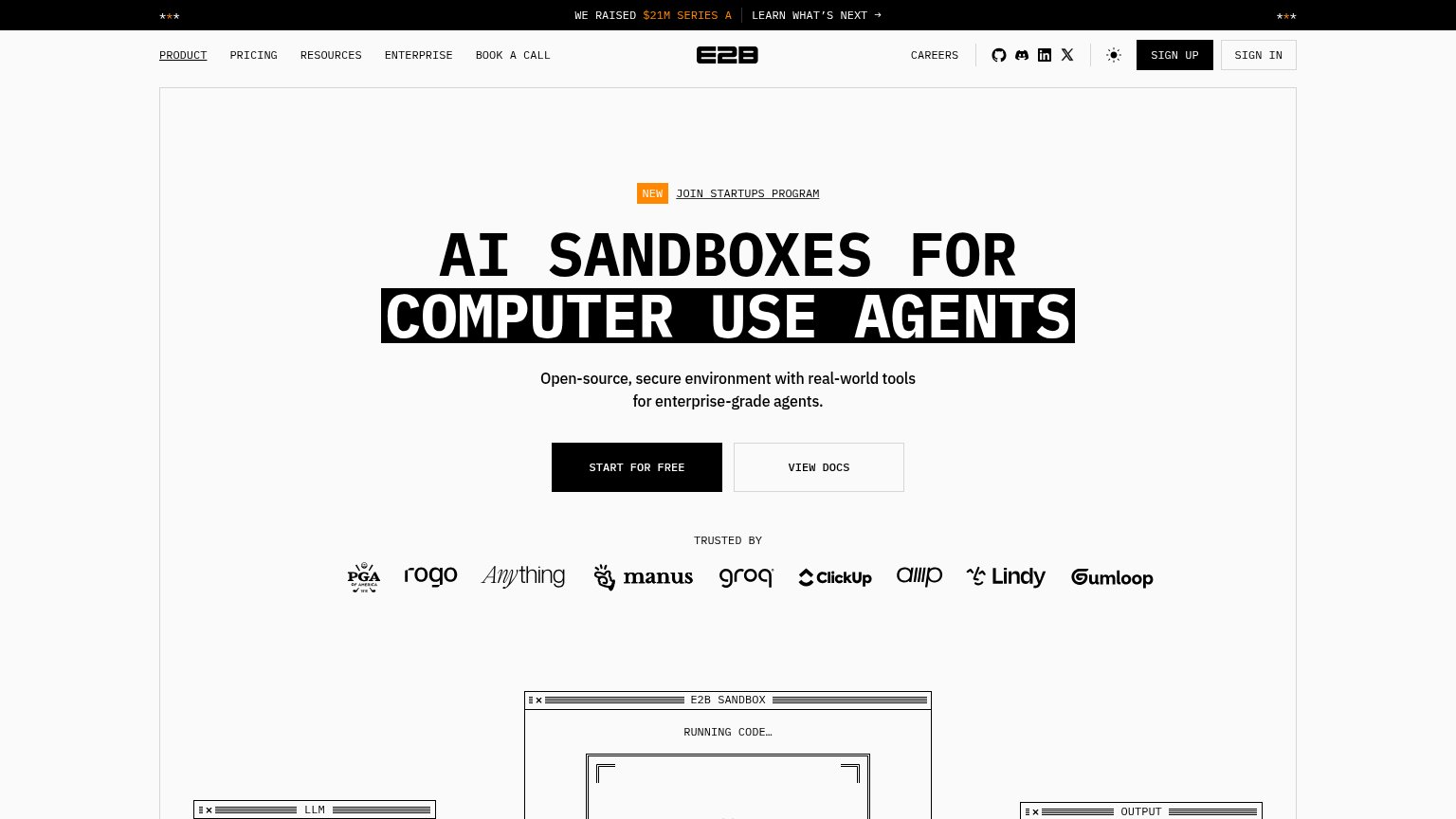
| No visible trust signal identified. | |
| implicit context E2B may benefit from pre-existing familiarity among its target audience. |
CTA
72FairCopy, size, verb, cost-feel — does the primary CTA earn the click?
Problems
- 'Install' feels like work, not value
- competes with 'Start a trial' + 'Get a demo'
- no payoff language in label
Information hierarchy
76FairDoes the design help or inhibit what the page is trying to say?
What works
What to improve
Value props
76FairTitle, subtitle, hero — do they sell the product's true value?
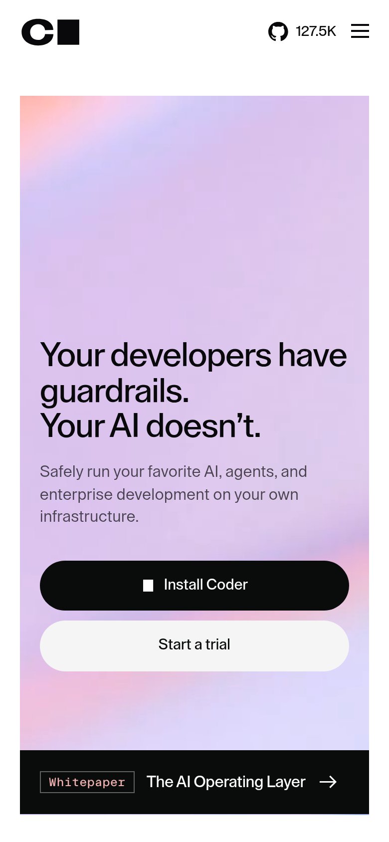
Coder’s headline
Your developers have guardrails. Your AI doesn't.
Safely run your favorite AI, agents, and enterprise development on your own infrastructure.
Working
Could improve
Mobile web
76FairThe phone experience as a first-class citizen.
What works
What to improve