
Your landing page’s weakest score is Trust.
How DevZero ranks
Trust
58FairProof that the product is real, competent, and safe to try.
| Trust read | |
|---|---|
| DevZero | No visible trust signal identified. |
| "Announcing our backing by Y Combinator" banner | |
| implicit context Gitpod (Ona) may benefit from pre-existing familiarity among its target audience. | |
| Code editor screenshot with tabs "game.ts", "characters.module.css", "bonus-level.ts" | |
| GitHub star count "127.5K" in the header | |
| implicit context E2B may benefit from pre-existing familiarity among its target audience. |
Mobile web
72FairThe phone experience as a first-class citizen.
 123
- Oversized hero headline — Barely-scaled desktop headline wraps into four huge lines, shoving the CTA to the fold's bottom edge.
- Try it DevZero button — Desktop-width button floats at half the column instead of a thumb-friendly full-bleed bar.
- Clipped scan caption — "Scans DevZero's cluster locally" reassurance line is cut off mid-sentence at the viewport edge.
Information hierarchy
76FairDoes the design help or inhibit what the page is trying to say?
What works
What to improve
Value props
78FairTitle, subtitle, hero — do they sell the product's true value?
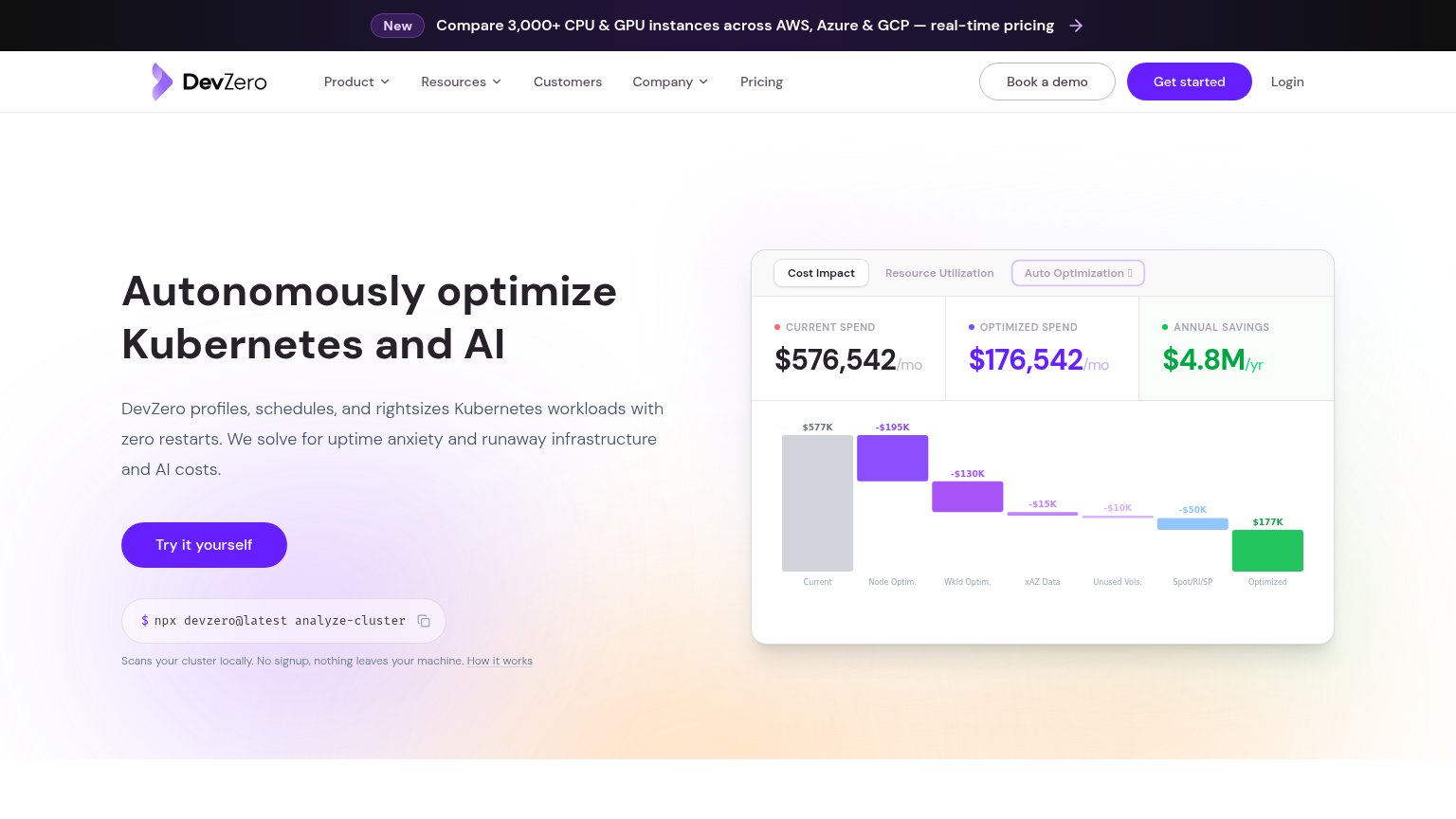
DevZero’s headline
Autonomously optimize Kubernetes and AI
DevZero profiles, schedules, and rightsizes Kubernetes workloads with zero restarts. We solve for uptime anxiety and runaway infrastructure and AI costs.
Working
Could improve
CTA
80StrongCopy, size, verb, cost-feel — does the primary CTA earn the click?
How DevZero compares
Recommended rewrites