
Your landing page’s weakest score is Information hierarchy.
How Axiom ranks
69Growth scoreupdated
category scores
category scoresShowHide
Information hierarchy
62FairDoes the design help or inhibit what the page is trying to say?
 1234
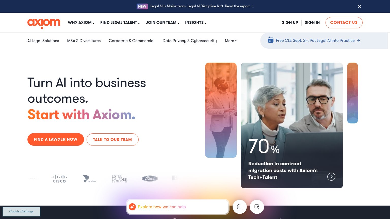
- Dual top nav rows — Two stacked navigation bars with 13+ links dilute attention before the headline registers.
- CLE webinar banner — The blue 'Free CLE Sept. 24' promo sits in the hero scan path and competes with the primary CTA as a third call to action.
- Chat and widget cluster — The 'Explore how we can help' bubble plus calendar and form icons stack three more competing actions at the bottom of the fold.
- Cookies Settings button — A visually broken, half-styled cookie control floats over the hero corner and reads as a rendering error.
Value props
62FairTitle, subtitle, hero — do they sell the product's true value?
Axiom’s headline vague
Turn AI into business outcomes. Start with Axiom.
Working
- 70% cost-reduction stat card in the fold
- Blue-chip logos (Cisco, Ford, Estée Lauder)
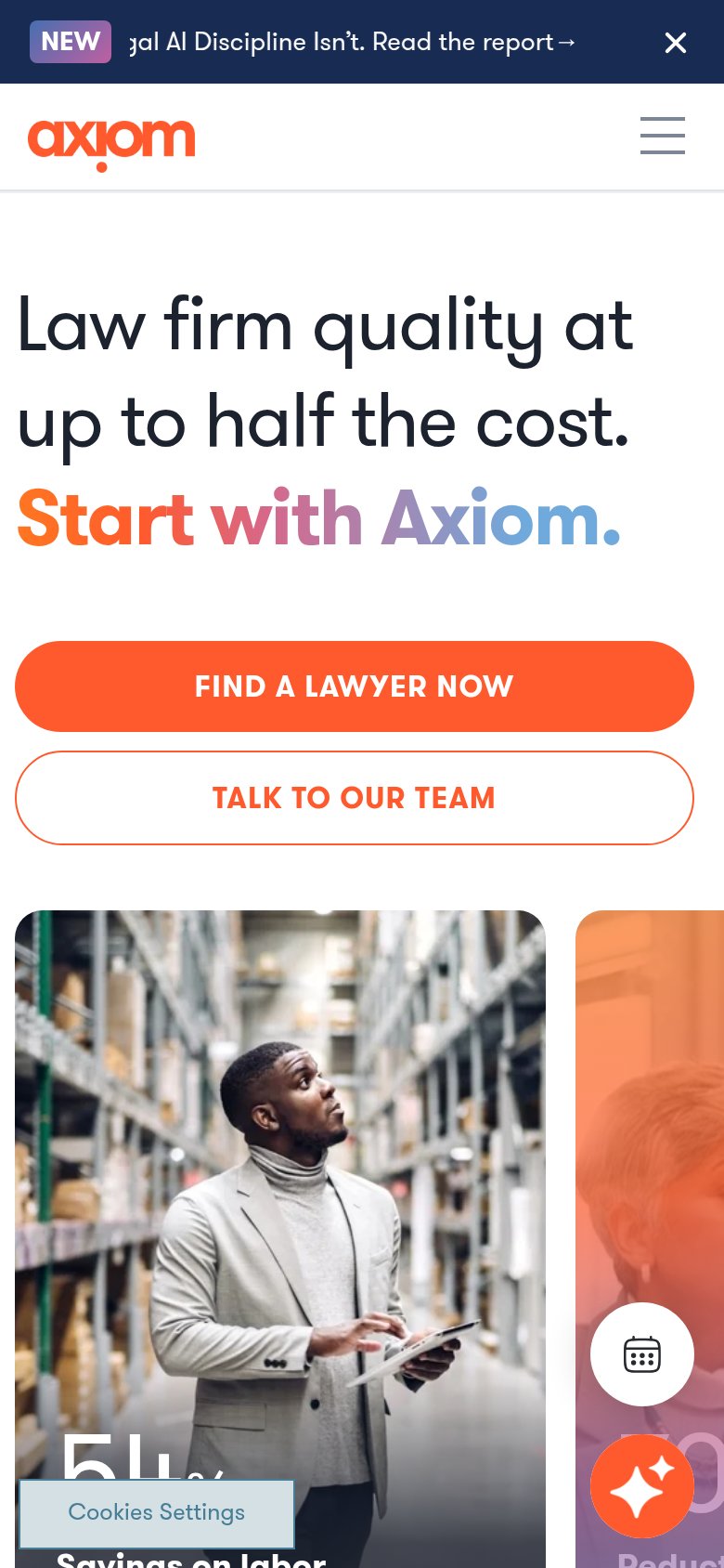
- Mobile variant names real value: half the cost
Could improve
- Desktop H1 never says legal talent
- "Business outcomes" is a generic abstraction
- No subhead to explain what Axiom does
Trust
68FairProof that the product is real, competent, and safe to try.
How Axiom compares
Trust read
Mobile web
76FairThe phone experience as a first-class citizen.
What works
What to improve
CTA
78FairCopy, size, verb, cost-feel — does the primary CTA earn the click?
How Axiom compares
Recommended rewrites