
Your landing page’s weakest score is Value props.
How PPPoker ranks
43Growth scoreupdated
category scores
category scoresShowHide
Value props
28PoorTitle, subtitle, hero — do they sell the product's true value?
Working
- Gaming Labs Certified badge builds trust
- App store badges make next step obvious
Could improve
- No headline or value statement at all
- Hero image decorates, shows no product
- Cookie banner buries the desktop fold
Information hierarchy
34PoorDoes the design help or inhibit what the page is trying to say?
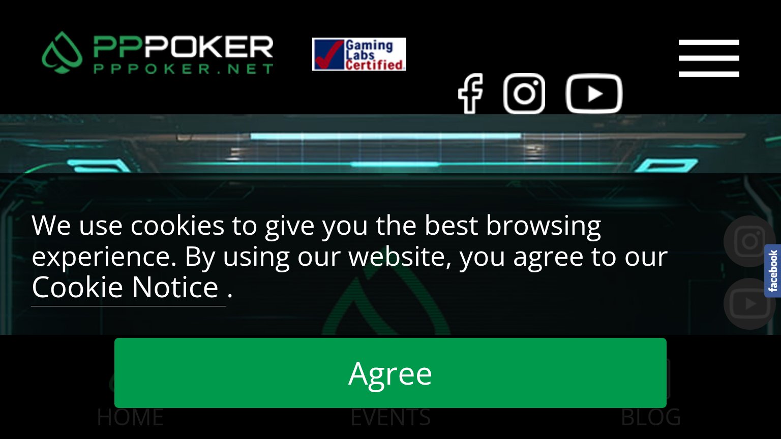 1234
- Cookie consent banner — Consumes the entire fold, hiding the hero, headline, and download CTAs behind an 'Agree' click.
- Green Agree button — The only button styled with primary weight is the cookie consent, not a conversion action.
- Header social icons — Facebook, Instagram, and YouTube exits sit at prime scan position before any value prop or CTA appears.
- Bottom nav row — HOME/EVENTS/BLOG links creep into the fold half-obscured by the banner, adding exits with zero clarity.
CTA
48PoorCopy, size, verb, cost-feel — does the primary CTA earn the click?
How PPPoker compares
Recommended rewrites
Trust
48PoorProof that the product is real, competent, and safe to try.
How PPPoker compares
Trust read
Mobile web
58FairThe phone experience as a first-class citizen.
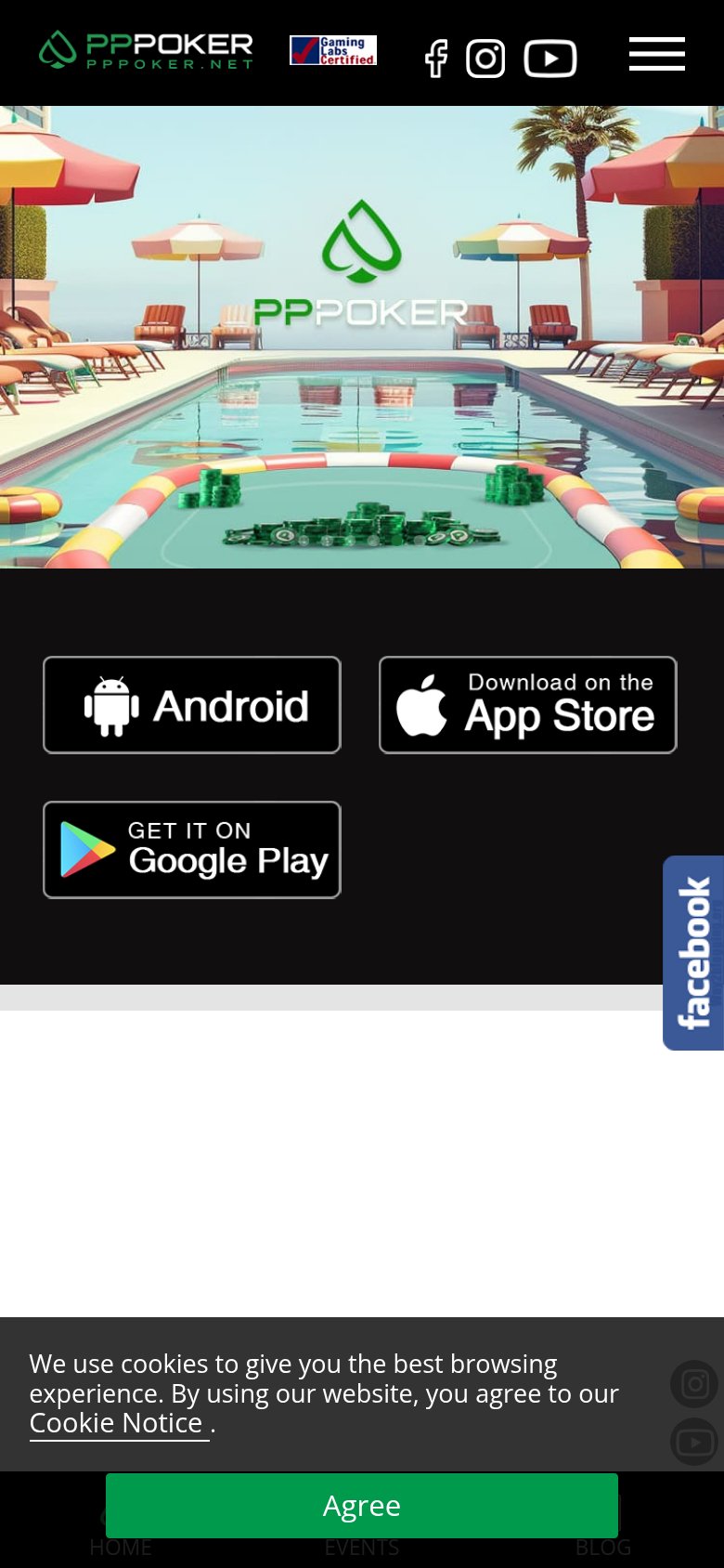
What works
What to improve