
Your landing page’s weakest score is Trust.
How PokerNow ranks
64Growth scoreupdated
category scores
category scoresShowHide
Trust
42PoorProof that the product is real, competent, and safe to try.
| Trust read | |
|---|---|
| PokerNow | No visible trust signal identified. |
| "Play on your browser. No downloads required." subheadline | |
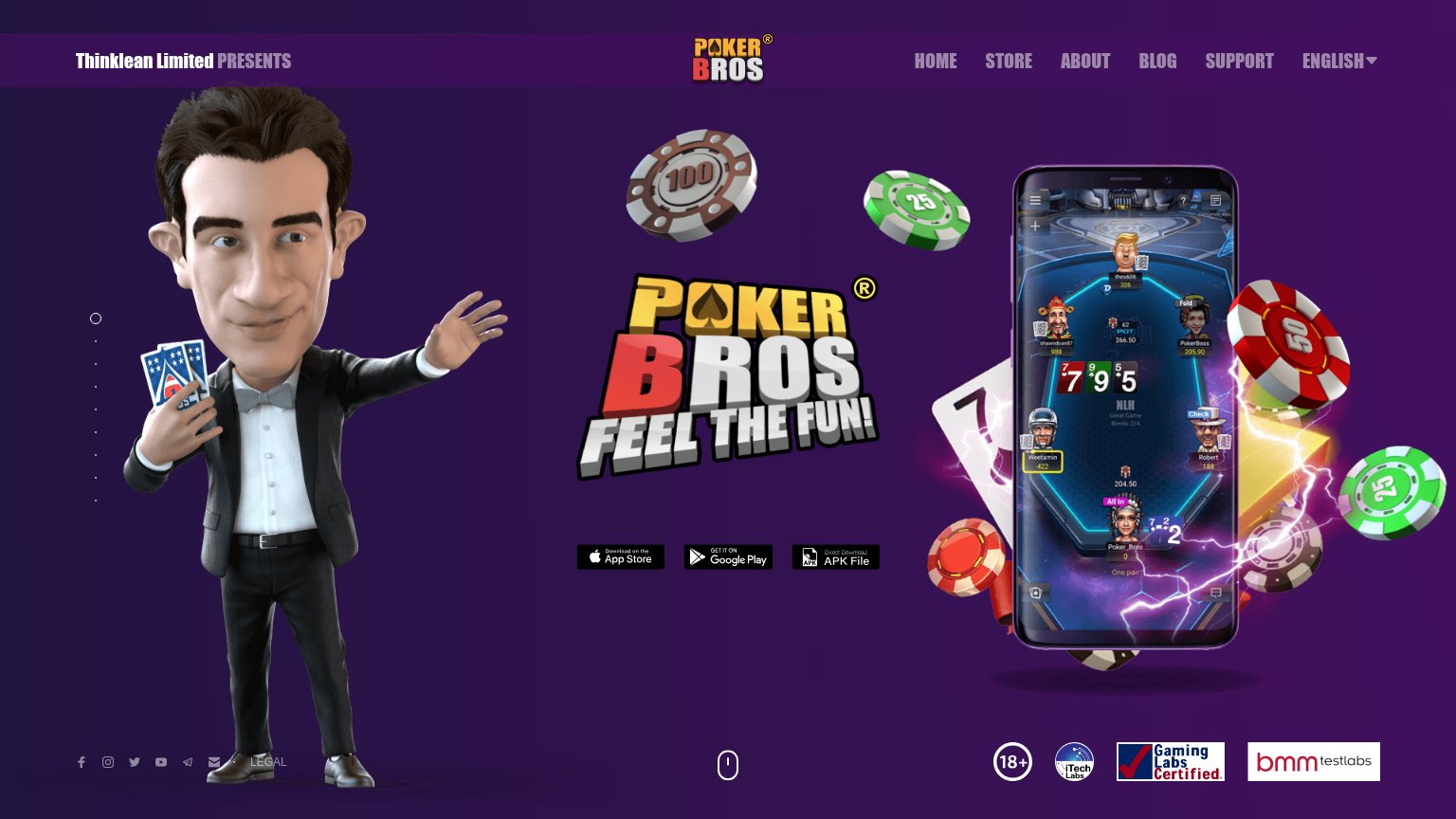
| "Gaming Labs Certified" badge alongside BMM Testlabs and iTech Labs certification logos in the footer | |
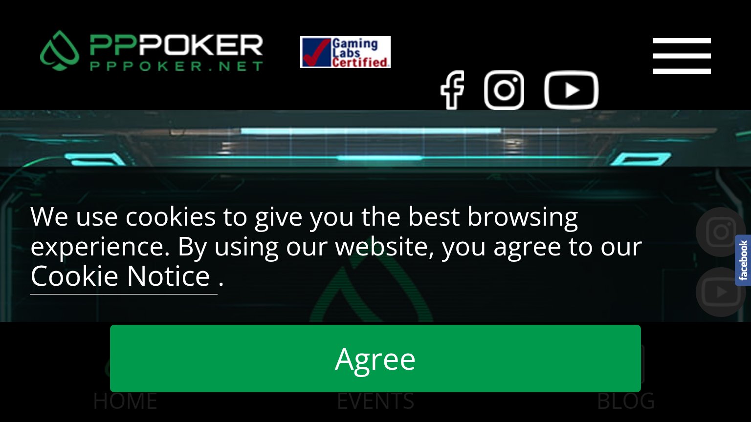
| "Gaming Labs Certified" badge in the header | |
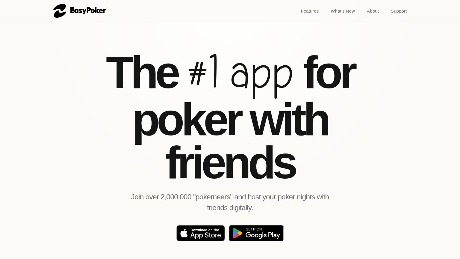
| Join over 2,000,000 "pokerneers" and host your poker nights with friends digitally. | |
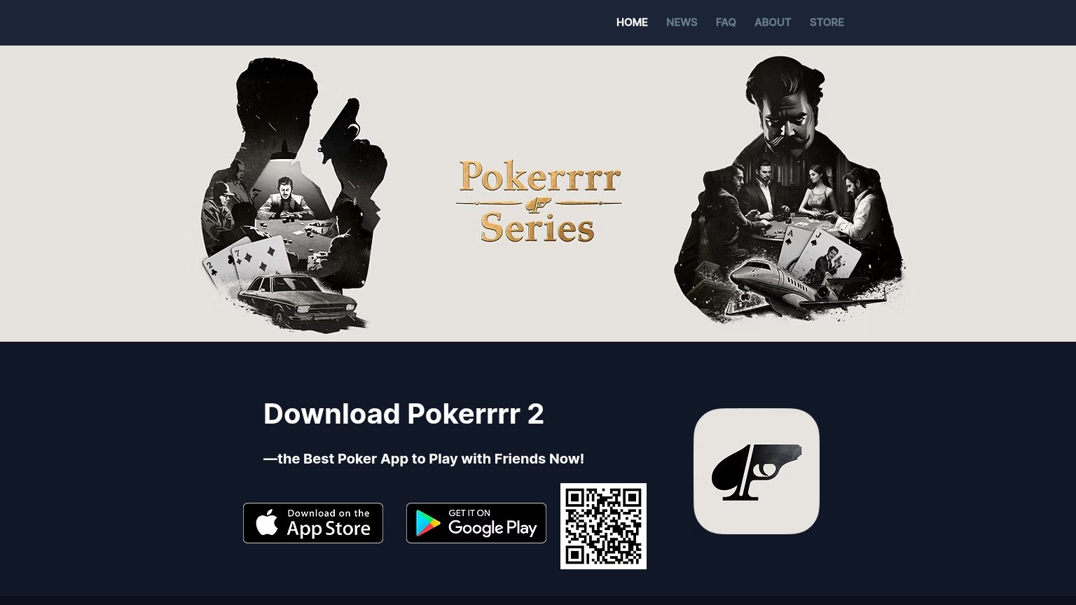
| App Store and Google Play download badges next to the "Download Pokerrrr 2" CTA |
Information hierarchy
62FairDoes the design help or inhibit what the page is trying to say?
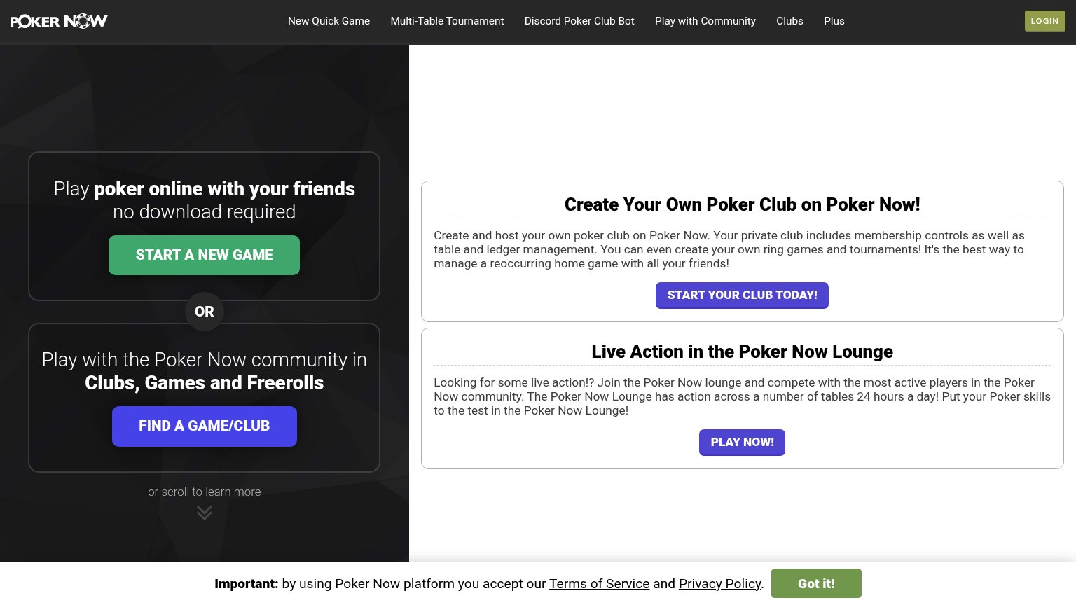 123
- Right panel CTAs — "START PokerNow's CLUB TODAY!" and "PLAY NOW!" are styled at near-identical weight to "FIND A GAME/CLUB", giving the fold four competing purple/green buttons.
- Top navigation row — Six nav links plus LOGIN sit above the hero, each an exit path competing with the primary game-start action.
- Consent banner — The "Got it!" banner uses the same green as "START A NEW GAME", pulling scan-path attention to a non-conversion control.
Mobile web
66FairThe phone experience as a first-class citizen.
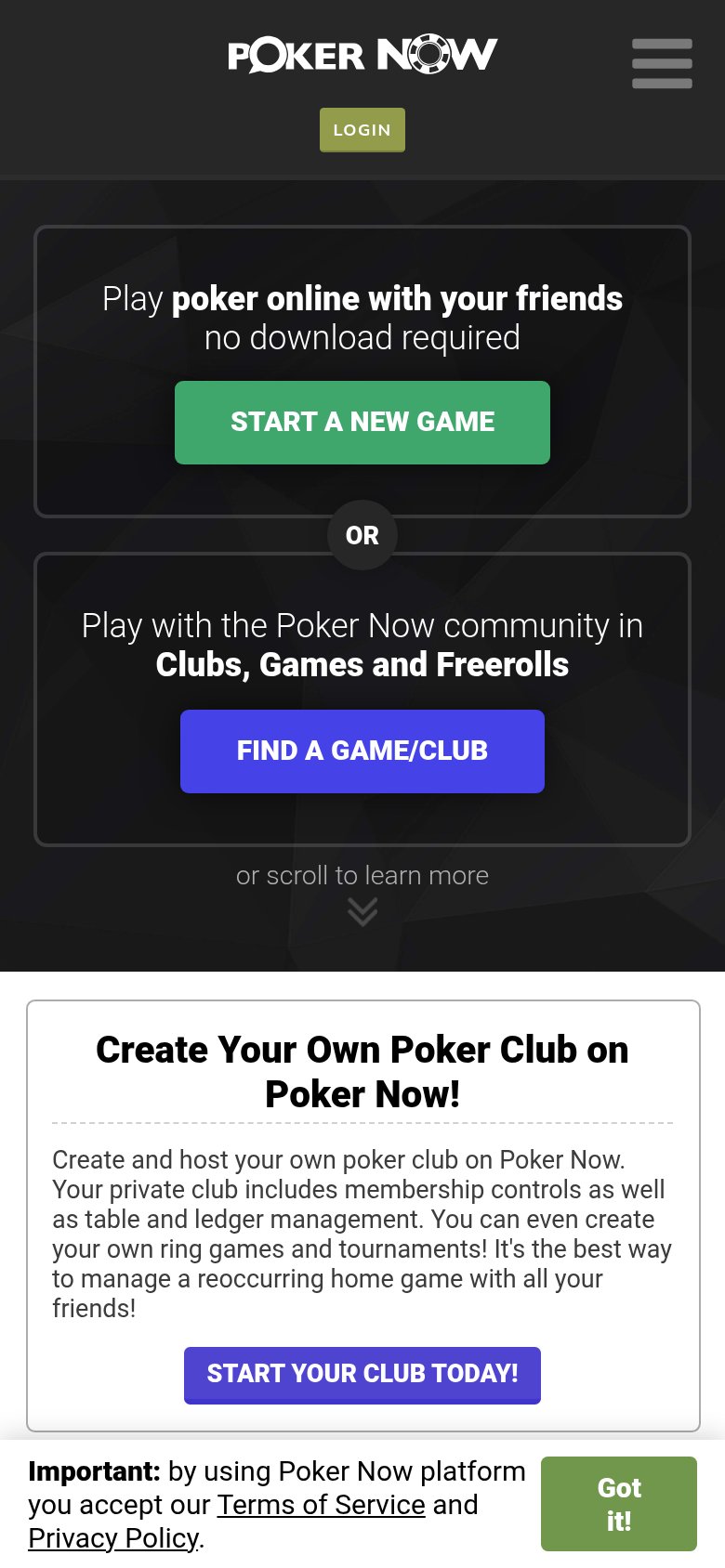
What works
What to improve
Value props
72FairTitle, subtitle, hero — do they sell the product's true value?
PokerNow’s headline
Play poker online with your friends no download required
Play with the Poker Now community in Clubs, Games and Freerolls
Working
Could improve
CTA
78FairCopy, size, verb, cost-feel — does the primary CTA earn the click?
How PokerNow compares
Recommended rewrites