
Your landing page’s weakest score is Value props.
How PokerBros ranks
54Growth scoreupdated
category scores
category scoresShowHide
Value props
38PoorTitle, subtitle, hero — do they sell the product's true value?
PokerBros’s headline vague
POKER BROS
FEEL THE FUN!
Working
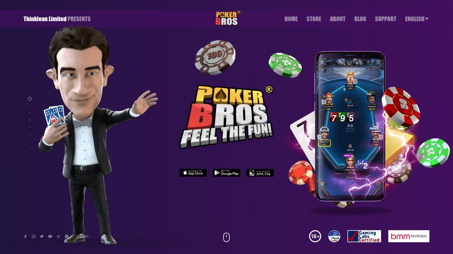
- Phone mockup shows a real NLH table in play
- Testing-lab badges add trust
- Three clear download paths incl. APK
Could improve
- No headline states what PokerBros is
- "Feel the fun!" fits any game — zero specifics
- No numbers, games, or club features named
Information hierarchy
58FairDoes the design help or inhibit what the page is trying to say?
 1234
- Three equal download buttons — App Store, Google Play, and APK File sit at identical weight and small size — no single primary CTA to anchor the scan path.
- Top nav link row — Six nav items (HOME, STORE, ABOUT, BLOG, SUPPORT, ENGLISH) plus footer social icons in the fold create eight-plus exit paths before the download action.
- FEEL THE FUN tagline — The only headline copy is a slogan; nothing in the fold states what PokerBros is or why to download it.
- Footer social icon strip — Social links and LEGAL creep into the fold, pulling attention sideways at the exact height where the eye finishes scanning.
CTA
58FairCopy, size, verb, cost-feel — does the primary CTA earn the click?
How PokerBros compares
Recommended rewrites
Trust
58FairProof that the product is real, competent, and safe to try.
How PokerBros compares
Trust read
Mobile web
58FairThe phone experience as a first-class citizen.
What works
What to improve