
Your landing page’s weakest score is CTA.
How Pololu ranks
56Growth scoreupdated
category scores
category scoresShowHide
CTA
48PoorCopy, size, verb, cost-feel — does the primary CTA earn the click?

Problems
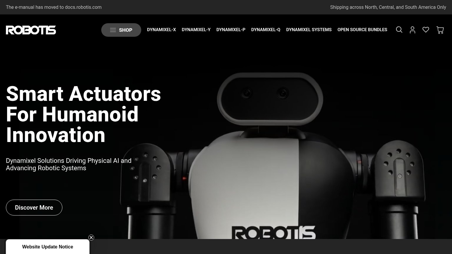
- no action verb — noun chip only
- hero banner has no click target
- search box tiny, corner-placed
- chips compete; no single primary
Information hierarchy
54FairDoes the design help or inhibit what the page is trying to say?
 1234
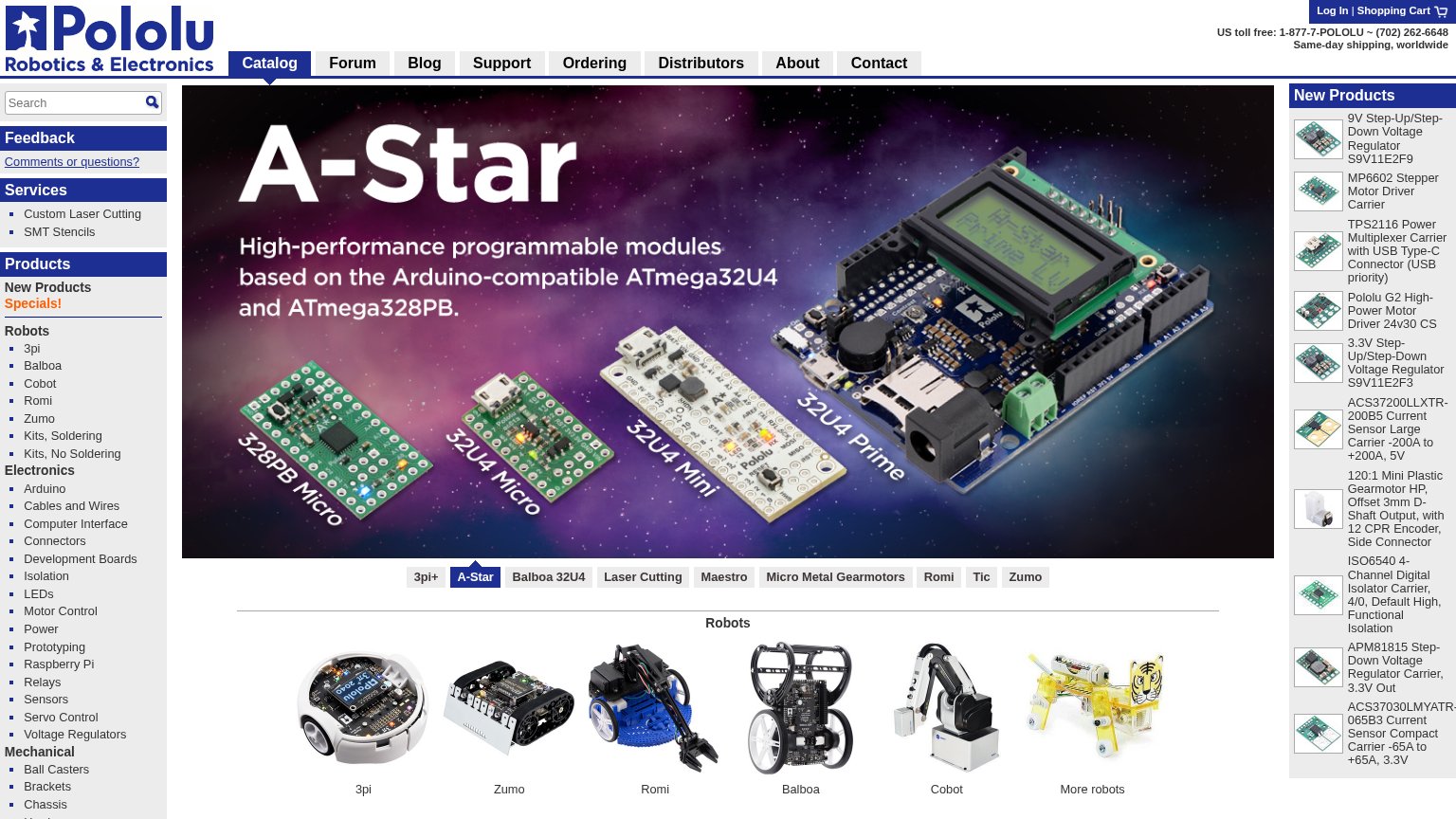
- Left category sidebar — 30+ equal-weight text links compete with the hero at the same visual priority, turning the fold into a link index.
- New Products rail — Ten dense thumbnail-plus-spec entries stack against the right edge, adding a second scrolling column that fights the hero for attention.
- Hero banner — The A-Star promo is the largest element but has no clickable CTA button, so the strongest visual anchor ends in a dead scan path.
- Carousel tab row — Ten same-weight pills (3pi+, A-Star, Balboa 32U4…) sit under the hero with no hierarchy signaling which matters.
Value props
58FairTitle, subtitle, hero — do they sell the product's true value?
Pololu’s headline
A-Star
High-performance programmable modules based on the Arduino-compatible ATmega32U4 and ATmega328PB.
Working
Could improve
Mobile web
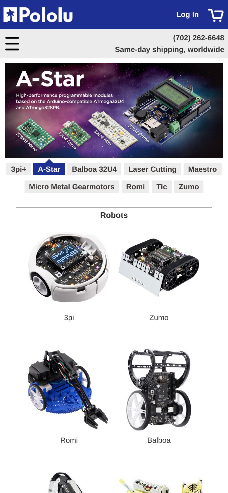
58FairThe phone experience as a first-class citizen.
What works
What to improve
Trust
64FairProof that the product is real, competent, and safe to try.
How Pololu compares
Trust read