
Your landing page’s weakest score is Mobile web.
How MyActuator ranks
38Growth scoreupdated
category scores
category scoresShowHide
Mobile web
28PoorThe phone experience as a first-class citizen.
 123
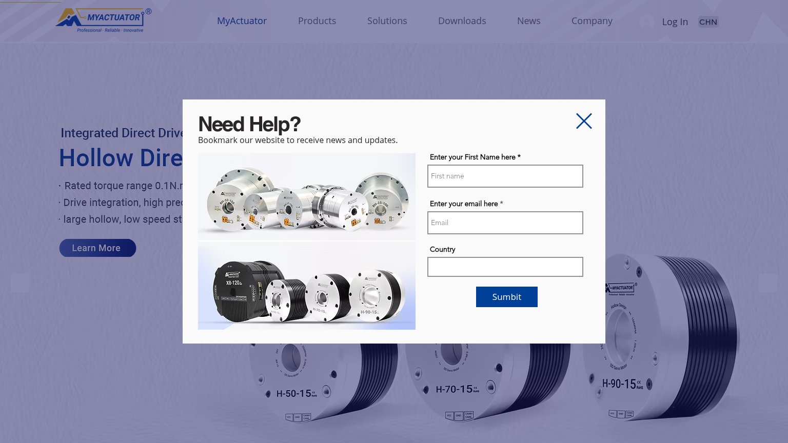
- Sumbit button — Modal's only action is misspelled "Sumbit", undermining trust the instant a visitor lands.
- Country field placeholder — Field labeled "Country" shows "City" placeholder — mismatched form copy signals a broken form.
- Learn More button — Primary CTA is a tiny desktop-proportioned button at the bottom edge, mostly obscured by the modal.
Information hierarchy
38PoorDoes the design help or inhibit what the page is trying to say?
 1234
- Need Help popup — Modal covers the headline, value prop, and hero CTA on first load, forcing a dismissal before any message lands.
- Sumbit button — Primary action of the interrupting modal is misspelled ('Sumbit'), undermining trust at the moment of highest attention.
- Truncated hero headline — 'Hollow Dire...' and its bullet copy are cut off behind the modal, so the core promise is unreadable.
- Top nav row — Seven equal-weight links plus Log In and CHN toggle offer nine exit paths before the fold's Learn More CTA.
CTA
38PoorCopy, size, verb, cost-feel — does the primary CTA earn the click?
How MyActuator compares
Recommended rewrites
Value props
42PoorTitle, subtitle, hero — do they sell the product's true value?
MyActuator’s headline
Hollow Dire… (truncated by modal)
Integrated Direct Drive…
Working
Could improve
Trust
44PoorProof that the product is real, competent, and safe to try.
How MyActuator compares
Trust read