
Your landing page’s weakest score is CTA.
How Plural Policy ranks
- 1.
Plural Policy73
- 2.
Fed1068
- 3.
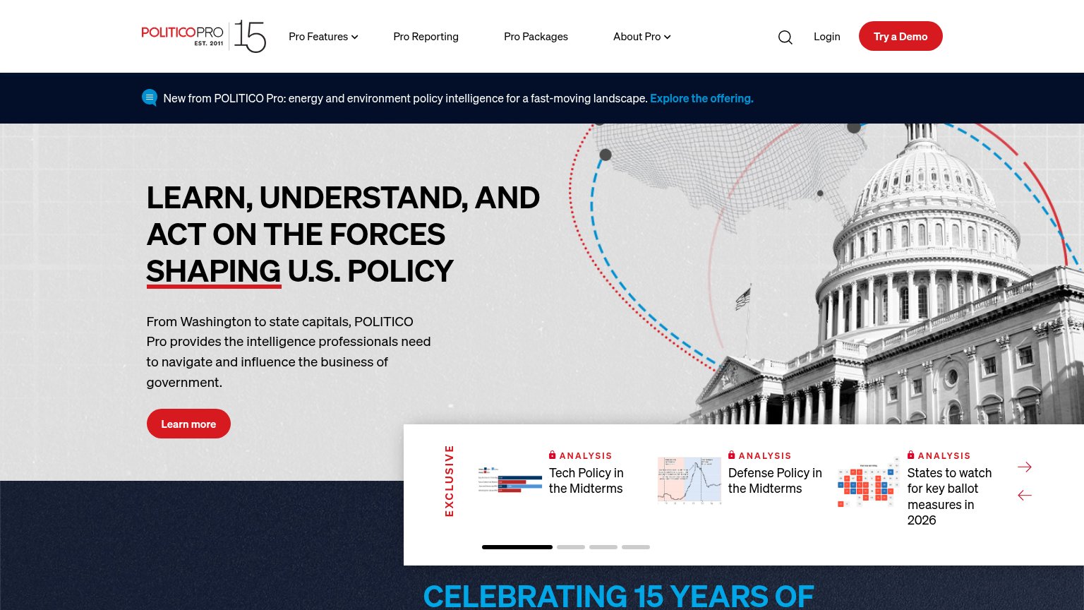
Politico Pro64
- 4.
Quorum62
- 5.
LegiStorm52
CTA
68FairCopy, size, verb, cost-feel — does the primary CTA earn the click?

Problems
- demo booking feels costly
- search input lacks submit label
- no self-serve path stated
- hero splits focus: search vs demo
Trust
72FairProof that the product is real, competent, and safe to try.
| Trust read | |
|---|---|
| Plural Policy | "Trusted by over 500 teams across advocacy, academia, and government affairs" above a logo row (Common Cause, NBCUnivers |
| Real Fed10 workspace UI screenshot showing "New Thread", "Briefing", and "Agents" navigation | |
| Quincy product UI mockup with query "What are the sponsors of the bills saying about artificial intelligence on social m | |
| Analysis carousel with real report thumbnails ("Tech Policy in the Midterms", "Defense Policy in the Midterms") plus "ES | |
| Hero carousel showing real LegiStorm Pro product UI (Congressional Staff Directory and state map) on laptop, tablet, and |
Mobile web
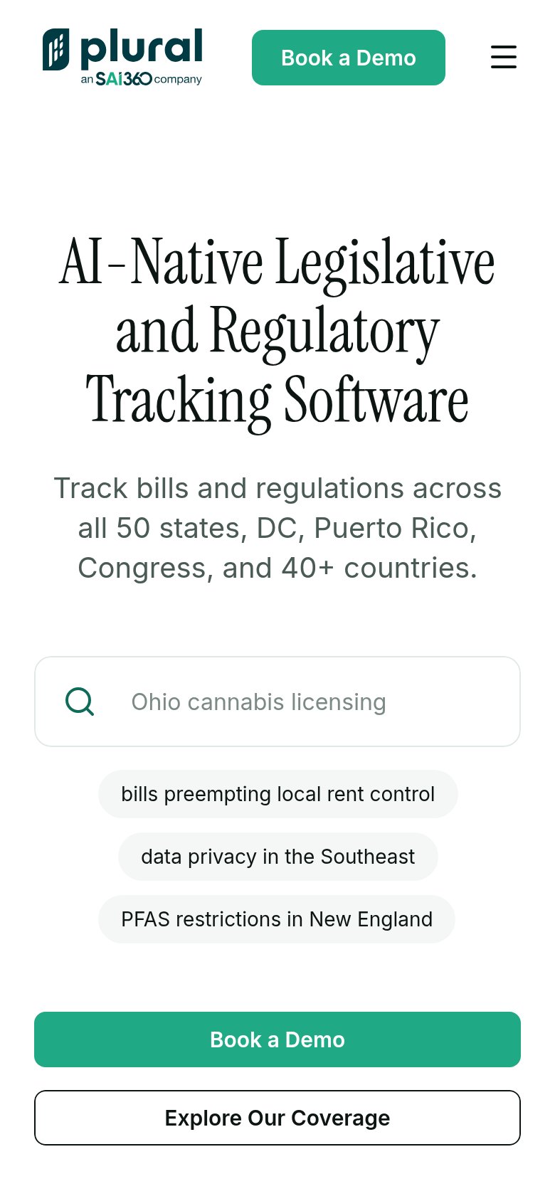
72FairThe phone experience as a first-class citizen.
What works
What to improve
Value props
76FairTitle, subtitle, hero — do they sell the product's true value?
Plural Policy’s headline
AI-Native Legislative and Regulatory Tracking Software
Track bills and regulations across all 50 states, DC, Puerto Rico, Congress, and 40+ countries.
Working
Could improve
Information hierarchy
78FairDoes the design help or inhibit what the page is trying to say?
What works
What to improve