
Your landing page’s weakest score is Trust.
How Fed10 ranks
Trust
58FairProof that the product is real, competent, and safe to try.
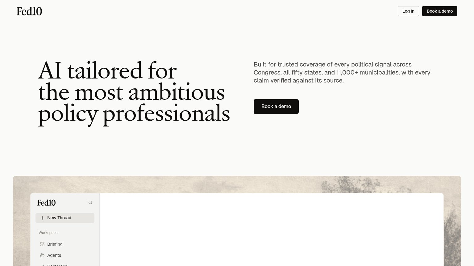

| Trust read | |
|---|---|
| Fed10 | Real Fed10 workspace UI screenshot showing "New Thread", "Briefing", and "Agents" navigation |
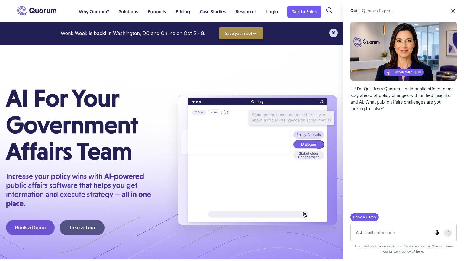
| Quincy product UI mockup with query "What are the sponsors of the bills saying about artificial intelligence on social m | |
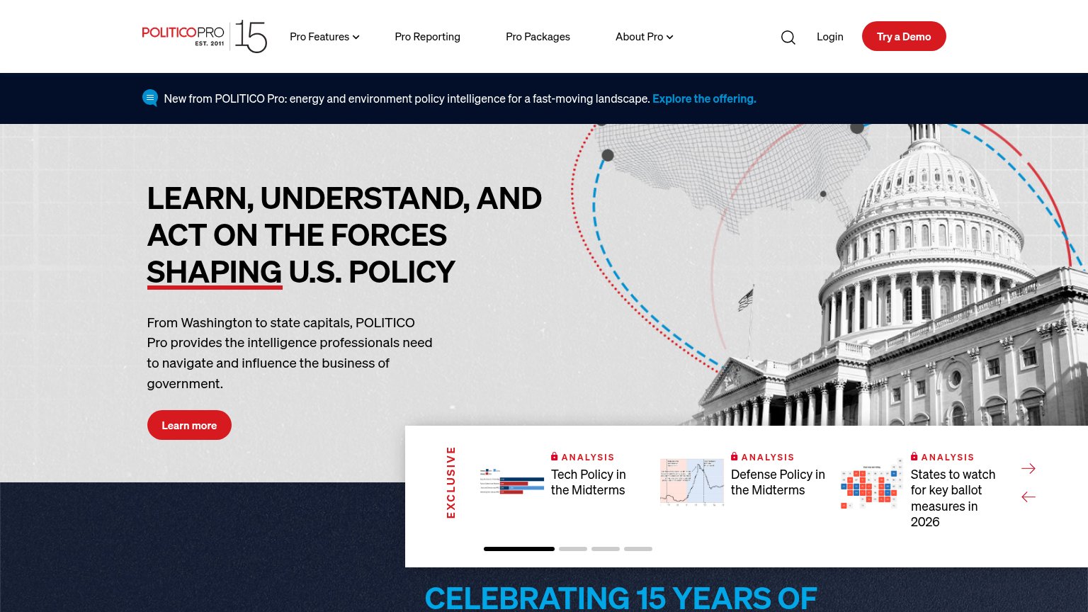
| "Trusted by over 500 teams across advocacy, academia, and government affairs" above a logo row (Common Cause, NBCUnivers | |
| Analysis carousel with real report thumbnails ("Tech Policy in the Midterms", "Defense Policy in the Midterms") plus "ES | |
| Hero carousel showing real LegiStorm Pro product UI (Congressional Staff Directory and state map) on laptop, tablet, and |
CTA
64FairCopy, size, verb, cost-feel — does the primary CTA earn the click?
Problems
- 'Book' feels costly and committal
- no self-serve or low-friction path
- small footprint vs huge headline
- product UI shown but not clickable
Mobile web
68FairThe phone experience as a first-class citizen.
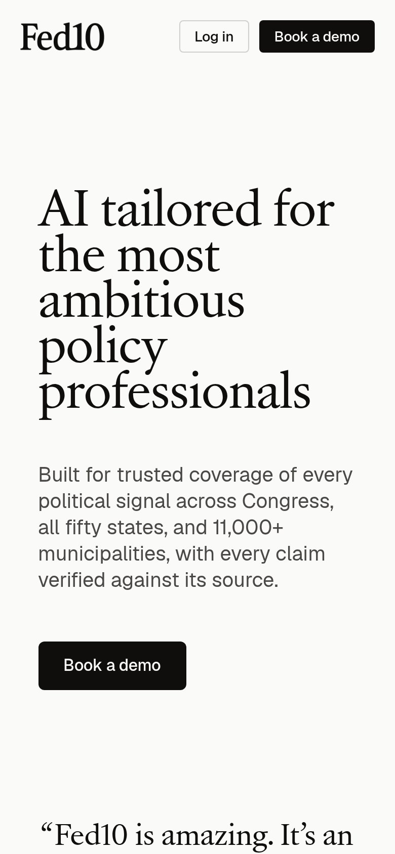
What works
What to improve
Value props
72FairTitle, subtitle, hero — do they sell the product's true value?
Fed10’s headline
AI tailored for the most ambitious policy professionals
Built for trusted coverage of every political signal across Congress, all fifty states, and 11,000+ municipalities, with every claim verified against its source.
Working
Could improve
Information hierarchy
78FairDoes the design help or inhibit what the page is trying to say?
What works
What to improve