
Your landing page’s weakest score is Mobile web.
How LegiStorm ranks
- 1.
Plural Policy73
- 2.
Fed1068
- 3.
Politico Pro64
- 4.
Quorum62
- 5.
LegiStorm52
category scores
category scoresShowHide
Mobile web
42PoorThe phone experience as a first-class citizen.
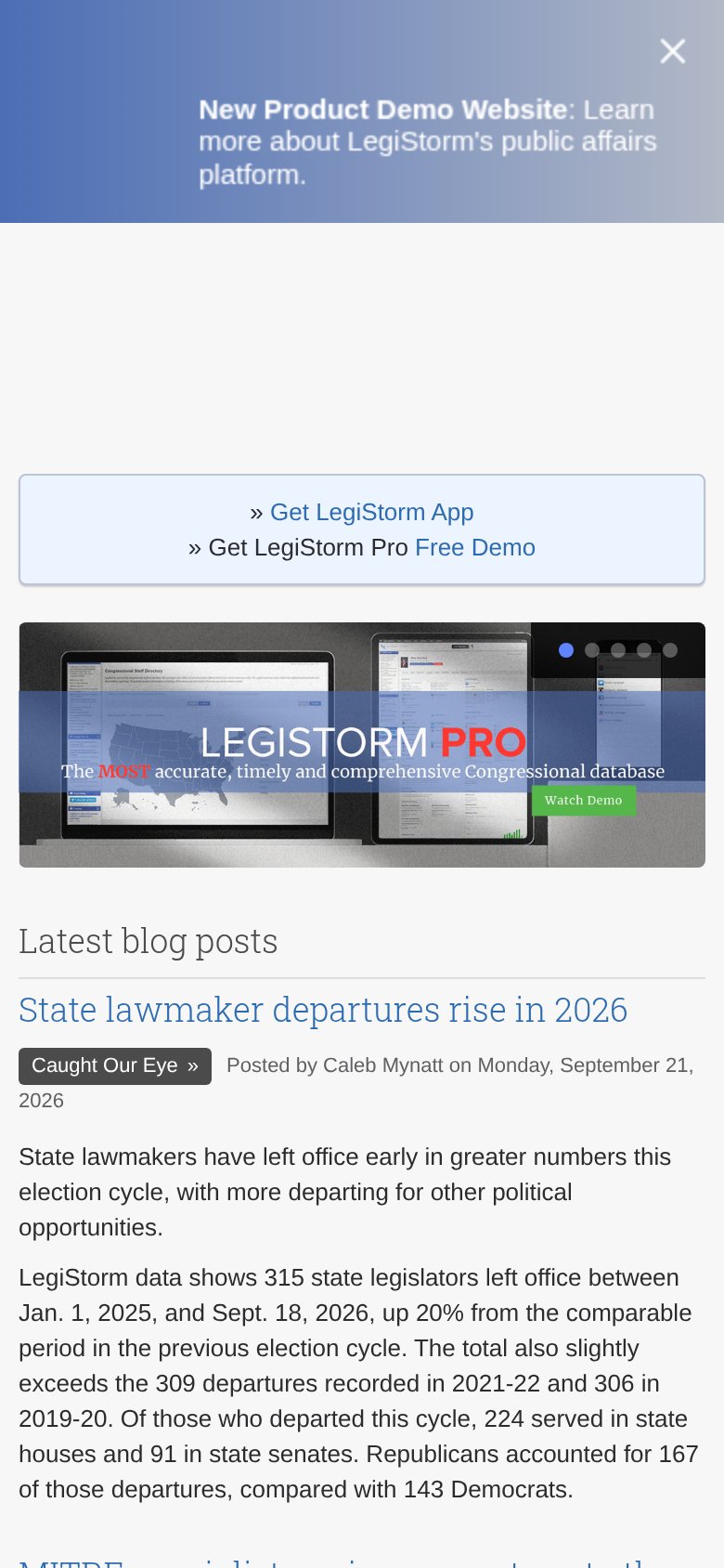
The mobile first viewport opens with a large "New Product Demo Website" promo banner, then a boxed link stack ("» Get LegiStorm App" / "» Get LegiStorm Pro Free Demo") rendered as plain text links rather than a tappable button — there is no thumb-friendly primary CTA anywhere in the fold. The hero carousel is the desktop image squeezed into the phone column, so "The MOST accurate, timely and comprehensive Congressional database" and its "Watch Demo" button shrink to near-illegible size, with the button far too small to tap reliably. No visible hamburger or search means navigation was stripped rather than collapsed, leaving visitors with only blog posts below. The biggest lever is replacing the shrunken desktop hero with a mobile-sized headline and a full-width "Watch Demo" button in the first viewport.
Value props
52FairTitle, subtitle, hero — do they sell the product's true value?
LEGISTORM PRO
The MOST accurate, timely and comprehensive Congressional database
Working
- Names the real category: Congressional database
- Hero shows actual product screens
- Clear Watch Demo CTA in the hero
Could improve
- Headline is just the product name
- Three superlatives, zero proof or numbers
- No emotional hook for the target user
Information hierarchy
54FairDoes the design help or inhibit what the page is trying to say?
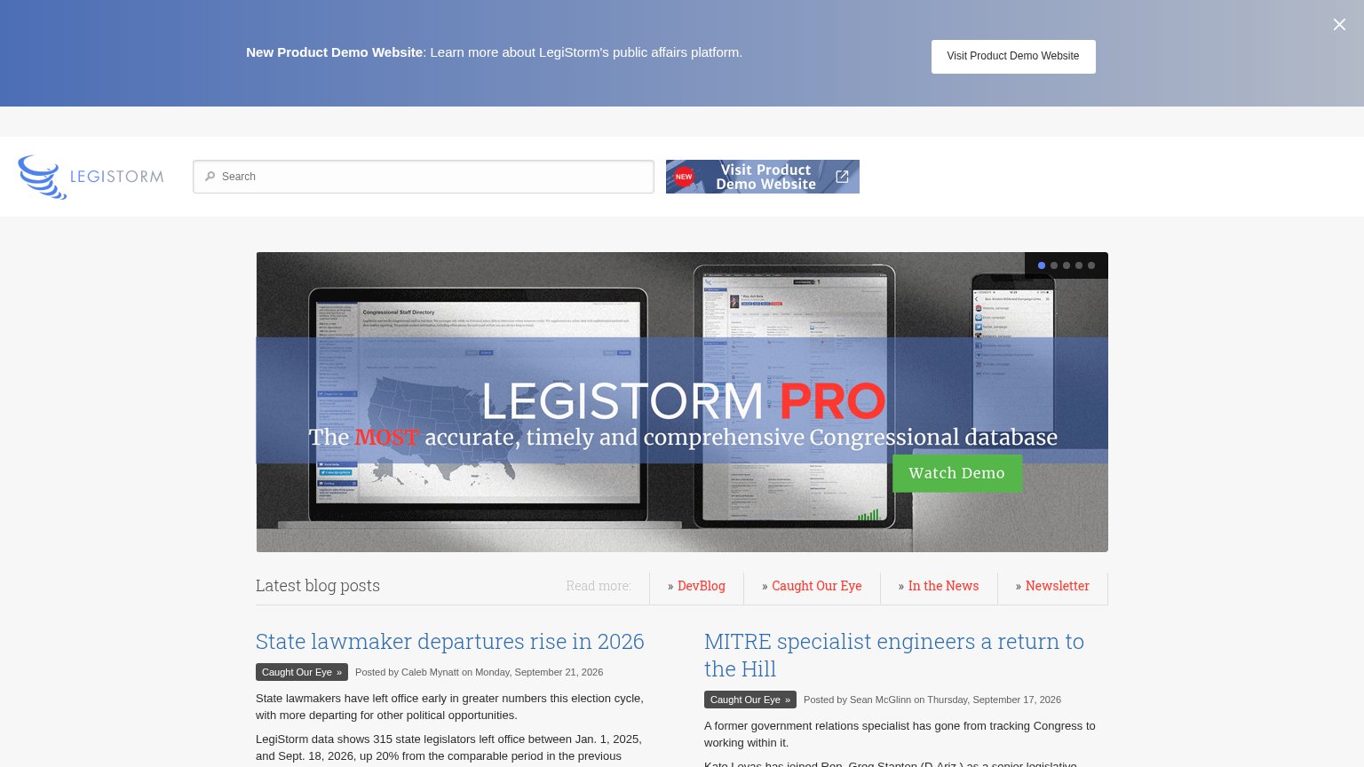
What works
What to improve
Trust
54FairProof that the product is real, competent, and safe to try.
How LegiStorm compares
Trust read
CTA
58FairCopy, size, verb, cost-feel — does the primary CTA earn the click?
How LegiStorm compares
Recommended rewrites