
Your landing page’s weakest score is Trust.
How PlanSwift ranks
78Growth scoreupdated
category scores
category scoresShowHide
Trust
74FairProof that the product is real, competent, and safe to try.
| Trust read | |
|---|---|
| PlanSwift | "4.7 Google Rating · 4.4 G2 Rating · Most Popular Takeoff Software - Construction Coverage 2024" badges above the CTA |
| 3D structural model captioned "↑ Footage from Alkali" showing real product output | |
| "A NEMETSCHEK COMPANY" mark under the Allplan logo | |
| Detailed 3D BIM building model rendering in the hero, suggesting real product output | |
| No visible trust signal identified. | |
| "Trusted every day by thousands of professional builders." strip above the customer logo row |
Information hierarchy
78FairDoes the design help or inhibit what the page is trying to say?
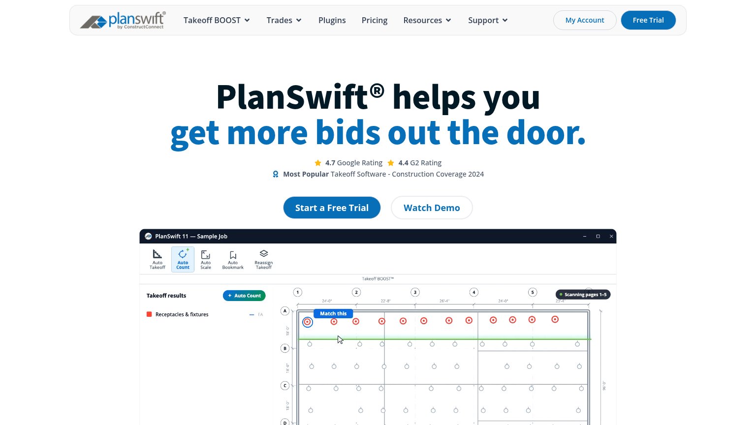 123
- Header Free Trial pill — Duplicates the hero CTA at equal visual weight, splitting the primary action into two targets.
- Seven-item nav row — Multiple dropdown menus and My Account offer nine-plus exit paths before the hero CTA.
- Watch Demo button — Styled at near-equal size and prominence to Start a Free Trial, diluting the single-action scan.
Value props
78FairTitle, subtitle, hero — do they sell the product's true value?
PlanSwift’s headline
PlanSwift® helps you get more bids out the door.
Working
Could improve
Mobile web
78FairThe phone experience as a first-class citizen.
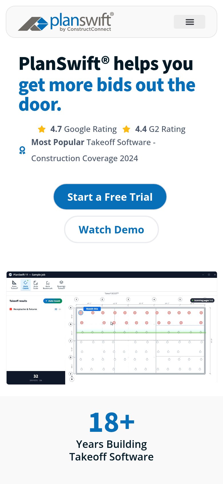
What works
What to improve
CTA
82StrongCopy, size, verb, cost-feel — does the primary CTA earn the click?
How PlanSwift compares
Recommended rewrites