
Your landing page’s weakest score is Mobile web.
How PlanRadar ranks
Mobile web
52FairThe phone experience as a first-class citizen.
 123
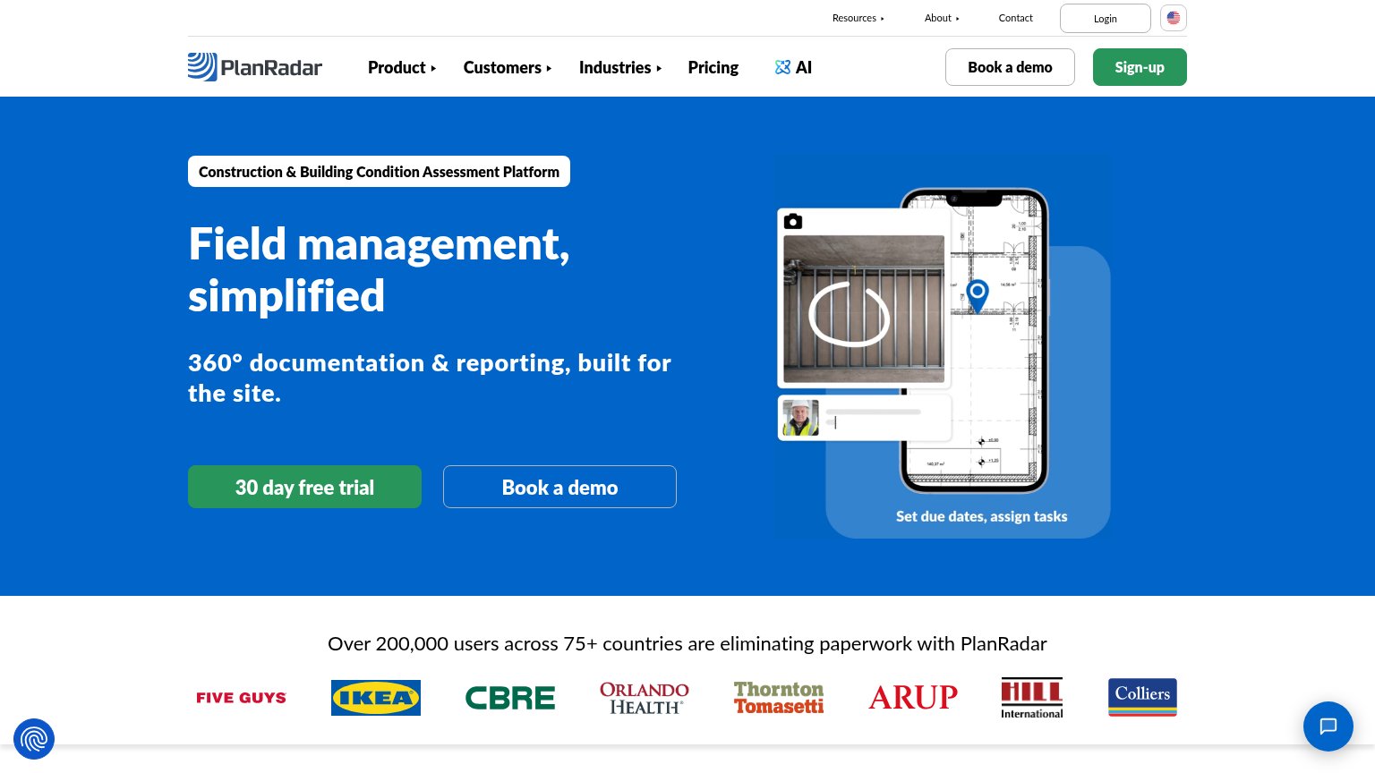
- Oversized hero illustration — The phone-in-phone graphic fills half the viewport and pushes every CTA below the fold.
- Two-line eyebrow pill — The long category pill wraps to two lines and delays the headline and any action.
- Chat bubble overlay — The floating chat bubble sits over the hero image, adding friction with no conversion CTA.
CTA
68FairCopy, size, verb, cost-feel — does the primary CTA earn the click?


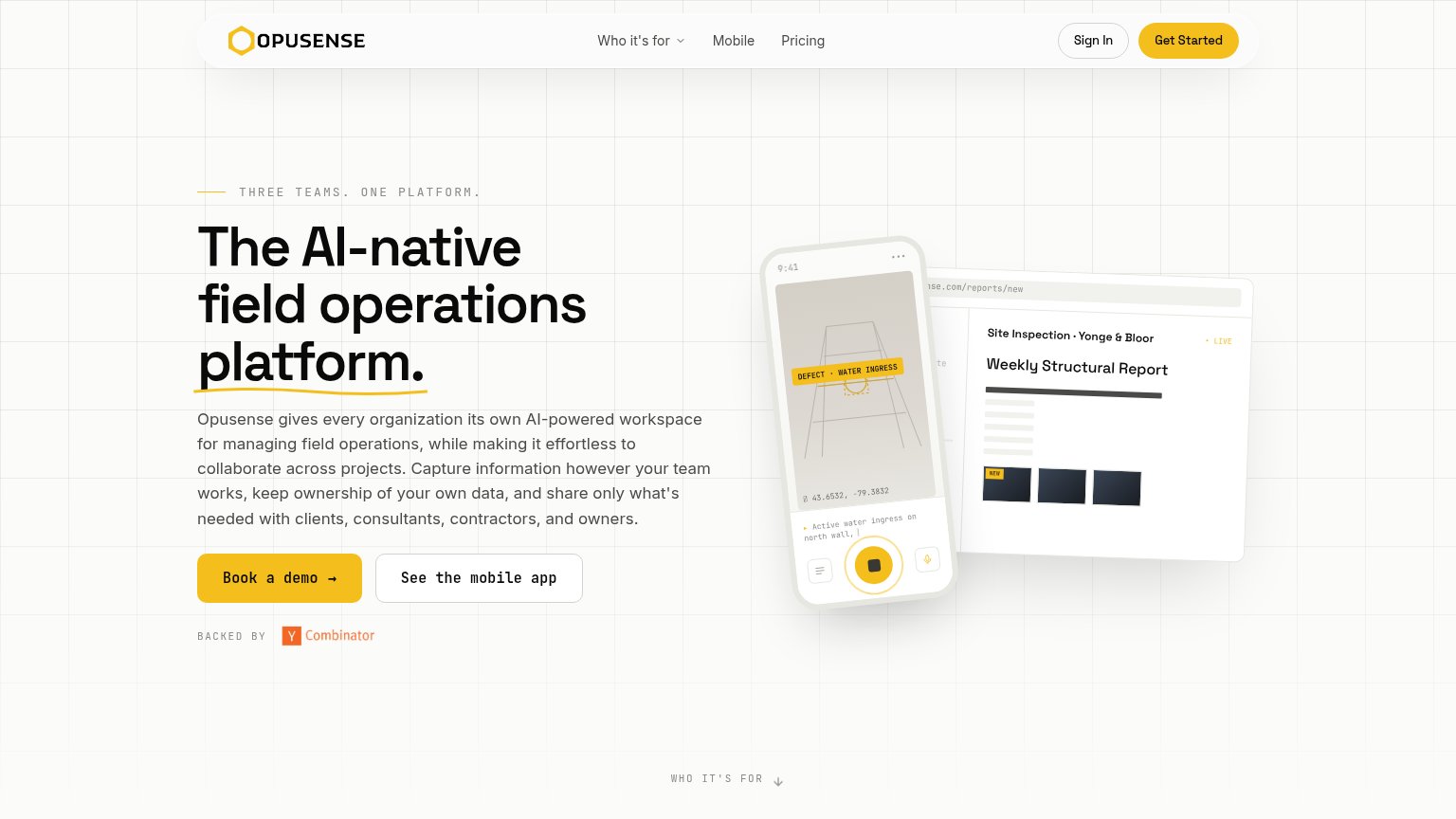

Problems
- no action verb — reads as a label
- four words, over the 3-word limit
- absent from mobile fold
- nav says 'Sign-up', hero differs
Information hierarchy
72FairDoes the design help or inhibit what the page is trying to say?
What works
What to improve
Value props
74FairTitle, subtitle, hero — do they sell the product's true value?
PlanRadar’s headline
Field management, simplified
360° documentation & reporting, built for the site.
Working
Could improve
Trust
82StrongProof that the product is real, competent, and safe to try.
How PlanRadar compares
Trust read