
Your landing page’s weakest score is Trust.
How Pacvue ranks
Trust
44PoorProof that the product is real, competent, and safe to try.
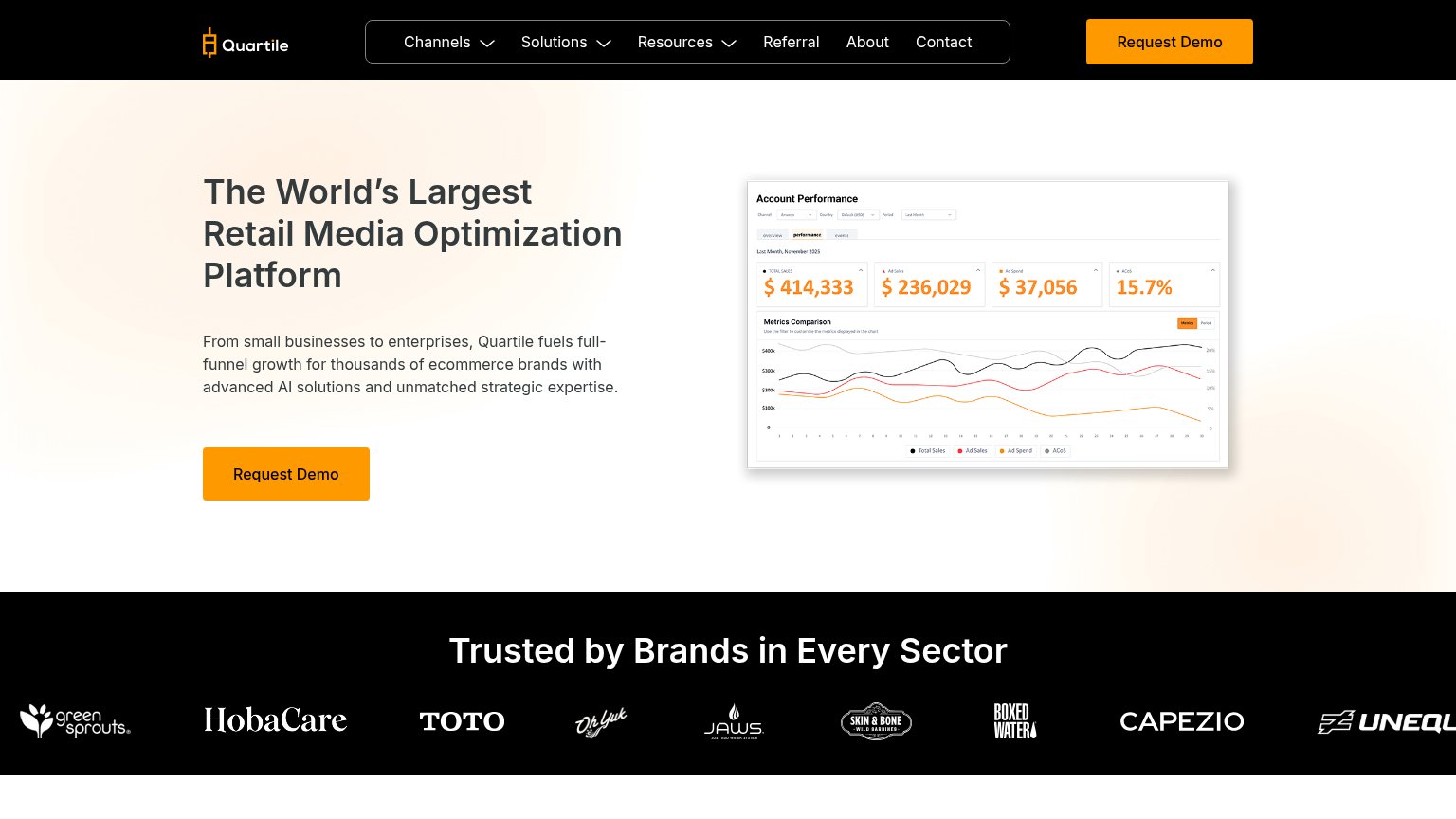
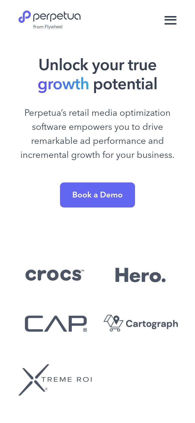
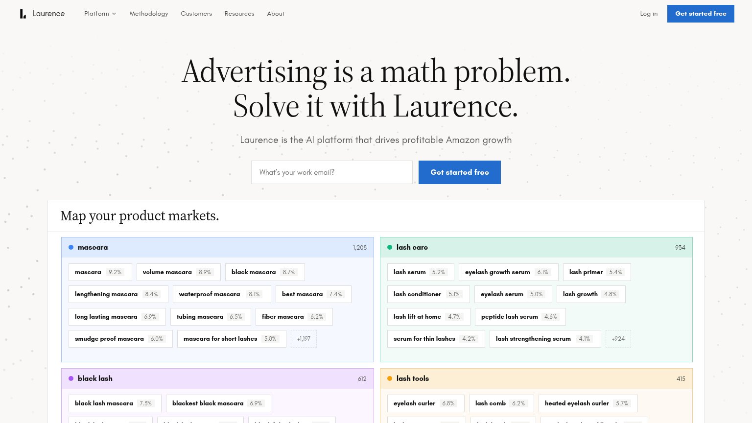
| Trust read | |
|---|---|
| Pacvue | No visible trust signal identified. |
| "Map your product markets." live product UI with keyword clusters and counts (mascara 1,208, lash care 934) | |
| Customer logo strip (Crocs, Hero, CAP, Cartograph, Xtreme ROI) on the mobile fold | |
| "Trusted by Brands in Every Sector" logo strip with green sprouts, HobaCare, TOTO, Capezio, and Boxed Water | |
| Amazon, Walmart, and TikTok Shop marketplace badges under the headline | |
| Helium chat UI mockup showing a keyword-gap analysis with specific data ("portable blender for travel" 38,400/mo) |
Mobile web
62FairThe phone experience as a first-class citizen.
 12
- Six-line hero headline — Desktop headline barely scaled down, wrapping into six lines and pushing the CTA toward the fold's bottom.
- Book a demo button — Button floats at desktop proportions instead of stretching near full-width for the thumb.
Information hierarchy
68FairDoes the design help or inhibit what the page is trying to say?
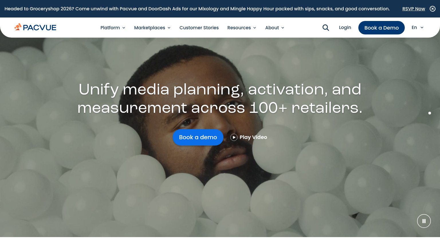
What works
What to improve
CTA
68FairCopy, size, verb, cost-feel — does the primary CTA earn the click?
How Pacvue compares
Recommended rewrites
Value props
68FairTitle, subtitle, hero — do they sell the product's true value?
Pacvue’s headline
Unify media planning, activation, and measurement across 100+ retailers.
Working
Could improve