
Your landing page’s weakest score is Trust.
How Adtomic by Helium 10 ranks
- 1.
Laurence76
- 2.
Quartile72
- 3.
Perpetua67
- 4.
Teikametrics67
- 5.
Pacvue62
- 6.
Adtomic by Helium 1053
53Growth scoreupdated
category scores
category scoresShowHide
Trust
44PoorProof that the product is real, competent, and safe to try.
| Trust read | |
|---|---|
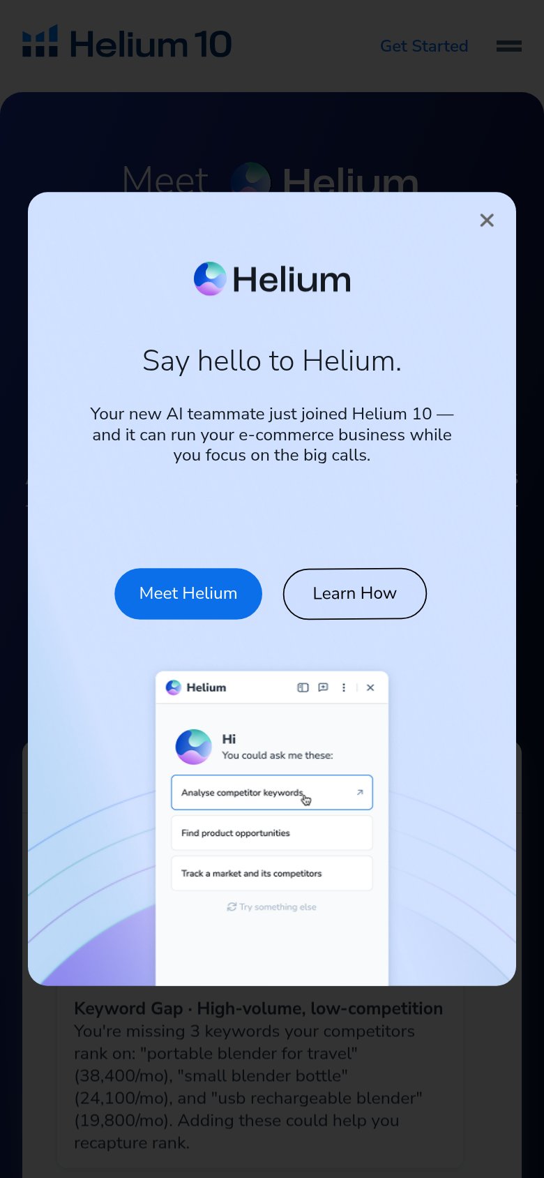
| Adtomic by Helium 10 | Helium chat UI mockup showing a keyword-gap analysis with specific data ("portable blender for travel" 38,400/mo) |
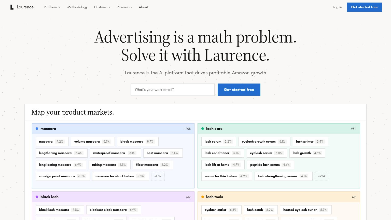
| "Map your product markets." live product UI with keyword clusters and counts (mascara 1,208, lash care 934) | |
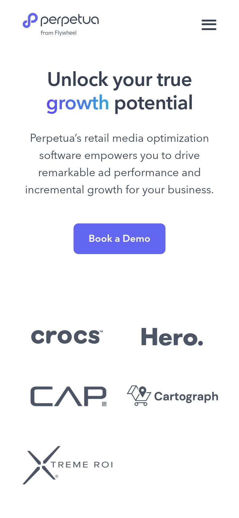
| Customer logo strip (Crocs, Hero, CAP, Cartograph, Xtreme ROI) on the mobile fold | |
| No visible trust signal identified. | |
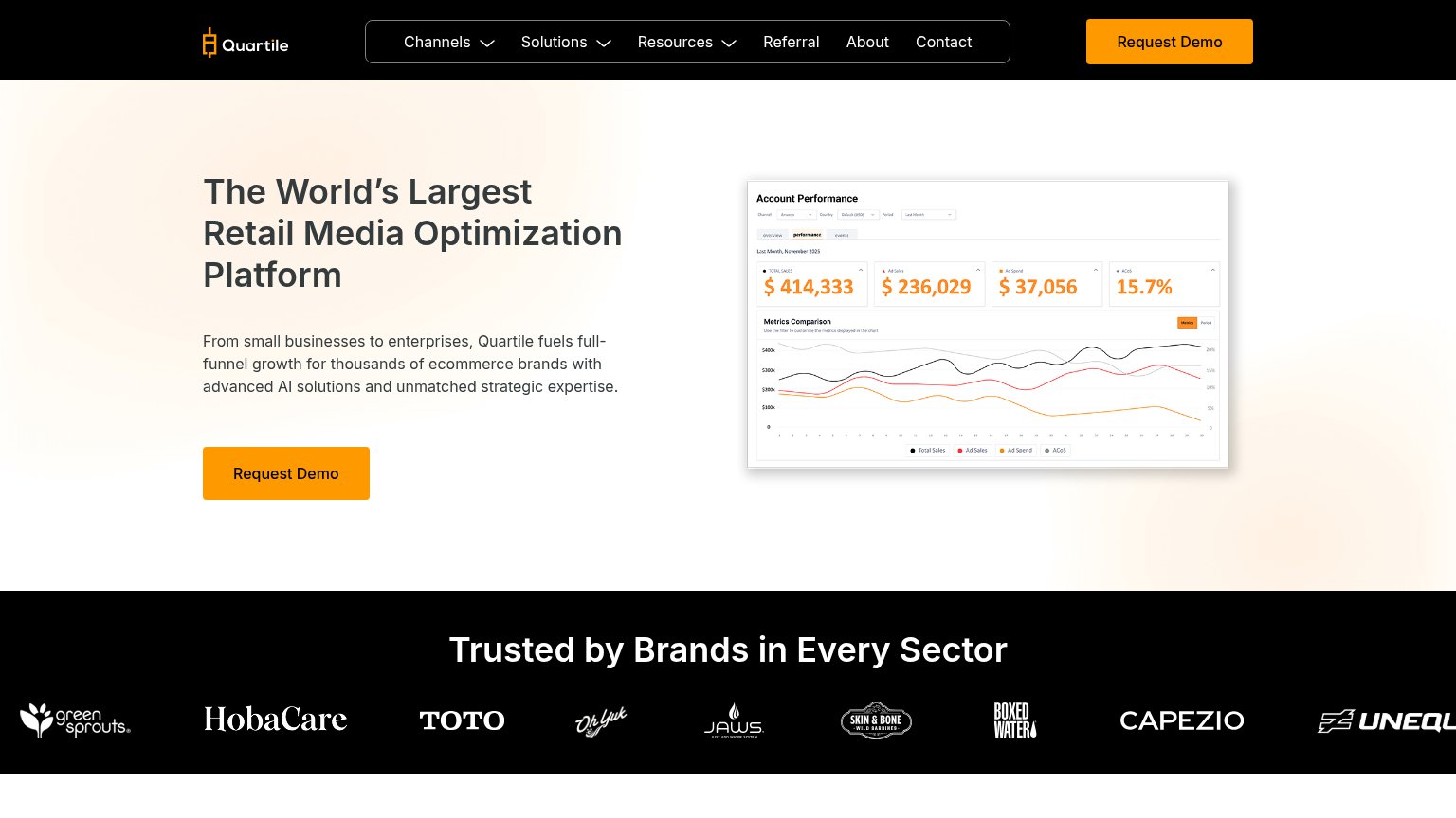
| "Trusted by Brands in Every Sector" logo strip with green sprouts, HobaCare, TOTO, Capezio, and Boxed Water | |
| Amazon, Walmart, and TikTok Shop marketplace badges under the headline |
Information hierarchy
48PoorDoes the design help or inhibit what the page is trying to say?
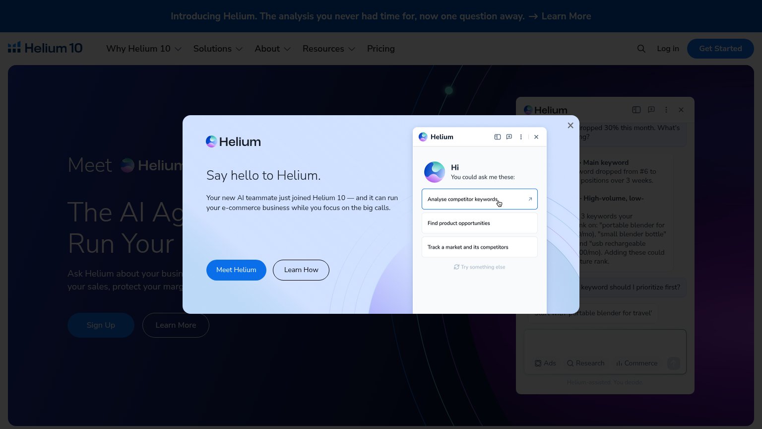 1234
- Say hello modal — Full-fold overlay buries the hero headline and Sign Up CTA behind a second, competing pitch.
- Meet Helium buttons — Modal CTA pair duplicates the hero's Sign Up/Learn More, splitting the fold across four buttons.
- Truncated hero headline — The core value prop reads as fragments — 'The AI Ag... Run Adtomic by Helium 10's...' — because the modal cuts it off.
- Introducing Helium banner — A third 'Learn More' exit above the nav competes with the modal announcing the same feature.
Mobile web
52FairThe phone experience as a first-class citizen.
What works
What to improve
Value props
58FairTitle, subtitle, hero — do they sell the product's true value?
Adtomic by Helium 10’s headline
Say hello to Helium.
Your new AI teammate just joined Helium 10 — and it can run your e-commerce business while you focus on the big calls.
Working
Could improve
CTA
62FairCopy, size, verb, cost-feel — does the primary CTA earn the click?
How Adtomic by Helium 10 compares
Recommended rewrites