
Your landing page’s weakest score is CTA.
How Numeric ranks
78Growth scoreupdated
category scores
category scoresShowHide
CTA
72FairCopy, size, verb, cost-feel — does the primary CTA earn the click?
Problems
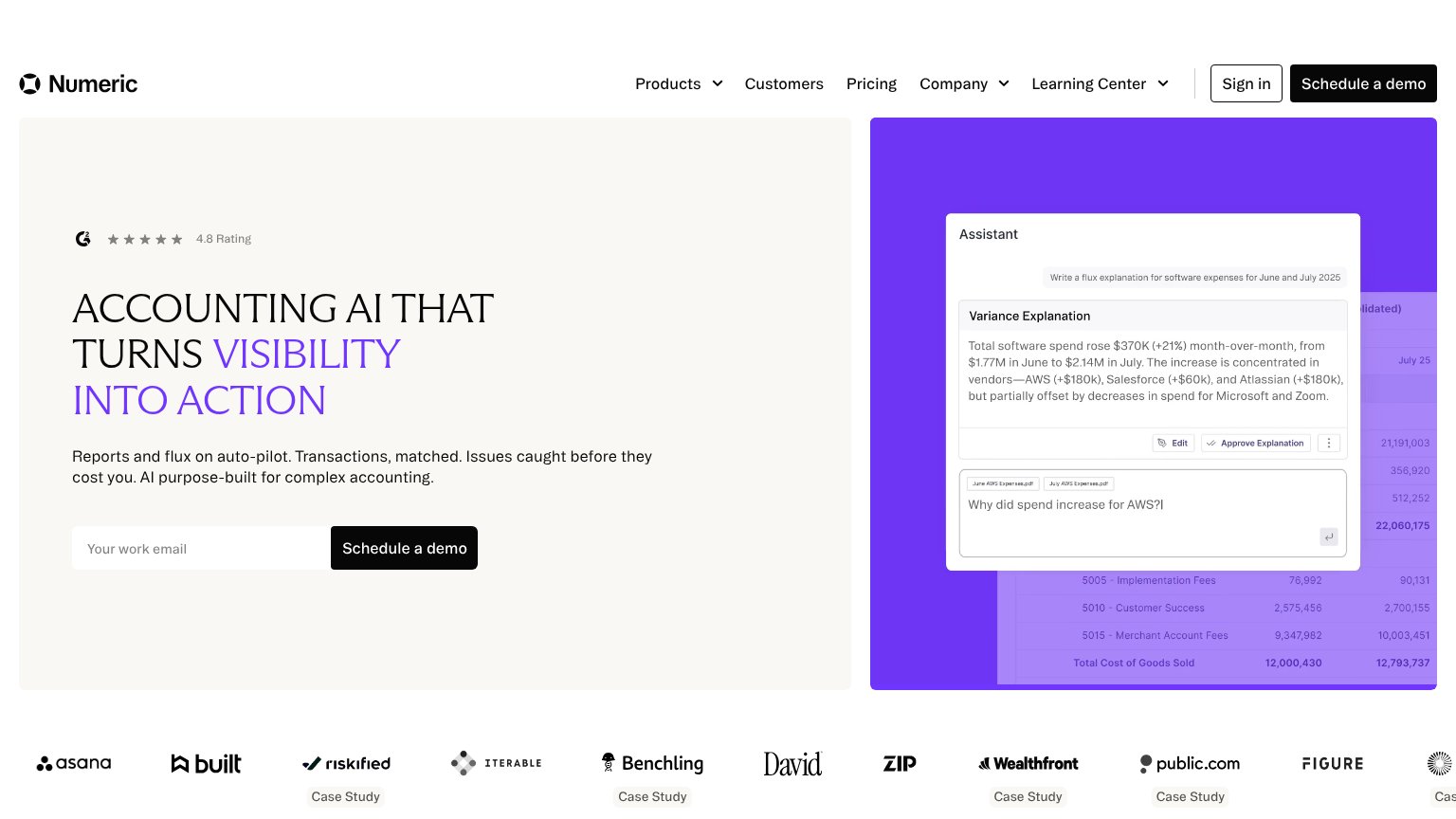
- click feels like booking a meeting
- work email gate before value
- no product-value payoff in copy
Information hierarchy
76FairDoes the design help or inhibit what the page is trying to say?
123- Duplicate demo CTAs — "Schedule a demo" appears in both nav and hero at equal black weight, splitting focus between two identical buttons.
- Assistant panel microcopy — The variance-explanation text and spreadsheet rows are too small to parse at fold scale, adding density without communicating the outcome.
- Five-item dropdown nav — Products, Customers, Pricing, Company and Learning Center plus Sign in create six exit paths before the hero form.
Value props
76FairTitle, subtitle, hero — do they sell the product's true value?
Numeric’s headline
ACCOUNTING AI THAT TURNS VISIBILITY INTO ACTION
Reports and flux on auto-pilot. Transactions, matched. Issues caught before they cost you. AI purpose-built for complex accounting.
Working
Could improve
Trust
80StrongProof that the product is real, competent, and safe to try.
How Numeric compares
Trust read
Mobile web
86StrongThe phone experience as a first-class citizen.
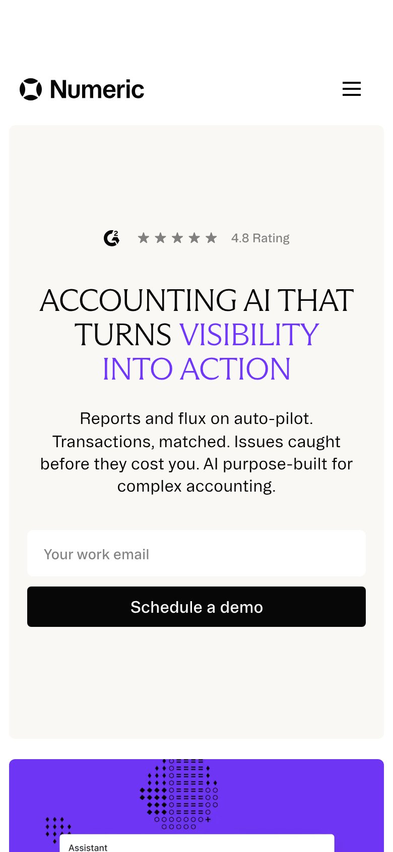
What works
What to improve