
Your landing page’s weakest score is CTA.
How Auditoria.AI ranks
- 1.
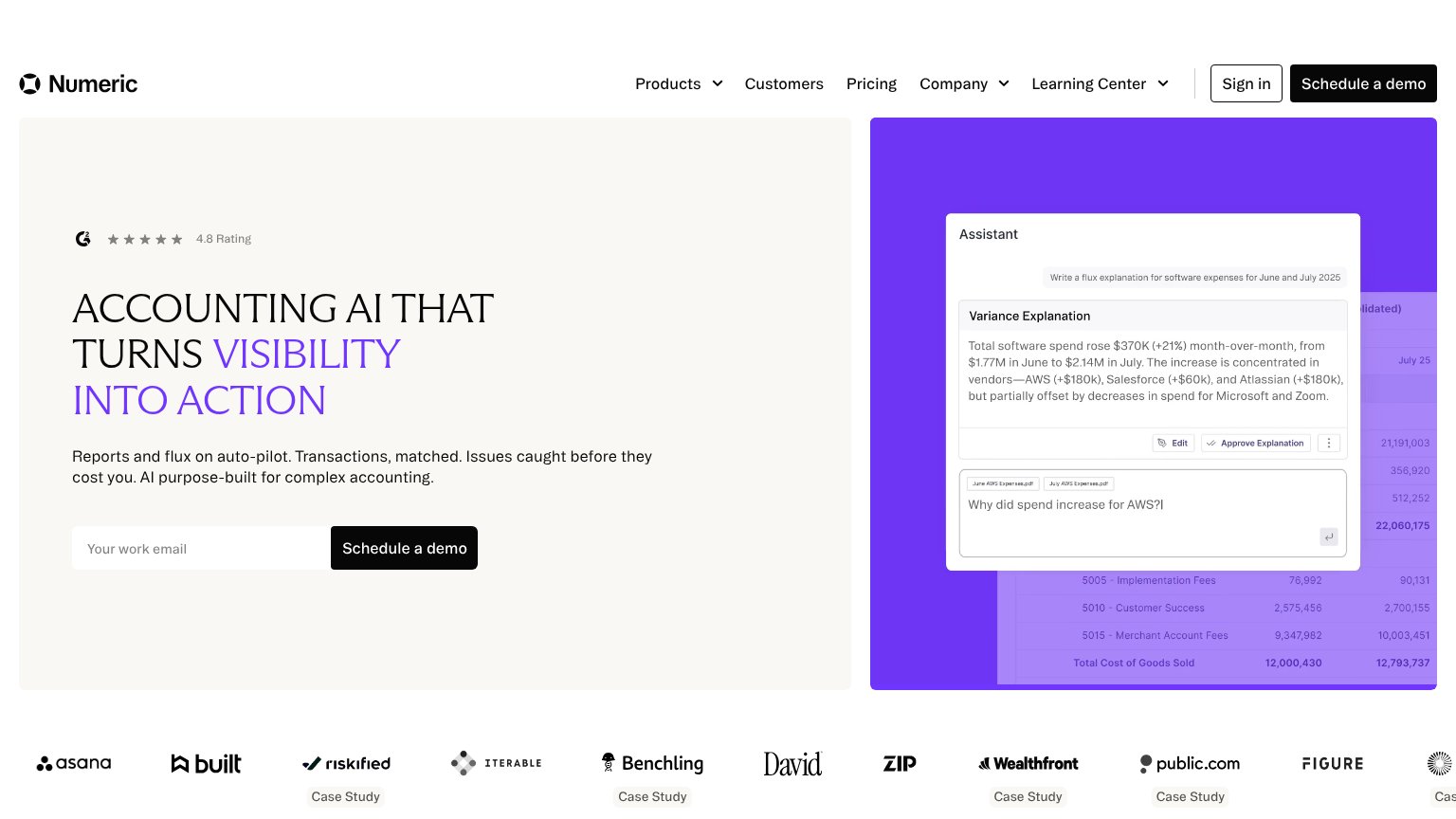
Numeric78
- 2.
Rogo72
- 3.
Auditoria.AI68
- 4.
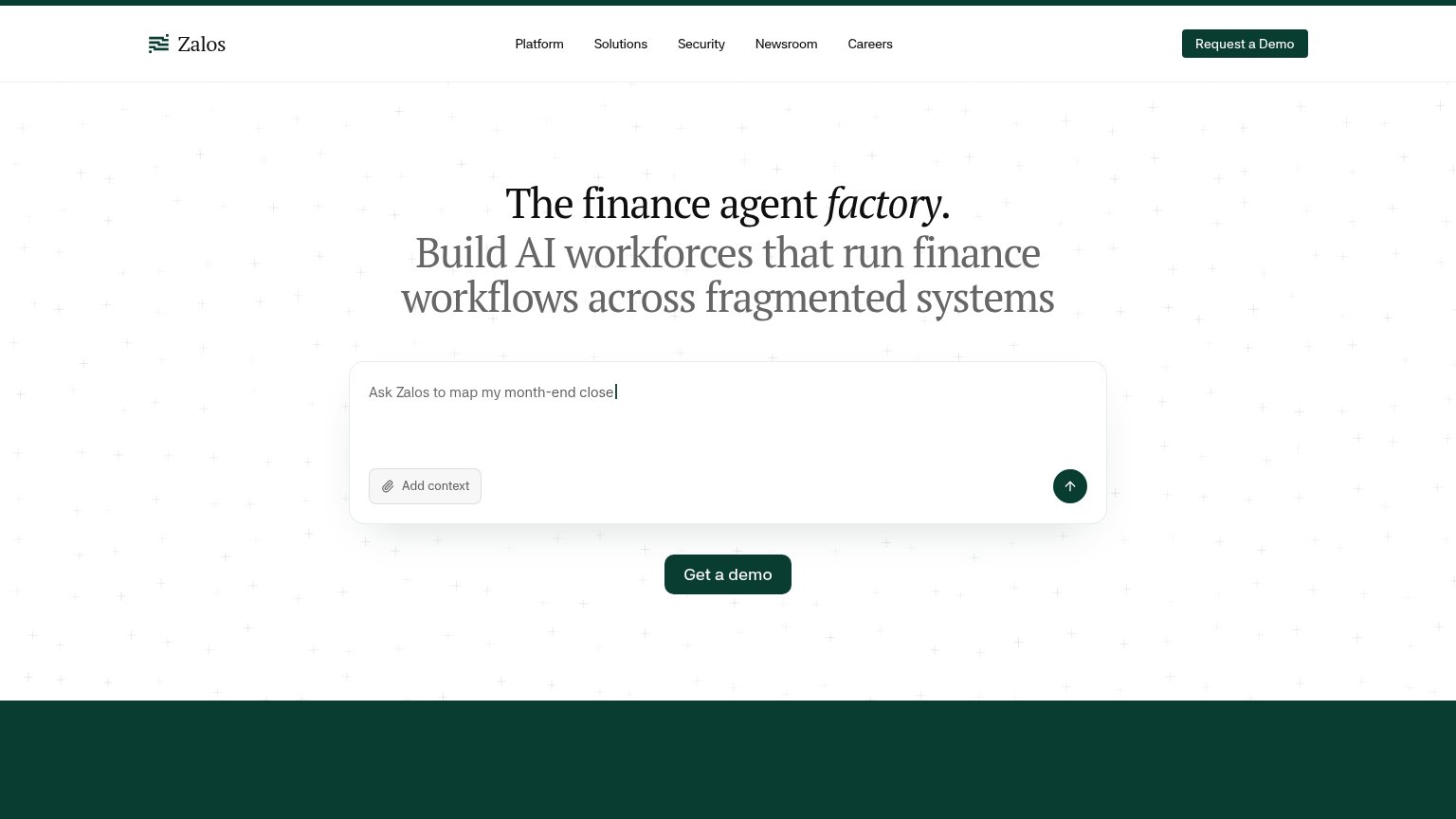
Zalos67
- 5.
Concourse64
- 6.
Doconomy... skip38
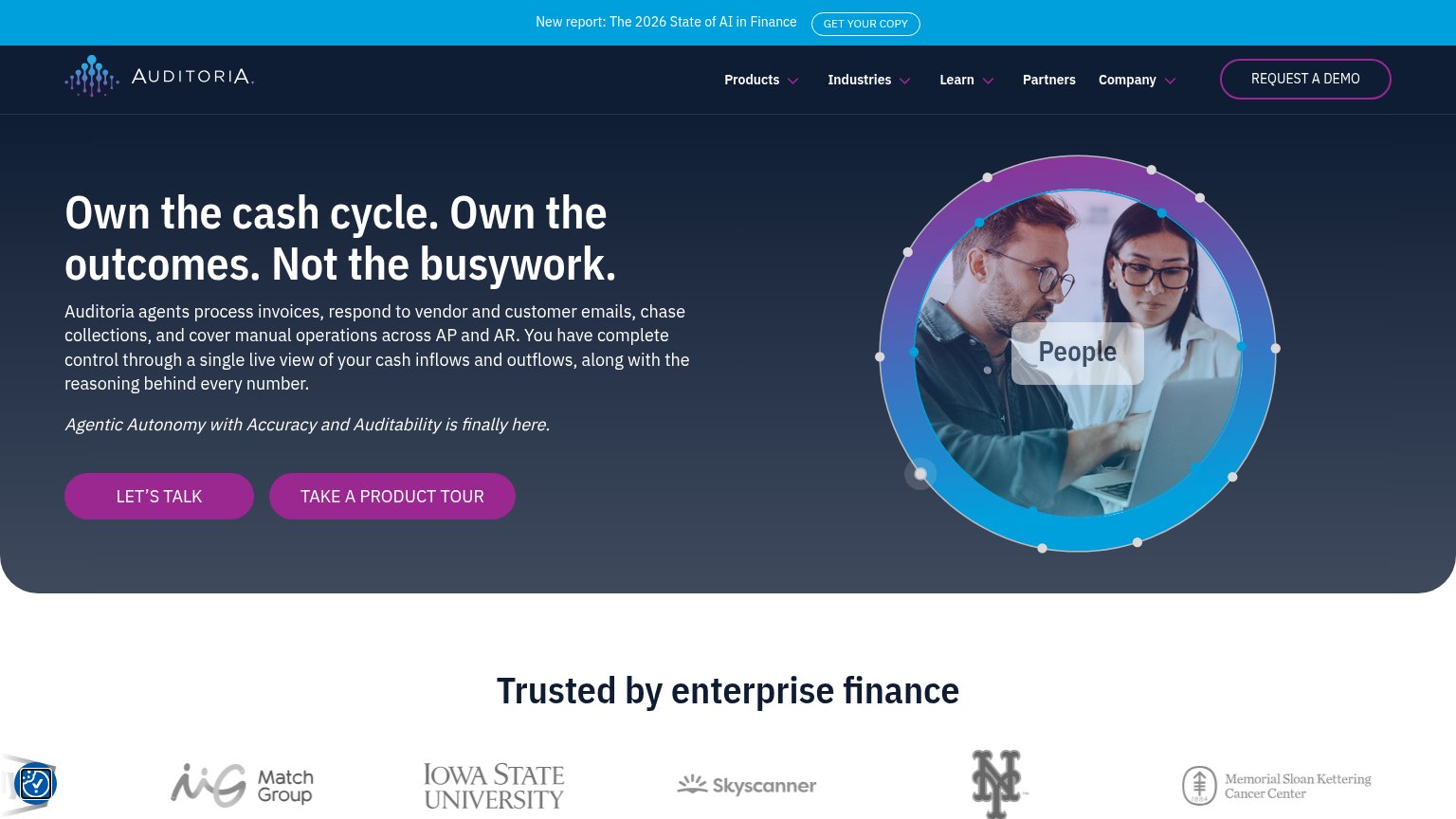
CTA
62FairCopy, size, verb, cost-feel — does the primary CTA earn the click?

Problems
- talk-to-sales feels costly
- no action verb leading
- competes with 'REQUEST A DEMO' in nav
- three CTAs above the fold
Mobile web
62FairThe phone experience as a first-class citizen.
 1234
- Seven-line body paragraph — Unedited desktop copy fills the fold and pushes both CTAs off-screen.
- Two-deck promo banner — Banner text plus GET Auditoria.AI's COPY pill eats the top of the viewport before the header.
- LET'S TALK button — Sits below the fold and stops short of full width; TAKE A PRODUCT TOUR duplicates the issue.
- Accessibility widget bubble — Floating icon overlaps the hero graphic near the thumb zone.
Information hierarchy
68FairDoes the design help or inhibit what the page is trying to say?
What works
What to improve
Trust
72FairProof that the product is real, competent, and safe to try.
How Auditoria.AI compares
Trust read
Value props
76FairTitle, subtitle, hero — do they sell the product's true value?
Auditoria.AI’s headline
Own the cash cycle. Own the outcomes. Not the busywork.
Auditoria agents process invoices, respond to vendor and customer emails, chase collections, and cover manual operations across AP and AR. You have complete control through a single live view of your cash inflows and outflows, along with th
Working
Could improve