
Your landing page’s weakest score is Mobile web.
How nPlan ranks
Mobile web
48PoorThe phone experience as a first-class citizen.
 1234
- Trial modal overlay — Covers two-thirds of the viewport and fully hides the hero's primary CTA on load.
- Clipped Learn more button — The primary CTA is reduced to an untappable sliver behind the modal edge.
- Modal product screenshot — Desktop-scale screenshot rendered illegibly small, adding noise without meaning on a phone.
- White-paper promo banner — Three lines of banner text eat the top of the fold before the hero begins.
CTA
58FairCopy, size, verb, cost-feel — does the primary CTA earn the click?
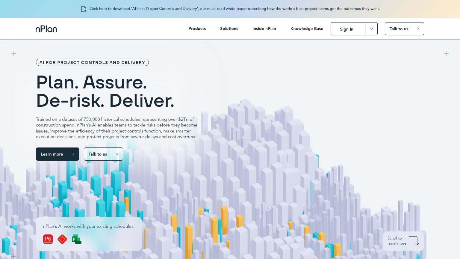


Problems
- vague — promises reading, not value
- no 'free' despite free trial popup
- 'Talk to us' feels sales-heavy
- small footprint vs. huge headline
Trust
58FairProof that the product is real, competent, and safe to try.
How nPlan compares
Trust read
Information hierarchy
68FairDoes the design help or inhibit what the page is trying to say?
What works
What to improve
Value props
68FairTitle, subtitle, hero — do they sell the product's true value?
nPlan’s headline
Plan. Assure. De-risk. Deliver.
Trained on a dataset of 750,000 historical schedules representing over $2Tn of construction spend, nPlan's AI enables teams to tackle risks before they become issues, improve the efficiency of their project controls function, make smarter e
Working
Could improve