
Your landing page’s weakest score is Mobile web.
How Nolej ranks
71Growth scoreupdated
category scores
category scoresShowHide
Mobile web
54FairThe phone experience as a first-class citizen.
 123
- Oversized hero illustration — Tablet graphic fills the entire first viewport, pushing the headline and the primary CTA below the fold.
- Chat greeting bubble — Auto-opened "Hi there!" bubble and green launcher overlap the copy and clip the award line — a dead blocker with no conversion CTA.
- Clipped award text — "Winner of Best EdTech Startup out of 7,000 worl…" is cut off by the chat widget, undermining the trust signal.
Information hierarchy
72FairDoes the design help or inhibit what the page is trying to say?
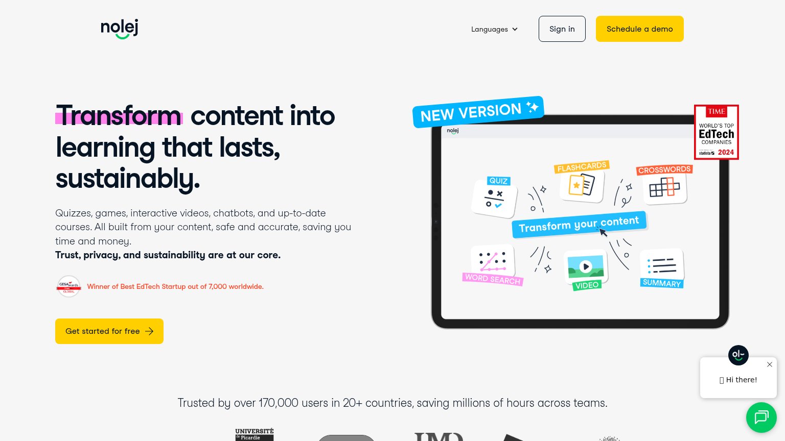 1234
- Schedule a demo button — Styled in the same yellow as the primary CTA, splitting attention between two equal-weight actions.
- Get started CTA — Sits well below the natural scan path, undersized relative to the headline and hero graphic above it.
- Chat widget popup — Auto-opened 'Hi there!' bubble plus launcher adds a third competing action in the fold's bottom-right.
- TIME EdTech badge — High-contrast red badge overlaps the hero graphic corner and pulls the eye away from the headline.
Value props
72FairTitle, subtitle, hero — do they sell the product's true value?
Nolej’s headline
Transform content into learning that lasts, sustainably.
Quizzes, games, interactive videos, chatbots, and up-to-date courses. All built from your content, safe and accurate, saving you time and money. Trust, privacy, and sustainability are at our core.
Working
Could improve
Trust
76FairProof that the product is real, competent, and safe to try.
How Nolej compares
Trust read
CTA
82StrongCopy, size, verb, cost-feel — does the primary CTA earn the click?
How Nolej compares
Recommended rewrites