
Your landing page’s weakest score is Information hierarchy.
How Brisk Teaching ranks
75Growth scoreupdated
category scores
category scoresShowHide
Information hierarchy
62FairDoes the design help or inhibit what the page is trying to say?
 1234
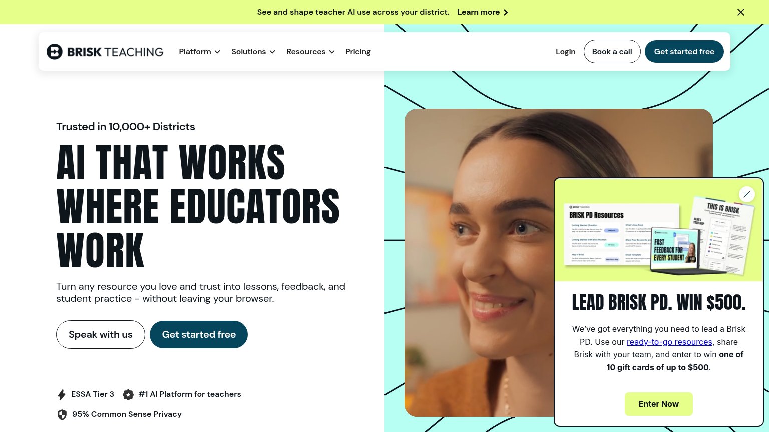
- $500 PD popup — Covers the hero video and outshouts the primary CTA with its own 'Enter Now' button and inline link.
- Yellow announcement banner — High-contrast 'Learn more' banner pulls the first glance away from the headline and conversion path.
- Book a call button — Outlined pill sits directly beside 'Get started free' at near-equal weight, splitting the nav's action.
- Speak with us button — Second hero button at the same size as 'Get started free' forces a choice before the primary action.
Trust
72FairProof that the product is real, competent, and safe to try.
| Trust read | |
|---|---|
| Brisk Teaching | "Trusted in 10,000+ Districts" eyebrow with badge row: ESSA Tier 3, #1 AI Platform for teachers, 95% Common Sense Privac |
| Embedded product UI showing a real assignment: "DM 4 · Dérivation" with "Terminale 2 · modifié à l'instant" and a chap-0 | |
| District customer logo strip (Atlanta Public Schools, Davis School District, Denver Public Schools, Dublin City Schools) | |
| No visible trust signal identified. | |
| Wall Street Journal quote: "Forget ChatGPT. These are the best AI-powered apps." |
Mobile web
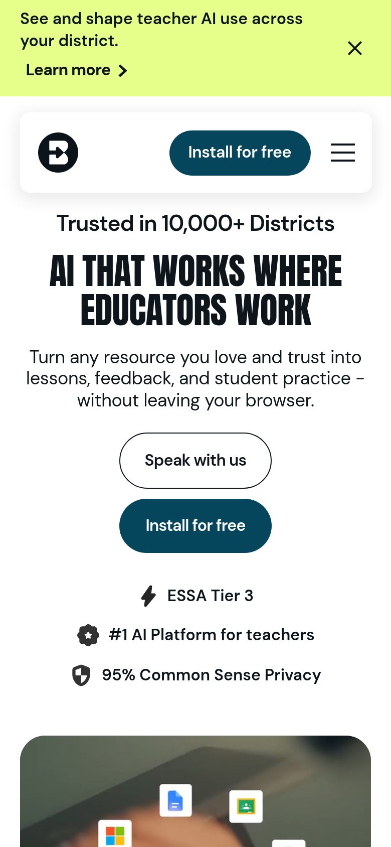
72FairThe phone experience as a first-class citizen.
What works
What to improve
CTA
84StrongCopy, size, verb, cost-feel — does the primary CTA earn the click?
How Brisk Teaching compares
Recommended rewrites
Value props
84StrongTitle, subtitle, hero — do they sell the product's true value?
Brisk Teaching’s headline
AI THAT WORKS WHERE EDUCATORS WORK
Turn any resource you love and trust into lessons, feedback, and student practice – without leaving your browser.
Working
Could improve