
Your landing page’s weakest score is Information hierarchy.
How Neo4j ranks
76Growth scoreupdated
category scores
category scoresShowHide
Information hierarchy
72FairDoes the design help or inhibit what the page is trying to say?
 1234
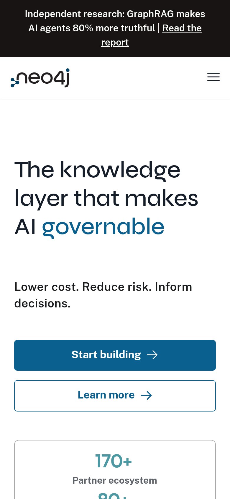
- Clipped headline word — The rotating word after "makes AI" renders as an illegible sliver, truncating the value proposition mid-sentence.
- Learn more button — Same size and arrow treatment as "Start building," splitting first-click attention between two equal-weight actions.
- Crowded utility nav — Pricing, Contact, Aura login, search, and "Get started free" cluster together, giving four exits beside the header CTA.
- Announcement banner link — "Read the report" is the first underlined link visitors see, pulling clicks off-page before the hero loads.
Value props
72FairTitle, subtitle, hero — do they sell the product's true value?
Neo4j’s headline sells
The knowledge layer that makes AI governable
Lower cost. Reduce risk. Inform decisions.
Working
- "Knowledge layer" names the true role in AI stacks
- 80% truthful stat is rare, specific proof
- Stats bar: 170+, 80+ Fortune 100, 300k devs
Could improve
- Subhead is three generic abstractions
- Rotating headline word clipped on desktop
- Hero collage is busy; no single clear demo
CTA
78FairCopy, size, verb, cost-feel — does the primary CTA earn the click?
How Neo4j compares
Recommended rewrites
Mobile web
78FairThe phone experience as a first-class citizen.
What works
What to improve
Trust
82StrongProof that the product is real, competent, and safe to try.
How Neo4j compares
Trust read