
Your landing page’s weakest score is Information hierarchy.
How FalkorDB ranks
- 1.
Cognee80
- 2.
Zep78
- 3.
Mem078
- 4.
Neo4j76
- 5.
HelixDB73
- 6.
FalkorDB65
65Growth scoreupdated
category scores
category scoresShowHide
Information hierarchy
42PoorDoes the design help or inhibit what the page is trying to say?
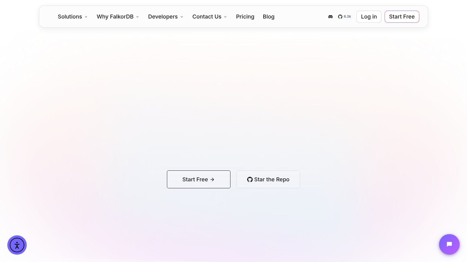 12
- Equal-weight CTA pair — "Start Free" and "Star the Repo" share the same outline styling, so neither reads as the primary action.
- Crowded nav bar — Six nav links plus Discord, GitHub, and Log in offer nine exits before the hero CTA, and Start Free is duplicated here.
Value props
62FairTitle, subtitle, hero — do they sell the product's true value?
FalkorDB’s headline undersells
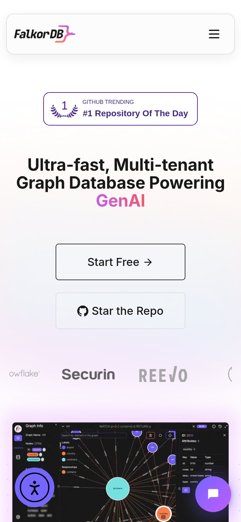
Ultra-fast, Multi-tenant Graph Database Powering GenAI
Working
- Names real differentiators: speed, multi-tenancy
- GitHub #1 trending badge is credible proof
- Mobile screenshot shows the actual product
Could improve
- Desktop hero renders no headline at all
- No subhead to add specifics or outcome
- "Ultra-fast" has no number backing it
Trust
62FairProof that the product is real, competent, and safe to try.
How FalkorDB compares
Trust read
Mobile web
76FairThe phone experience as a first-class citizen.
What works
What to improve
CTA
82StrongCopy, size, verb, cost-feel — does the primary CTA earn the click?
How FalkorDB compares
Recommended rewrites