
Your landing page’s weakest score is Trust.
How Uno Wallet ranks
- 1.
Uno Wallet82
- 2.
Kudos77
- 3.
MaxRewards75
- 4.
CardPointers64
Trust
72FairProof that the product is real, competent, and safe to try.

| Trust read | |
|---|---|
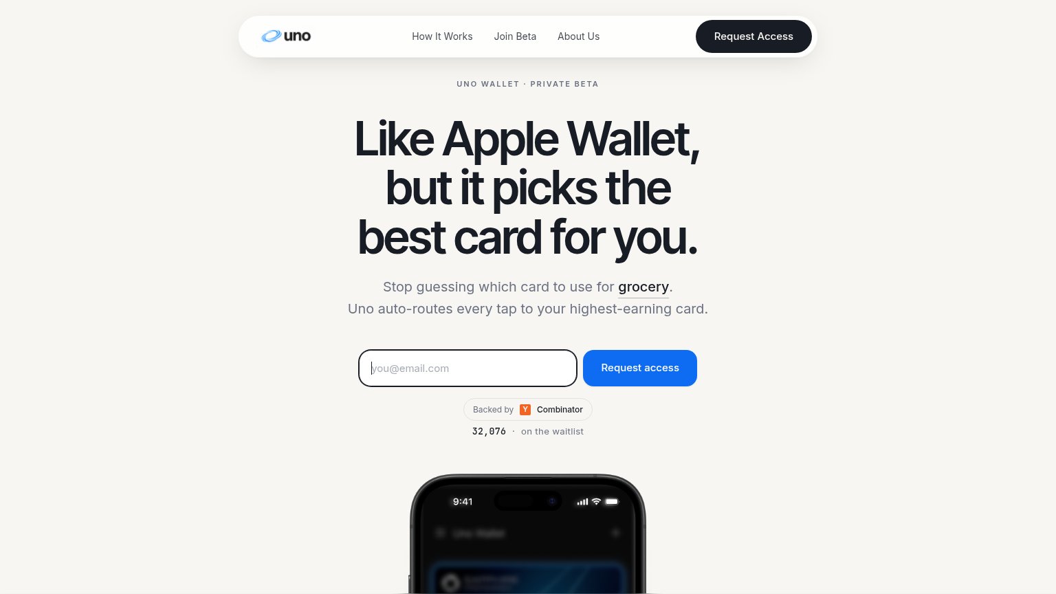
| Uno Wallet | "Backed by Y Combinator" badge with "32,076 · on the waitlist" counter below the CTA |
| "Join over 400,000+ members taking control of their finances today." beneath the Get started CTA | |
| "Trusted by 900,000+ members" beneath the Get Started CTA | |
| Award laurels reading "App of the Day," "Essential Finance App," and "Must-Have Extensions" beside real product screensh |
CTA
76FairCopy, size, verb, cost-feel — does the primary CTA earn the click?
Problems
- 'Request' feels like asking permission
- waitlist gate, no immediate value
- no payoff hint in label
Information hierarchy
86StrongDoes the design help or inhibit what the page is trying to say?
What works
What to improve
Value props
88StrongTitle, subtitle, hero — do they sell the product's true value?
Uno Wallet’s headline
Like Apple Wallet, but it picks the best card for you.
Stop guessing which card to use for grocery. Uno auto-routes every tap to your highest-earning card.
Working
Could improve
Mobile web
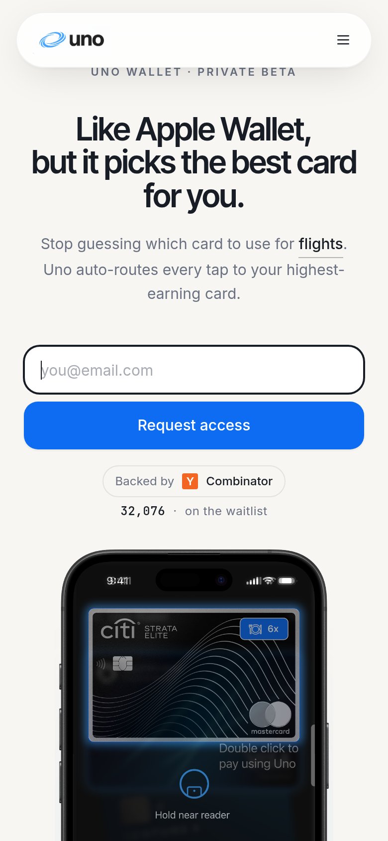
88StrongThe phone experience as a first-class citizen.
What works
What to improve