
Your landing page’s weakest score is CTA.
How MaxRewards ranks
- 1.
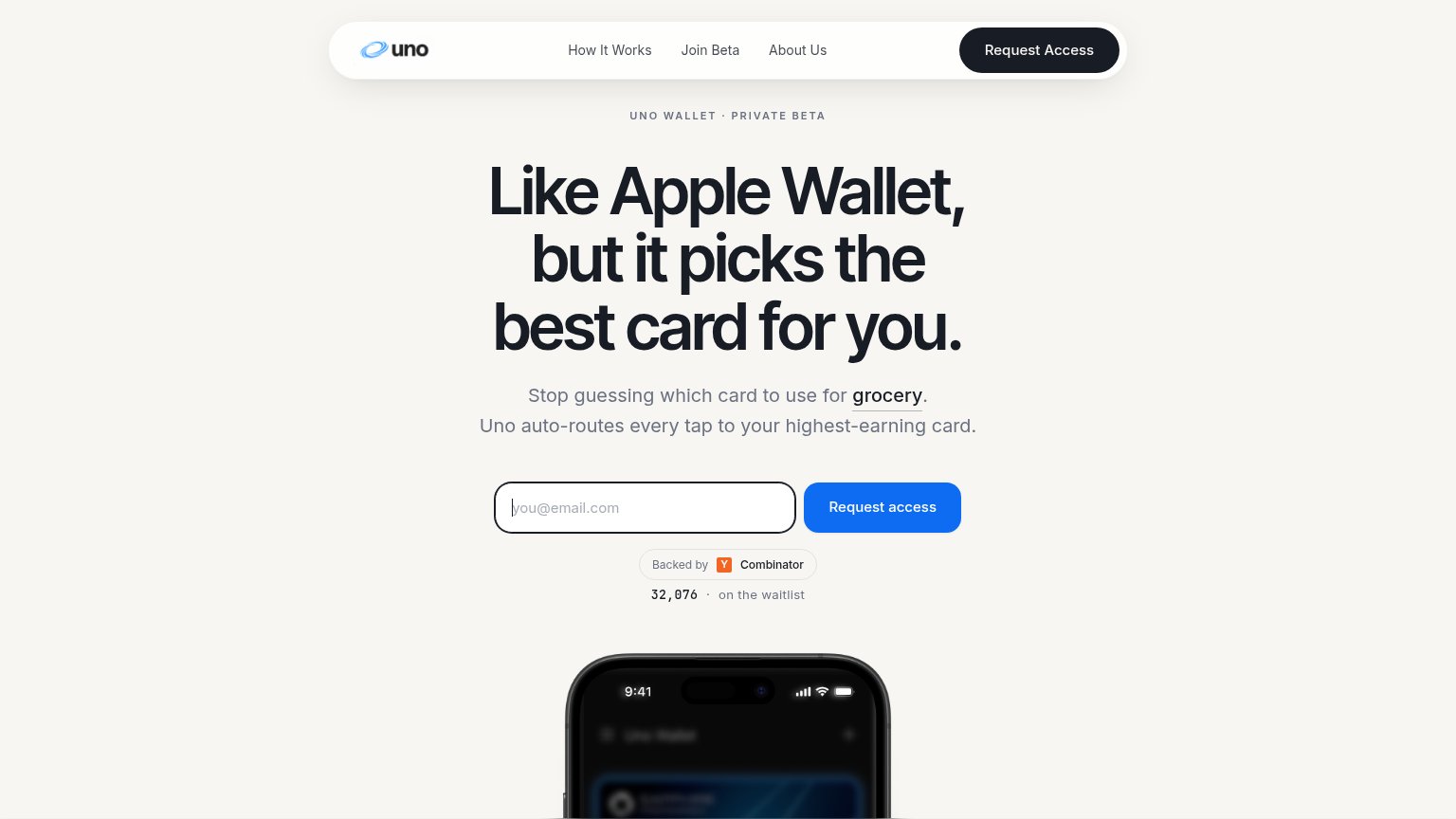
Uno Wallet82
- 2.
Kudos77
- 3.
MaxRewards75
- 4.
CardPointers64
CTA
72FairCopy, size, verb, cost-feel — does the primary CTA earn the click?

Problems
- generic label, no benefit
- competes with Sign Up + store badges
- no echo of headline promise
Mobile web
72FairThe phone experience as a first-class citizen.
 1234
- Six-line body paragraph — Desktop-length subcopy wraps into six lines and shoves the primary CTA to the fold's bottom edge.
- Get Started button — Primary CTA sits at the very bottom of the first viewport and is inset instead of full-width.
- Oversized serif headline — Headline scaled down too little, wrapping into three tall lines that eat a third of the fold.
- Duplicate Sign Up pill — Header "Sign Up" competes with the hero's "Get Started" as a second primary action.
Trust
76FairProof that the product is real, competent, and safe to try.
How MaxRewards compares
Trust read
Information hierarchy
78FairDoes the design help or inhibit what the page is trying to say?
What works
What to improve
Value props
78FairTitle, subtitle, hero — do they sell the product's true value?
MaxRewards’s headline
Make every card in your wallet work harder.
Keep rewards, benefits, and card-linked offers in one place. MaxRewards helps you use the right card, activate more card-linked offers, and keep more of the value your cards already provide.
Working
Could improve