
Your landing page’s weakest score is CTA.
How CardPointers ranks
- 1.
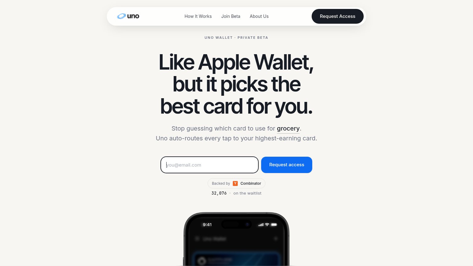
Uno Wallet82
- 2.
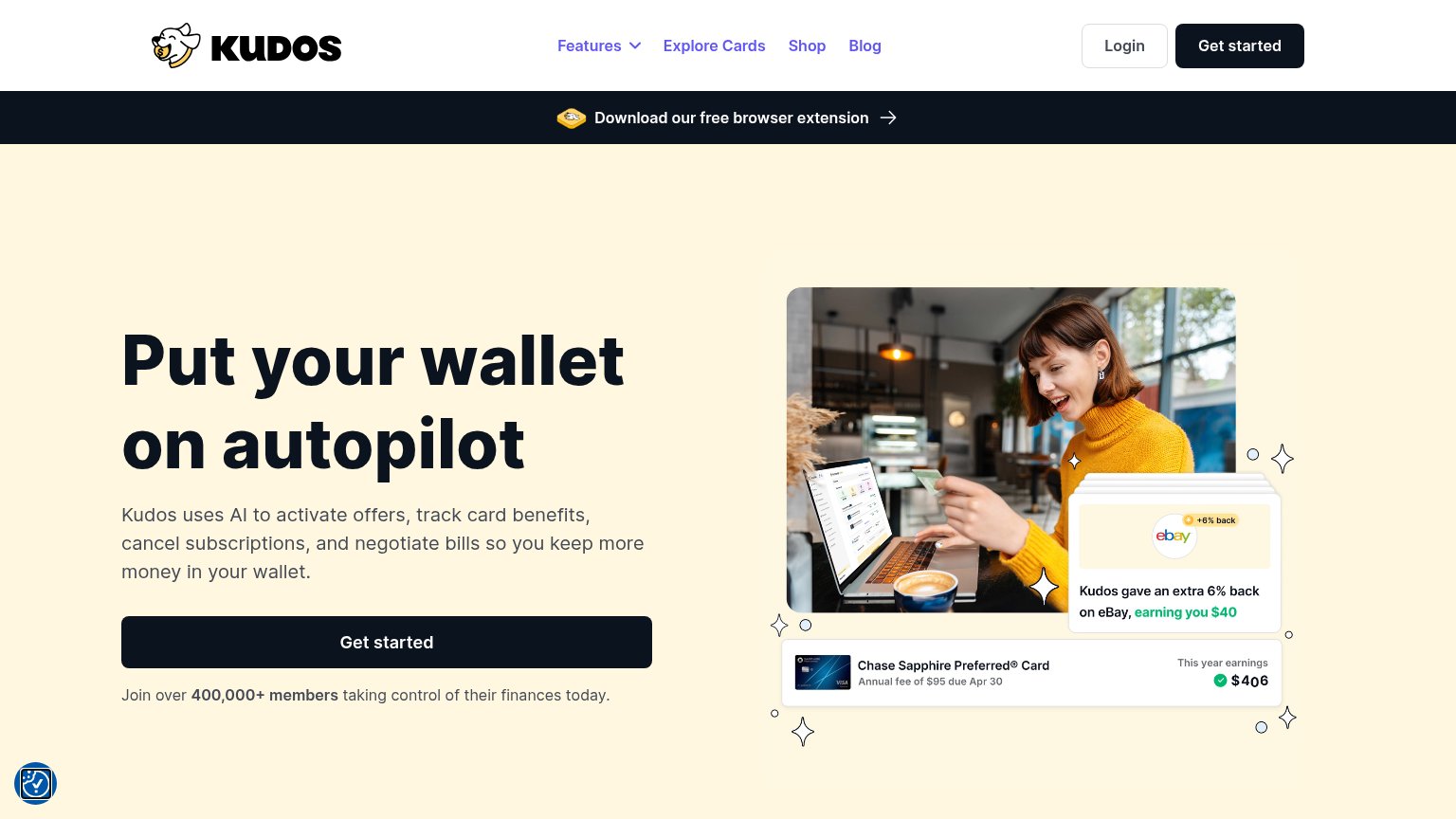
Kudos77
- 3.
MaxRewards75
- 4.
CardPointers64
CTA
54FairCopy, size, verb, cost-feel — does the primary CTA earn the click?

Problems
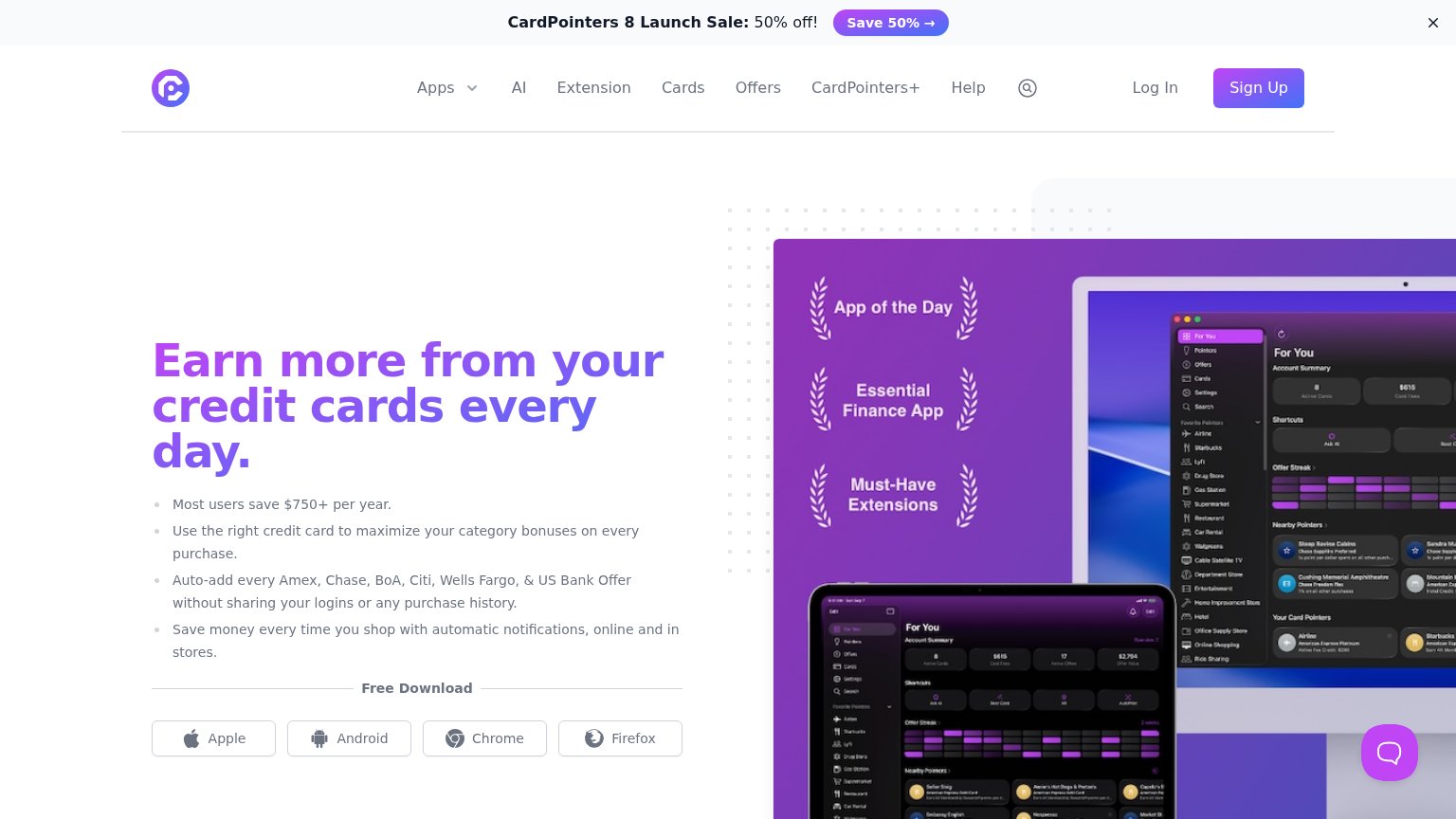
- no action verb — platform nouns only
- four small buttons split the click
- 'free' lives in divider, not button
- icon-only buttons on mobile
Mobile web
58FairThe phone experience as a first-class citizen.
 1234
- Chat bubble over CTA — The chat widget sits directly on the fourth download button, blocking the tap on the only CTAs in view.
- Four-bullet feature stack — Desktop-length bullets stacked verbatim fill the whole fold and push the download CTAs off-screen.
- Launch sale banner — The promo banner consumes the top slice of the viewport before the brand or headline appears.
- Small unlabeled download buttons — Icon-only platform buttons are desktop-proportioned and cramped instead of one full-bleed primary action.
Information hierarchy
62FairDoes the design help or inhibit what the page is trying to say?
What works
What to improve
Trust
62FairProof that the product is real, competent, and safe to try.
How CardPointers compares
Trust read
Value props
82StrongTitle, subtitle, hero — do they sell the product's true value?
CardPointers’s headline
Earn more from your credit cards every day.
Working
Could improve