
Your landing page’s weakest score is CTA.
How Molg ranks
CTA
44PoorCopy, size, verb, cost-feel — does the primary CTA earn the click?
Problems
- no hero button or in-product action
- only action is a small nav link
- 'get in touch' feels costly
- hidden behind hamburger on mobile
Mobile web
58FairThe phone experience as a first-class citizen.
 123
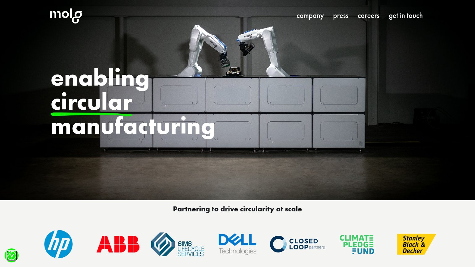
- Hero headline area — No tappable CTA accompanies the headline — the only conversion path is buried in the hamburger menu.
- Partner logo strip — Seven logos squeezed into one row; Sims Lifecycle and Closed Loop marks are illegibly small on a phone.
- Headline over cabinets — White headline text overlaps the light-grey machine panels, reducing contrast on 'manufacturing'.
Value props
62FairTitle, subtitle, hero — do they sell the product's true value?
Molg’s headline
enabling circular manufacturing
Working
Could improve
Information hierarchy
64FairDoes the design help or inhibit what the page is trying to say?
What works
What to improve
Trust
78FairProof that the product is real, competent, and safe to try.
How Molg compares
Trust read