
Your landing page’s weakest score is Trust.
How Maywood ranks
Trust
52FairProof that the product is real, competent, and safe to try.

| Trust read | |
|---|---|
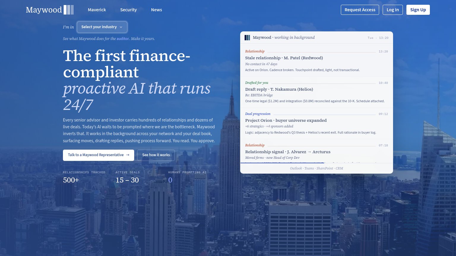
| Maywood | Product feed panel "Maywood · working in background" showing real drafted replies and deal-progression entries with an " |
| Customer/partner logo strip: Tiger Global, Moelis, Nomura, Société Générale, Rothschild & Co, BNP Paribas, Raymond James | |
| Product animation showing AI workflow steps: "Pulling pipeline status…", "Scanning portfolio updates…", "Mapping & scori | |
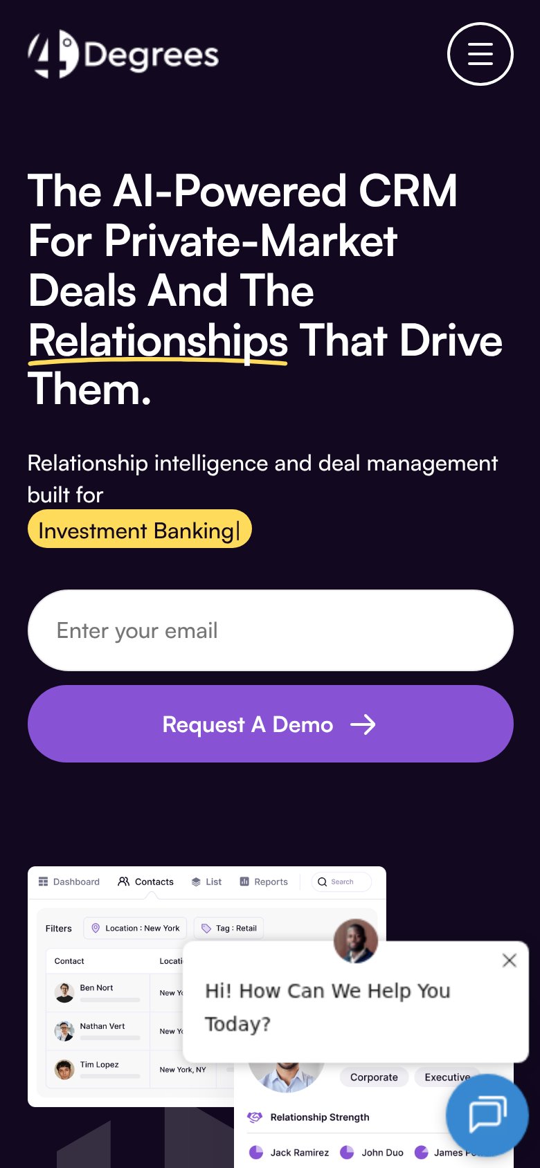
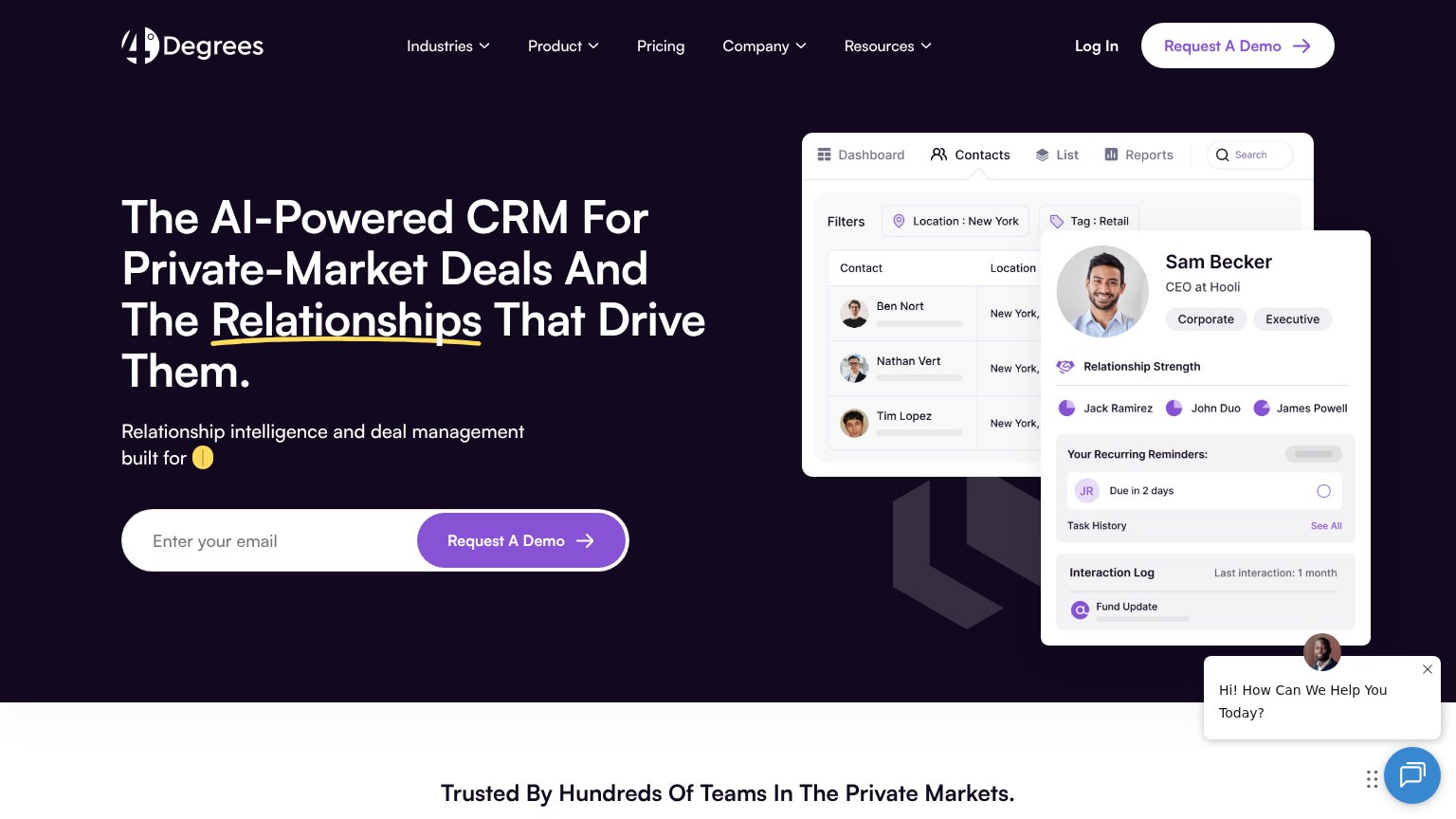
| Detailed product UI mockup showing Contacts view with Relationship Strength panel, recurring reminders, and interaction | |
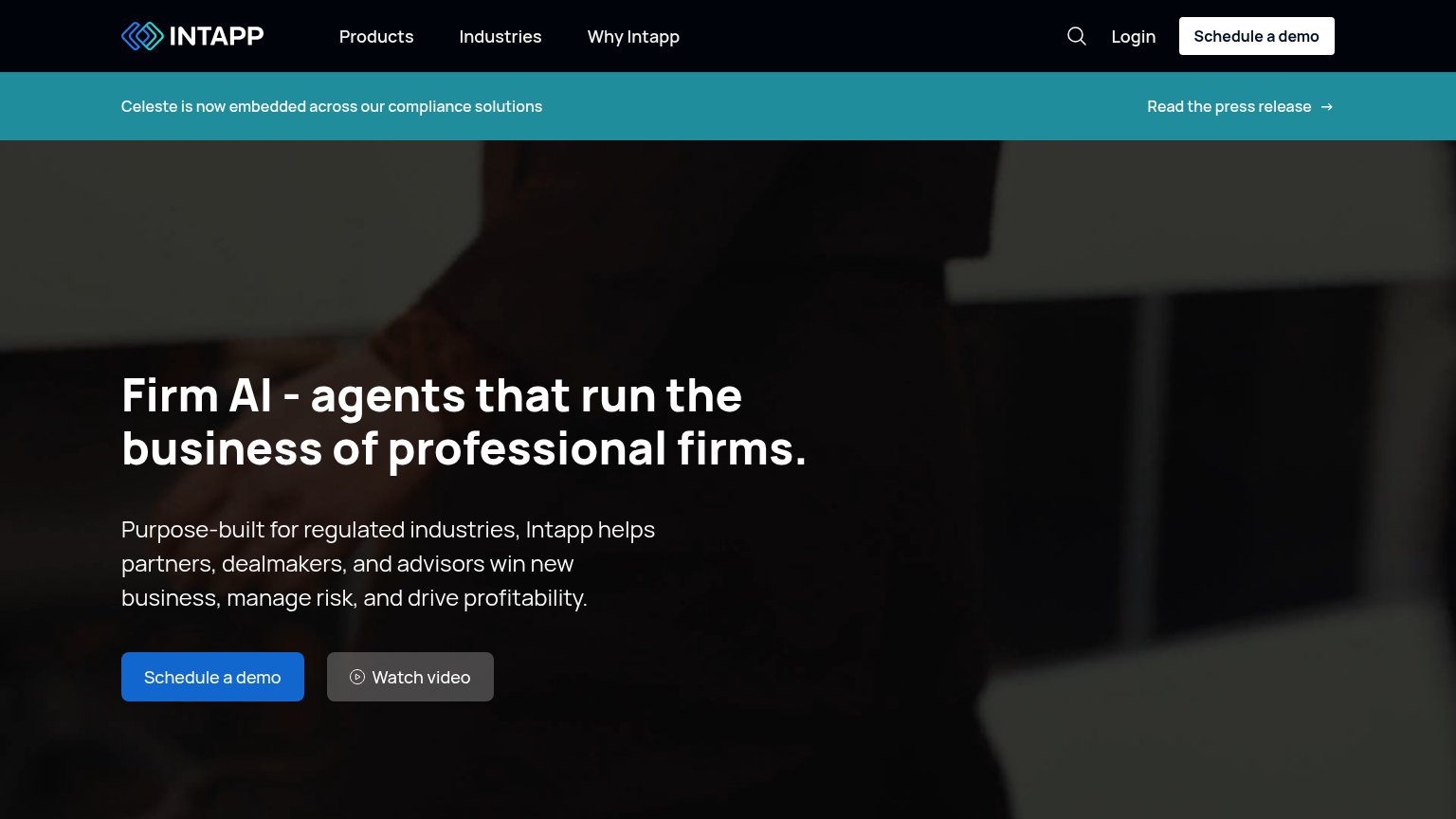
| Banner: "Celeste is now embedded across our compliance solutions" with "Read the press release" link |
CTA
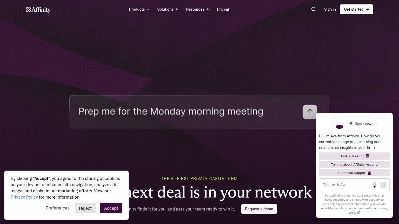
58FairCopy, size, verb, cost-feel — does the primary CTA earn the click?
Problems
- click feels like a sales call
- 5 words - too long
- names company, not visitor payoff
- competes with nav Sign Up/Request Access
Information hierarchy
64FairDoes the design help or inhibit what the page is trying to say?
What works
What to improve
Mobile web
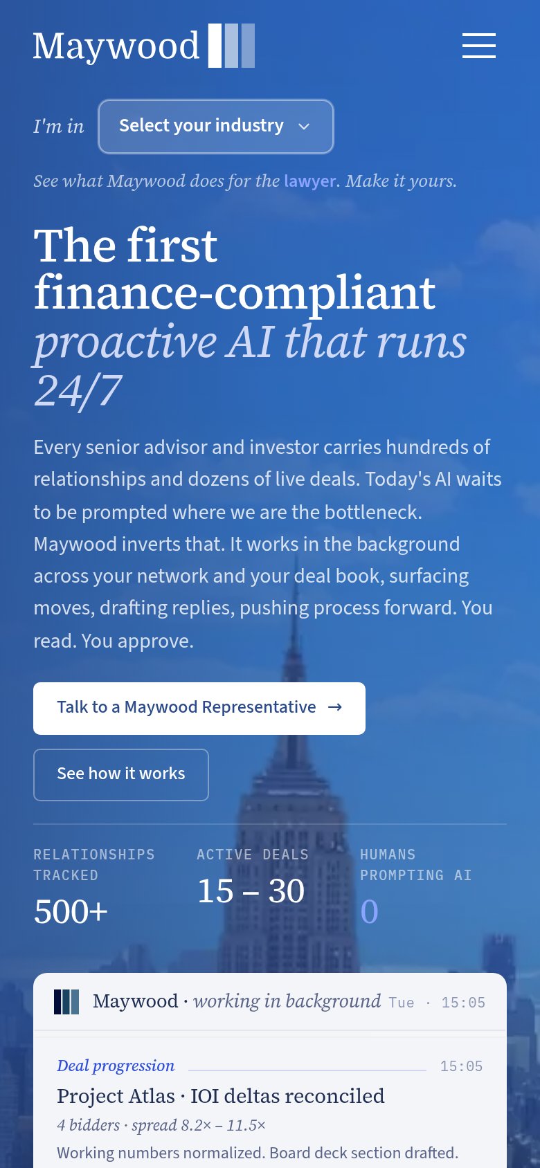
68FairThe phone experience as a first-class citizen.
What works
What to improve
Value props
86StrongTitle, subtitle, hero — do they sell the product's true value?
Working
Could improve