
Your landing page’s weakest score is Trust.
How Affinity ranks
61Growth scoreupdated
category scores
category scoresShowHide
Trust
48PoorProof that the product is real, competent, and safe to try.

| Trust read | |
|---|---|
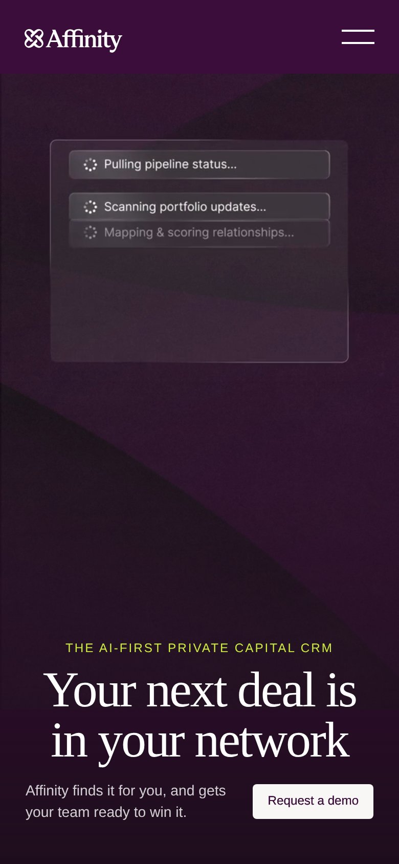
| Affinity | Product animation showing AI workflow steps: "Pulling pipeline status…", "Scanning portfolio updates…", "Mapping & scori |
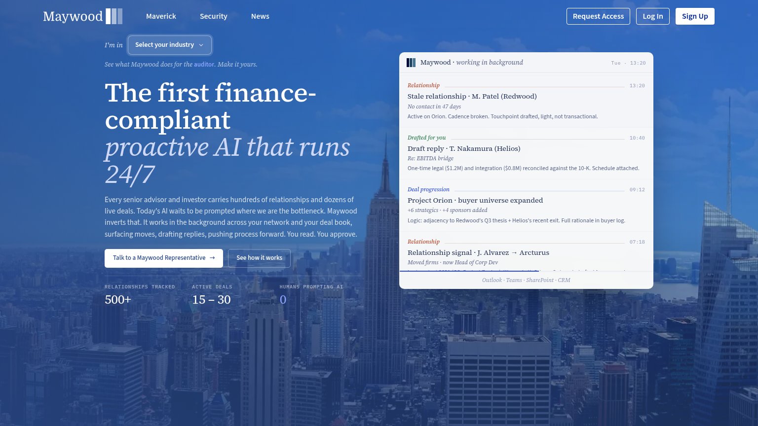
| Product feed panel "Maywood · working in background" showing real drafted replies and deal-progression entries with an " | |
| Customer/partner logo strip: Tiger Global, Moelis, Nomura, Société Générale, Rothschild & Co, BNP Paribas, Raymond James | |
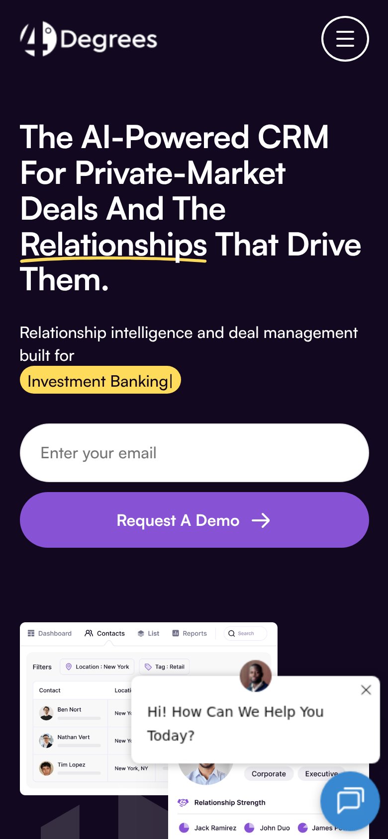
| Detailed product UI mockup showing Contacts view with Relationship Strength panel, recurring reminders, and interaction | |
| Banner: "Celeste is now embedded across our compliance solutions" with "Read the press release" link |
Information hierarchy
58FairDoes the design help or inhibit what the page is trying to say?
 1234
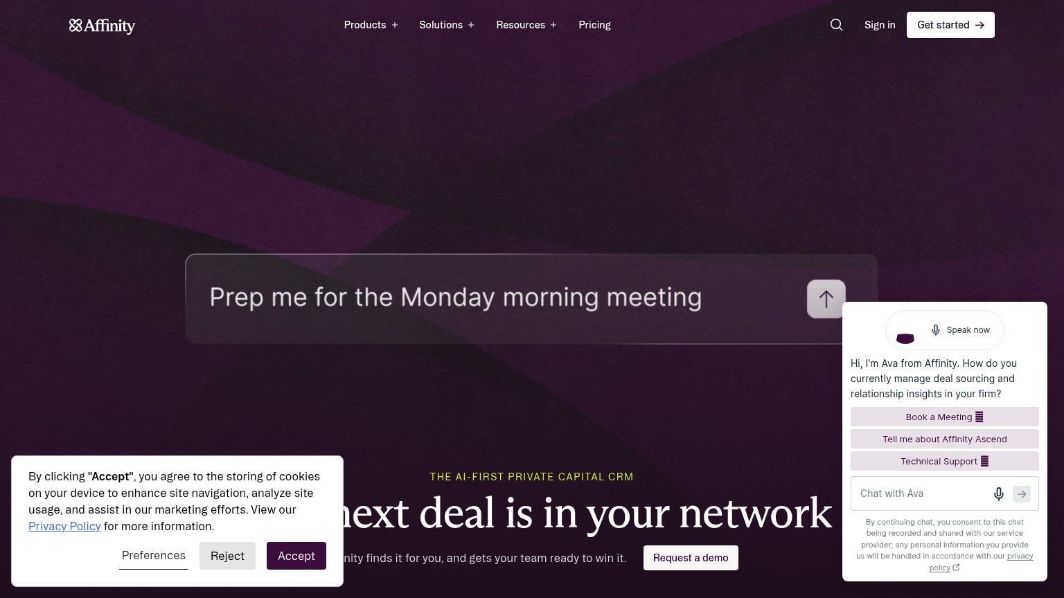
- Auto-opened chat widget — Covers the right third of the fold, overlaps the headline, and adds three competing buttons against the demo CTA.
- Cookie consent banner — Blocks the left half of the headline and subtitle, leaving the value prop unreadable at a glance.
- Truncated hero headline — "next deal is in Affinity's network" is clipped by overlays on both sides, so the core promise never lands whole.
- Request a demo CTA — Low-contrast outline button wedged between banner and chat panel, outside the natural scan path.
CTA
62FairCopy, size, verb, cost-feel — does the primary CTA earn the click?
How Affinity compares
Recommended rewrites
Mobile web
62FairThe phone experience as a first-class citizen.
What works
What to improve
Value props
74FairTitle, subtitle, hero — do they sell the product's true value?
Affinity’s headline
Your next deal is in your network
Affinity finds it for you, and gets your team ready to win it.
Working
Could improve