
Your landing page’s weakest score is Trust.
How Mayflower ranks
Trust
46PoorProof that the product is real, competent, and safe to try.

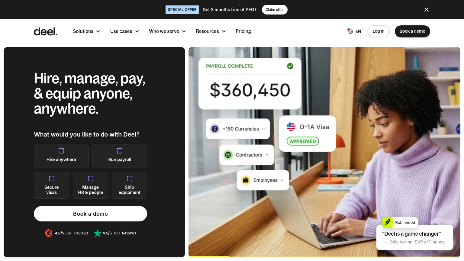
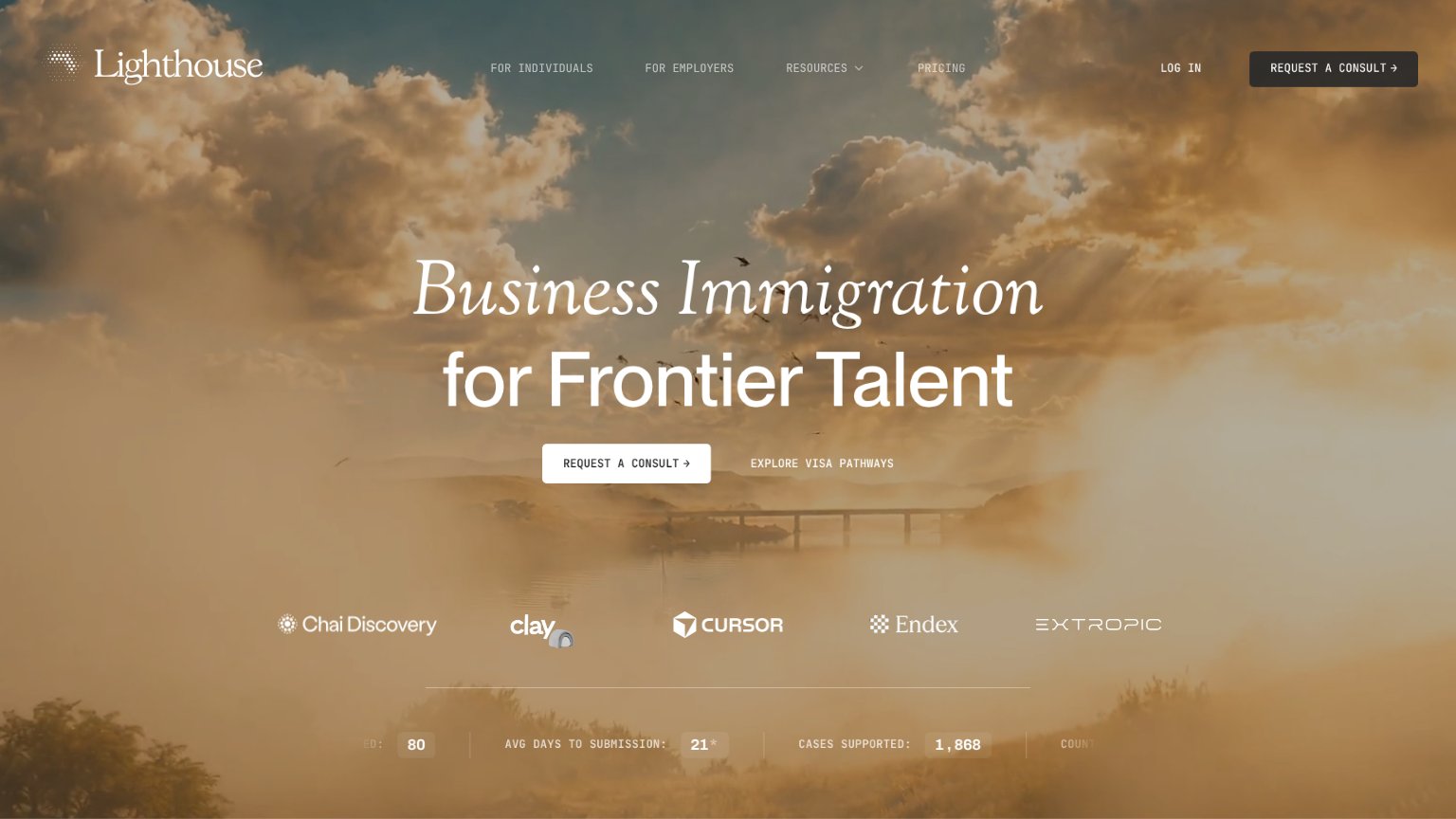
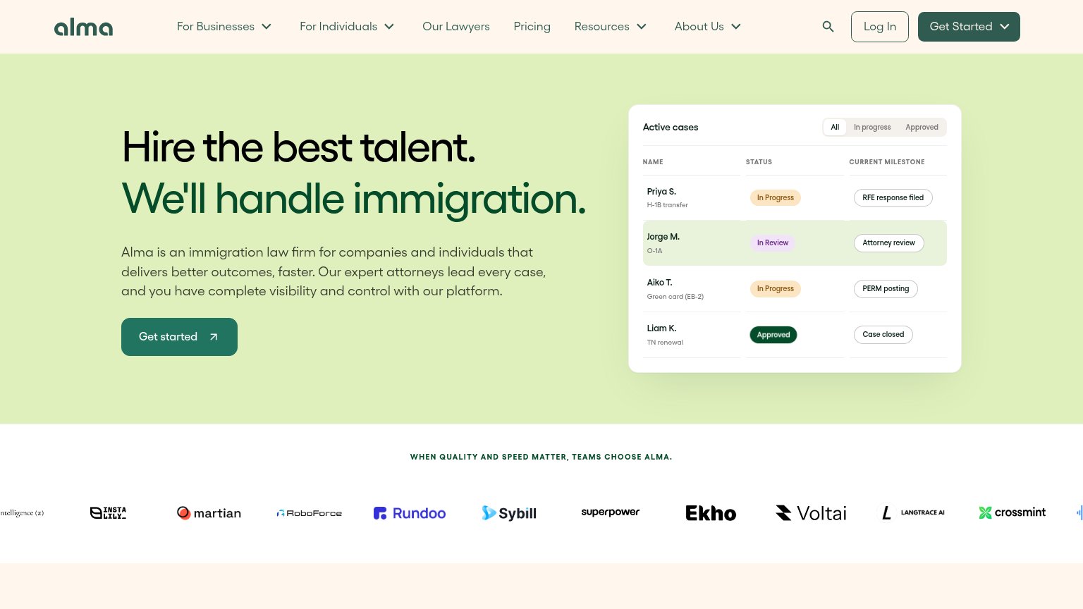
| Trust read | |
|---|---|
| Mayflower | "Backed by Y Combinator" badge |
| "PROUDLY SUPPORTING" heading at the mobile fold edge | |
| Customer logo bar (Sybill, Crossmint, Rundoo, Martian, Ekho) under "WHEN QUALITY AND SPEED MATTER, TEAMS CHOOSE ALMA." | |
| Customer logo row (Chai Discovery, Clay, Cursor, Endex, Extropic) with metrics strip "AVG DAYS TO SUBMISSION: 21*" and " | |
| G2 4.8/5 (5K+ Reviews) and Trustpilot 4.5/5 (9K+ Reviews) badges directly below the "Book a demo" CTA | |
| implicit context Bridge (Boundless for Employers) may benefit from pre-existing familiarity among its target audience. |
CTA
58FairCopy, size, verb, cost-feel — does the primary CTA earn the click?
Problems
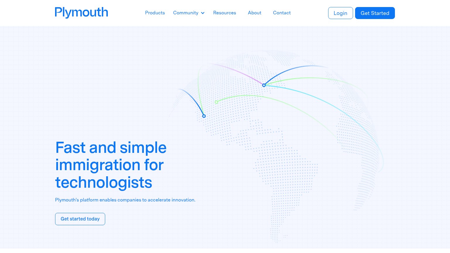
- click feels costly — sales call
- four words, over 3-word limit
- secondary CTA is same friction
- no low-cost product entry point
Value props
72FairTitle, subtitle, hero — do they sell the product's true value?
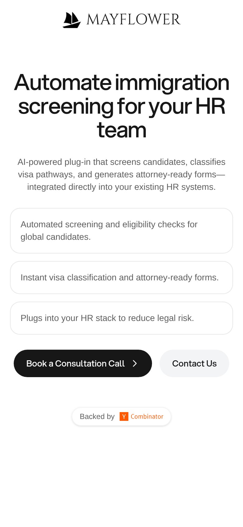
Mayflower’s headline
Automate immigration screening for your HR team
AI-powered plug-in that screens candidates, classifies visa pathways, and generates attorney-ready forms—integrated directly into your existing HR systems.
Working
Could improve
Mobile web
72FairThe phone experience as a first-class citizen.
What works
What to improve
Information hierarchy
74FairDoes the design help or inhibit what the page is trying to say?
What works
What to improve