
Your landing page’s weakest score is CTA.
How Lumini (lululab) ranks
CTA
32PoorCopy, size, verb, cost-feel — does the primary CTA earn the click?
Problems
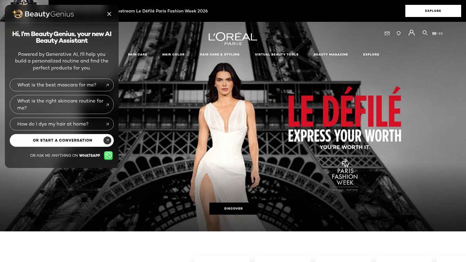
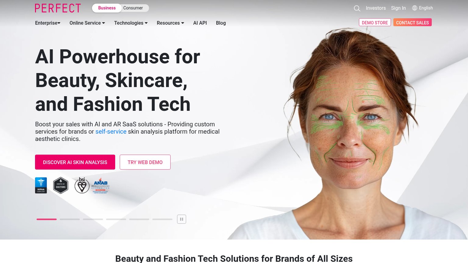
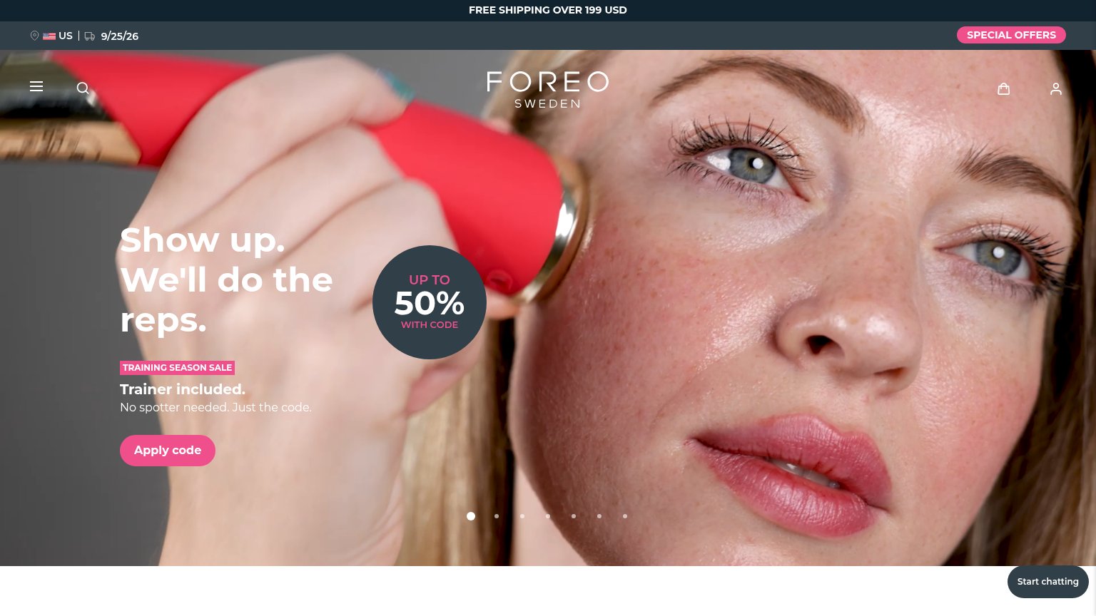
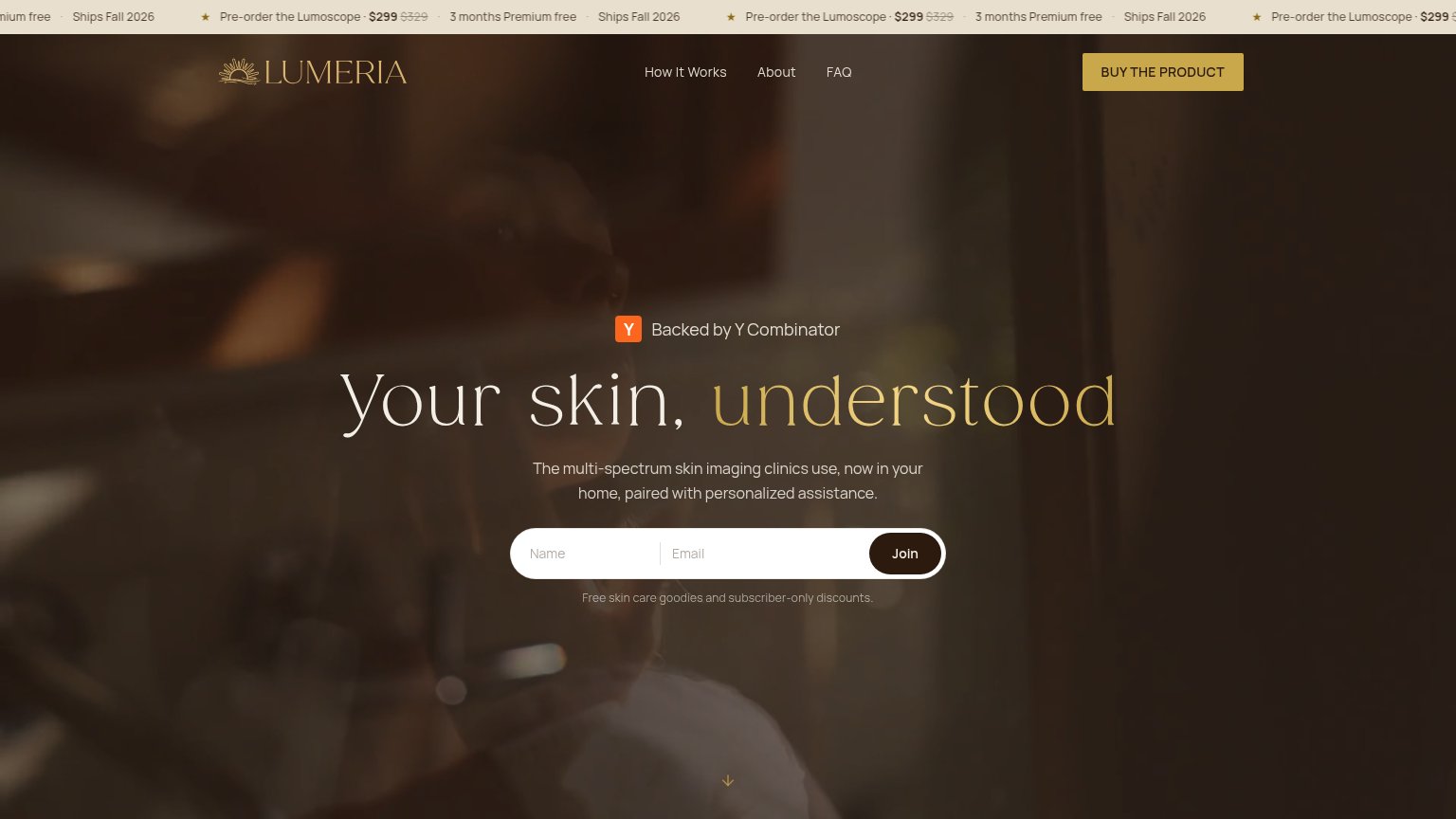
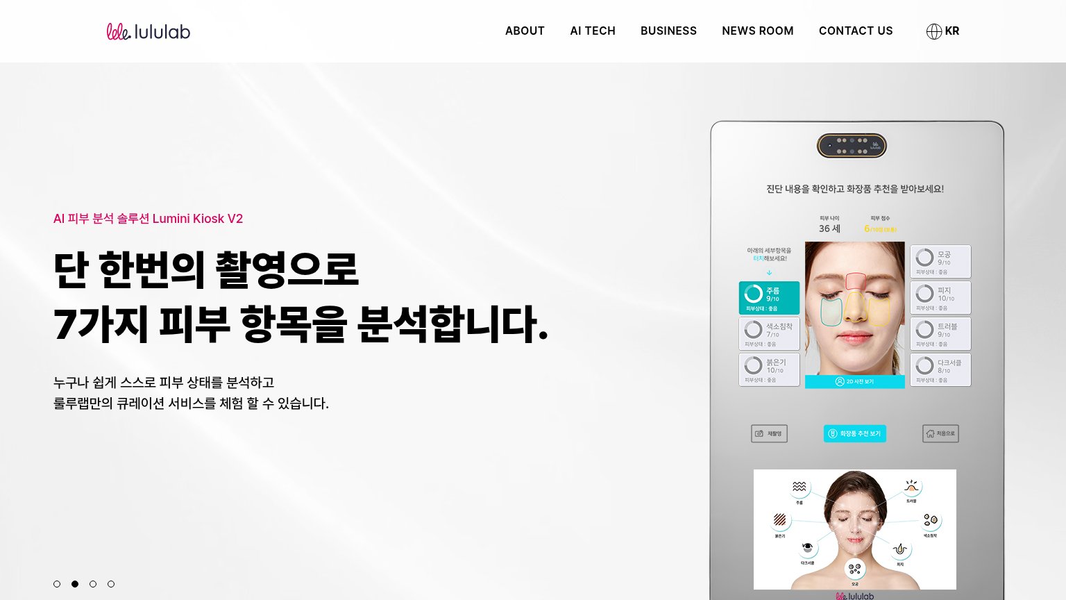
- no CTA anywhere in hero
- only nav links are clickable
- mobile hero broken, still no CTA
- carousel gives no next action
Mobile web
32PoorThe phone experience as a first-class citizen.
 1234
- Overlapping hero headlines — Two carousel slides render simultaneously, stacking headlines into an illegible jumble.
- Overlapping body paragraphs — Two slide subtexts overprint each other, so neither value description is readable.
- Low-contrast grey text — Pale grey copy on a white-grey photo background is barely visible at phone brightness.
- Doubled eyebrow labels — Both slide kickers (Kiosk V2 and HOME) show at once, confusing which product is pitched.
Information hierarchy
48PoorDoes the design help or inhibit what the page is trying to say?
What works
What to improve
Trust
52FairProof that the product is real, competent, and safe to try.
How Lumini (lululab) compares
Trust read
Value props
62FairTitle, subtitle, hero — do they sell the product's true value?
Lumini (lululab)’s headline
단 한번의 촬영으로 7가지 피부 항목을 분석합니다.
누구나 쉽게 스스로 피부 상태를 분석하고 룰루랩만의 큐레이션 서비스를 체험 할 수 있습니다.
Working
Could improve