
Your landing page’s weakest score is Value props.
How Limitless ranks
56Growth scoreupdated
category scores
category scoresShowHide
Value props
42PoorTitle, subtitle, hero — do they sell the product's true value?
Limitless’s headline vague
BTC Up or Down - 15 Min
ENDS SUN, SEP 20 • 09:45 PM
Working
- Live market shows real product in action
- Concrete numbers: prices, odds, timers
- Trade ticker doubles as social proof
Could improve
- No headline states what Limitless is
- No claim of payout or outcome value
- Assumes prediction-market fluency
Information hierarchy
48PoorDoes the design help or inhibit what the page is trying to say?
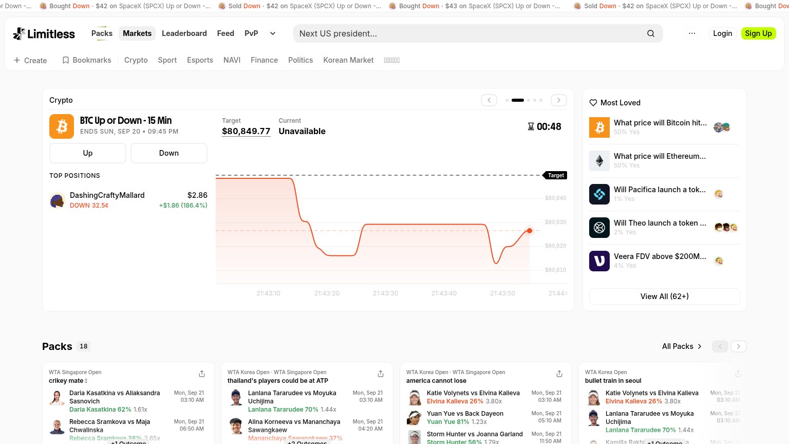 1234
- Scrolling trade ticker — Full-width animated 'Bought Down · $42' feed is the first thing seen and outranks any value proposition.
- Category links row — Eleven equal-weight links (Crypto, Sport, Esports, NAVI…) sit directly above the hero and siphon attention before the market card.
- Current: Unavailable label — The hero market shows 'Unavailable' for its current price, breaking the live-data demo that is the fold's main proof.
- Most Loved rail — Five clickable markets styled at the same weight as the hero card split focus and add exits before Sign Up.
Trust
58FairProof that the product is real, competent, and safe to try.
How Limitless compares
Trust read
CTA
64FairCopy, size, verb, cost-feel — does the primary CTA earn the click?
How Limitless compares
Recommended rewrites
Mobile web
68FairThe phone experience as a first-class citizen.
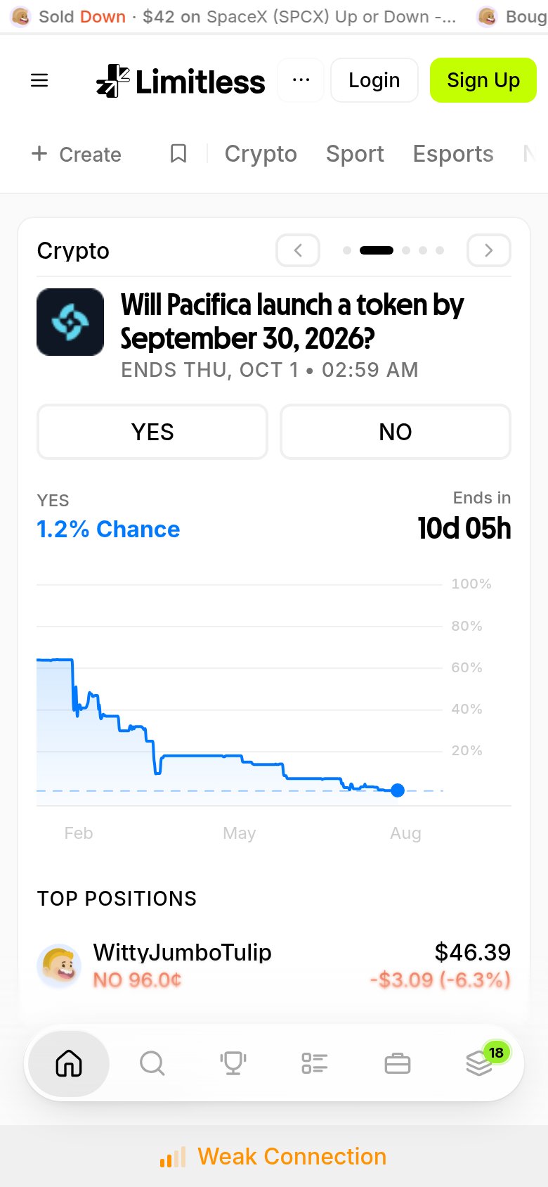
What works
What to improve