
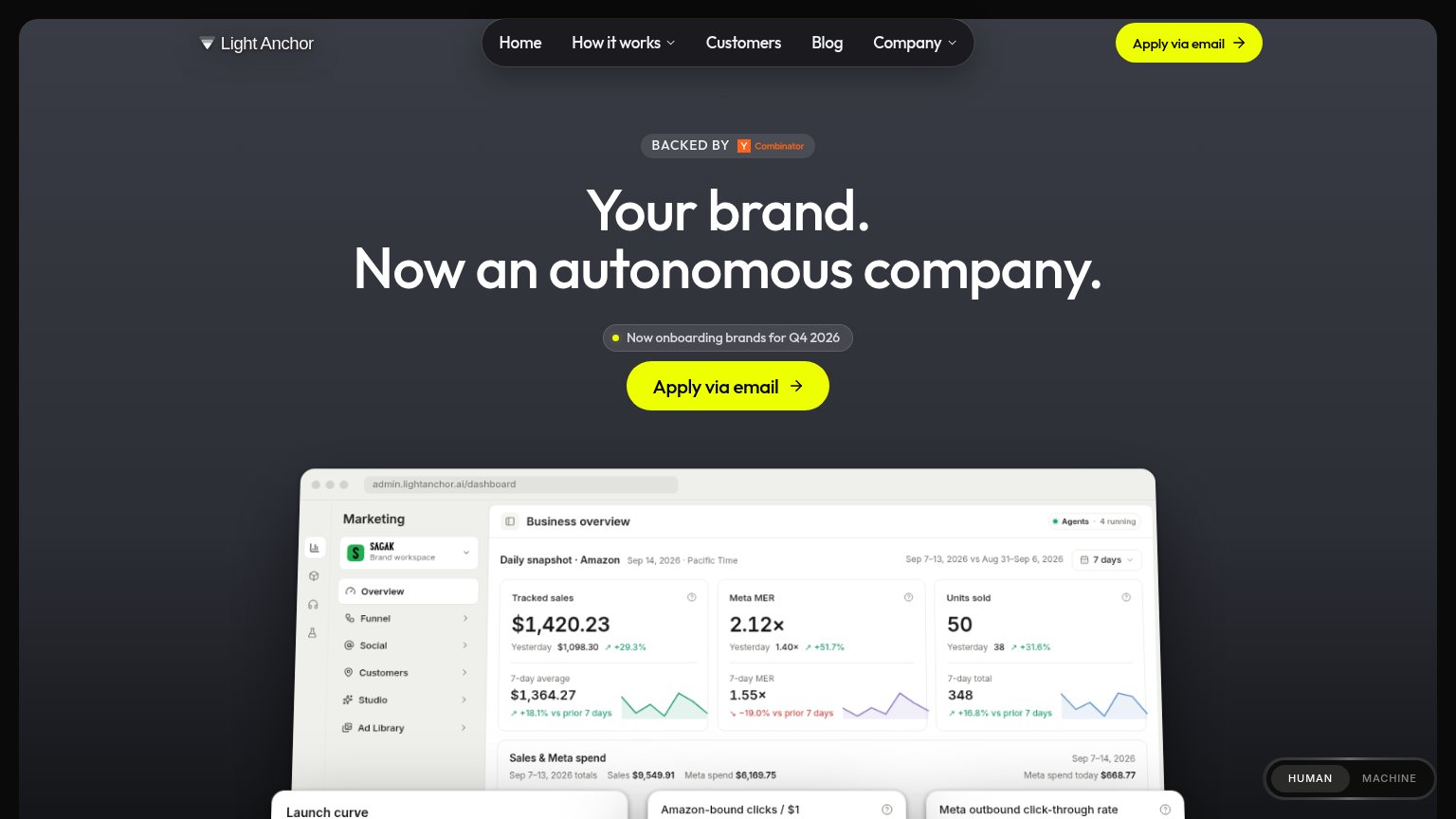
Your landing page’s weakest score is CTA.
How Light Anchor ranks
- 1.
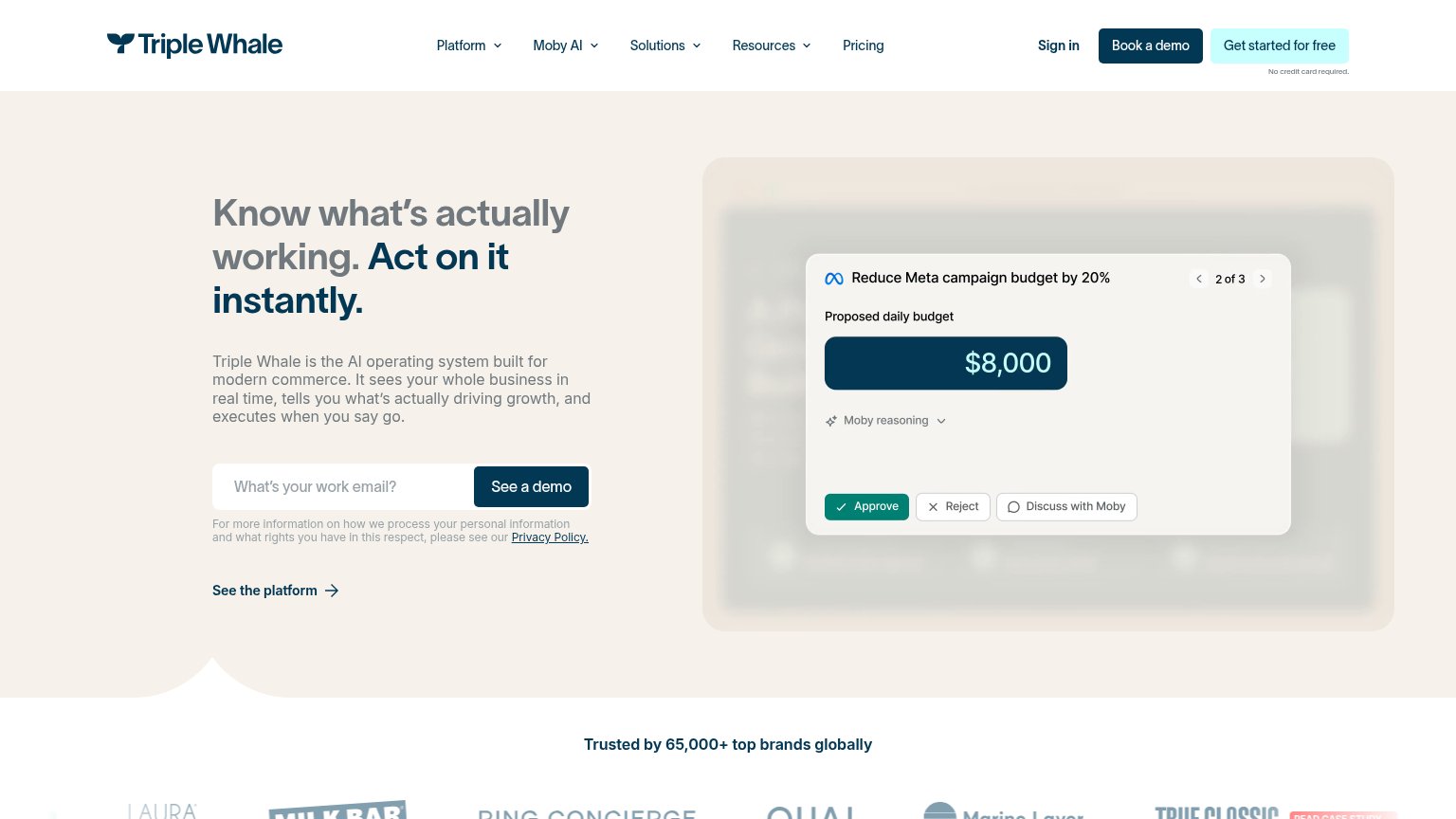
Triple Whale73
- 2.
Light Anchor72
- 3.
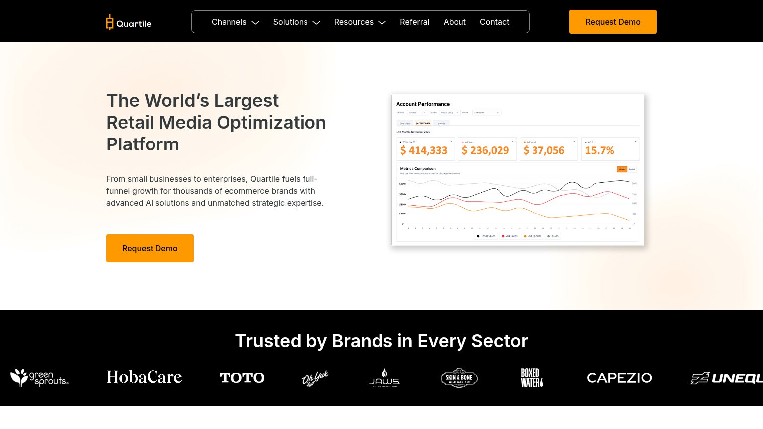
Quartile72
- 4.
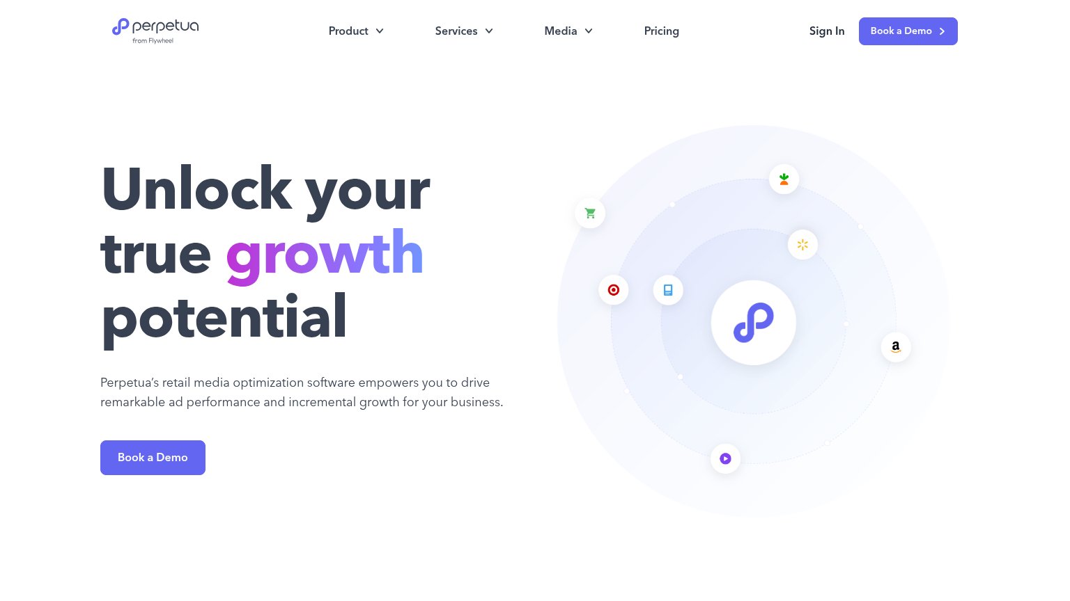
Perpetua67
- 5.
Trellis60
CTA
62FairCopy, size, verb, cost-feel — does the primary CTA earn the click?
Problems
- 'via email' signals slow, manual flow
- 'Apply' feels like petitioning, not value
- no secondary lower-friction path
Trust
62FairProof that the product is real, competent, and safe to try.
| Trust read | |
|---|---|
| Light Anchor | "BACKED BY Y Combinator" badge above the hero headline |
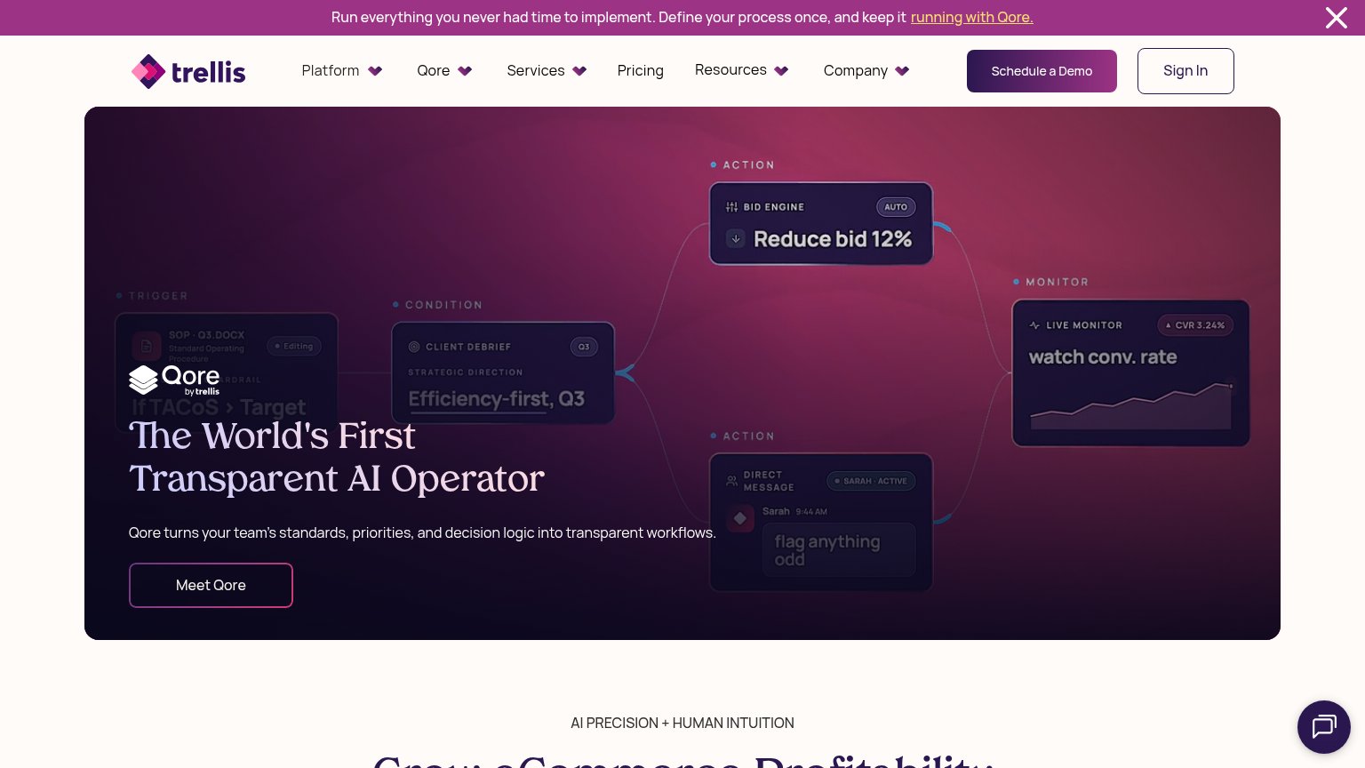
| Stylized workflow UI cards in the hero ("Bid Engine — Reduce bid 12%", "Live Monitor — watch conv. rate") that make the | |
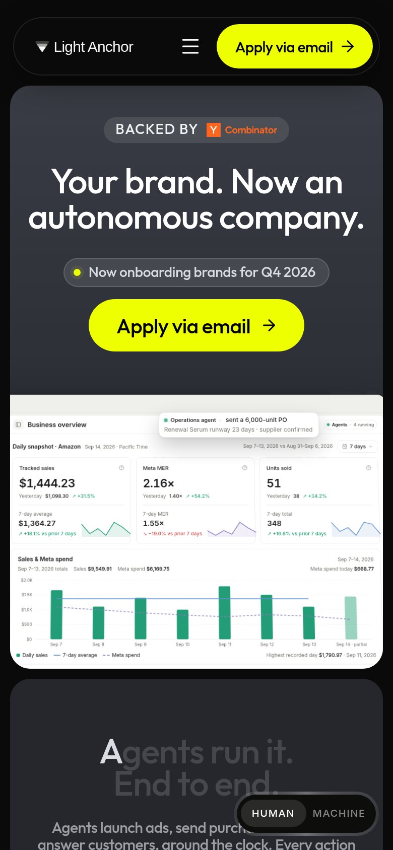
| Customer logo strip (Crocs, Hero, CAP, Cartograph, Xtreme ROI) on the mobile fold | |
| "Trusted by Brands in Every Sector" logo strip with green sprouts, HobaCare, TOTO, Capezio, and Boxed Water | |
| "Trusted by 65,000+ top brands globally" with customer logo row (Milk Bar, True Classic, Marine Layer) |
Value props
68FairTitle, subtitle, hero — do they sell the product's true value?
Light Anchor’s headline
Your brand. Now an autonomous company.
Working
Could improve
Information hierarchy
84StrongDoes the design help or inhibit what the page is trying to say?
What works
What to improve
Mobile web
86StrongThe phone experience as a first-class citizen.
What works
What to improve